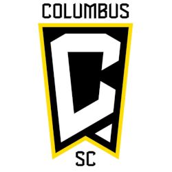
To partake in a fresh start to the 2021 frame, the Columbus Soccer Club is engaging in a full rebrand with a few key changes.
 Sports Logo History
 Columbus SC Primary Logo 2021 - Present
First and foremost, the nickname “Crew” is being dropped from the primary logo moving forward. The club will also be known as Columbus Soccer Club, or SC, and not Columbus Crew SC. The change toward a minimalist presentation, at least at the surface level, is fairly common in professional sports today.
However, the organization has made it clear that “Crew” will still be around as a nickname. It will just be gone from the official name and primary logo. So, for the fans that still want the Crew identity, it is there just not when it first meets the eye.
Although the change was announced just a few days ago, there has already been backlash about the change. People brought up that there is no real reason why a rebranding seems important. Especially since the Crew won the Major League Soccer championship last season, there are no crossroads that seem apparent to fans.
"The current direction of our Club and our city provides a natural time to examine our identity going forward," Crew President & General Manager Tim Bezbatchenko told ESPN. "Our identity and brand evolution includes a shift in our mindset to be consistent contenders on the pitch, but also includes evolving our look both in the community and across competitions.”
Another reasoning for the move is the timeliness of moving stadiums. Columbus SC is planning on moving into a new, $314 million stadium located in downtown Columbus later this summer. From the organization's perspective, the move is offering a great opportunity to present a new look.
 Sports Logo History
 Columbus SC Alternate Logo 2021 - Present
“With the upcoming completion of our new, modern, dynamic stadium, our world-class OhioHealth Performance Center, and coming off an MLS Cup championship, our marks are aligned with where we are headed as a city and as an organization,” Bezbatchenko told ESPN. “We are proud to represent Columbus on the global stage of soccer and aspire to help elevate the city and honor it for what it has done for the Club.”
Now, let’s get into the actual design of the primary logo.
With the name change comes a design change that will be a key part of the rebranding alongside the name. The old logo was curricular and highlighted white, black, and yellow as the main colors that pop to the eye.
Now, the logo has taken on a modern twist with sharp corners and a very clean presentation. The yellow has slightly transitioned to more of gold color and is far more subtle with it just serving as an accent.
The old logo featured a script in a circle around the center of the logo which was made up of a checkered and striped design. Now, a large “C” will be the new identity of the team. In white with a black background bordered with gold, it jumps out to the eye and will be how Columbus SC is known visually going forward.
So, be on the lookout for a new look and somewhat new identity from Columbus SC soon!
See the Columbus SC logo history and team history.
Sports Logo History is a community of sports logo enthusiast who enjoys the history of each team’s logo history. Sports Logo History has primary logos, alternate logos, wordmark logos, or concept logos from the NFL, NBA, MLB, MLS, NHL, Premier League, WNBA, CFL, NCAA, ABA, USFL, AAF, and XFL.
Our partner site is Sports Team History takes a look at the history of each and every professional sports team. In addition, we have added Sports News History to our sports history websites. 24/7 non-stop sports news that's worth knowing.

