
Atlanta Dream
A white letter "A" with a star at the top and a red abstract phoenix on top of a grey basketball on a dark grey with light grey trim shield.

Chicago Sky
The Willis Tower in yellow and white on a blue and yellow basketball with black trim.

Dallas Wings
A front view of a winged horse in navy, volt green, and cyan and a WNBA basketball in green and white at the bottom.

Golden State Valkyries
A set of Valkyrie wings and the wings’ spine down the logo’s center are two visual symbols. It’s shaped like a Valkyrie’s sword, “a symbol of courage, power, and authority,” according to the team. However, it also represents the Bay Bridge. This significant landmark connects Oakland, where the Valkyries’ practice facility and front office are located, to San Francisco, where the team will play its home games. Look closer, and you’ll notice its V-shaped wings have 13 lines. This refers to the fact that it’s the WNBA’s 13th team and is arranged to resemble bridge cables.

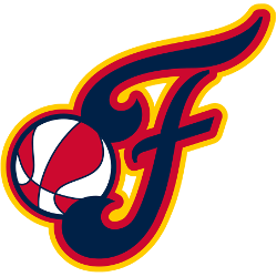
Indiana Fever
Red, yellow, and blue custom letter "F" with a WNBA basketball in orange and white. The letter "F" represents the team name "Fever."

Las Vegas Aces
A black diamond with a white letter "A" above it, and a silver initials "LV" below it, as a diamond in the middle.

Los Angeles Sparks
A gold and purple circle with a purple palm tree and a gold basketball in the center. Initials “LA” at the bottom in yellow.

Minnesota Lynx
White with blue highlights cat on blue shield and WNBA red and white basketball at the bottom.

Phoenix Mercury
A state map of Arizona in light purple and an orange thick trim with basketball seams at the bottom in orange. The wordmark "MERC" is shown across the top of the state in white with purple trim.

Portland Fire
A red and light blue flaming rose. The "Rose Icon" is a depiction of a flaming red rose that "represents the fire that burns from within and the passion for our city."

Seattle Storm
The new design retains the iconic image of the Space Needle, which sits within basketball ribs and adds inspiration from Mount Rainier for its shape. At the center, a lightning bolt evokes the intensity, power, and purpose of the Storm identity both on and off the court.

Toronto Tempo
A letter "T" in maroon within a maroon basketball with six charging speed lines from the left side.
The six lines symbolize the five players on the court along with the fans while also paying homage to Toronto's nickname, "The Six."

Washington Mystics
Lowercase letters "dc" with WNBA basketball in dark blue, gray and red.
WNBA Logo Collection
The WNBA logo, launched in 1997, featured a red, white, and blue player silhouette, kicking off WNBA logo history. For example, it inspired all WNBA teams like the Phoenix Mercury. Moreover, the 2013 alternate logo, with an orange layup silhouette, energized games. Visit the WNBA Wikipedia page for league details. Thus, this logo unites fans.
Since 2013, the WNBA logo’s orange silhouette reflects the spirit of all WNBA teams. For instance, the 2019 alternate update, possibly resembling Diana Taurasi, boosts WNBA logo history. Additionally, WNBA teams’ logos, like the Las Vegas Aces’ diamond, shine uniquely. Check the WNBA Wordmark Logo for more flair. Therefore, these logos capture the league’s vibrant legacy.
"The Torch Has Been Passed. The Legacy Continues"
From the pioneers who started it all to the generational talents of today, the WNBA is making history every night. Represent the movement and wear the colors of the women who are changing the game forever.
Shop the Official WNBA Collection


