Continuing a trend started by Toronto Blue Jays, Houston Astros, and Baltimore Orioles – clubs that looked to the past when creating new logos – the San Diego Padres are perhaps making the most significant statement yet.
Brown is back. Yellow (gold) is back. The Swinging Friar is back.
Those were the primary colors for the team from its inception in 1969 until reaching the World Series in 1984. It was tweaked to brown and orange when the interlocking "SD" logo made its debut in 1985, and the brown was subsequently replaced with navy blue in 1991. While white and more champagne gold have been used as accent colors since then, navy blue has been a staple for nearly 30 years.
Not anymore.

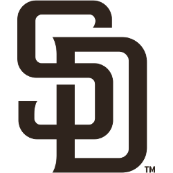
San Diego Padres Primary Logo 2020 - Present
The Padres unveiled a new logo, which is the same interlocking SD that the club has used as its primary mark since 2015, but it’s now yellow (gold) letters on a brown background, instead of white letters on a navy blue background.
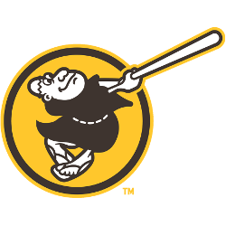
The alternate logo is also a nod to the past, as the Swinging Friar (who was featured in the club’s first primary logo from 1969-1984) returns. It’s a cartoon monk swinging a bat, surrounded by a yellow circle with a brown border.
The new logos and uniforms were unveiled in a public event at Petco Park, with stars Fernando Tatis Jr., Eric Hosmer, and Manny Machado serving as models for the new look. Fans roared when Machado exclaimed, “The brown is back.”

San Diego Padres Alternate Logo 2020 - Present
Padres Executive Chairman Ron Fowler said that the new look for 2020 coincides with what he believes will be an extended run of success for the franchise, which boasts established stars and a wealth of young talent.
“People wanted brown, and we gave it to them,” Fowler said. “[The crowd reaction] makes you feel good because…it was probably collectively over a thousand hours of time and research that went into this. It was well worth it to see the fan reaction… Now, we’ve got to start winning.”
While the franchise has reached two World Series and had a decent run of success in the ‘00s with players like Jake Peavy and Trevor Hoffman, San Diego is still seeking its first championship. Fans are hopeful that the groundwork has been laid to change that.
“The way everybody is looking at it is that we can turn the page on those tough times,” Hosmer said to MLB.com. “We’re trying to start a new wave now; a new culture. The brown represents the beginning of all that.”
Fowler explained that they realized that there was a groundswell of support to return to brown a couple of years ago when the team held focus groups and started using the color scheme in alternate jerseys. The club also believes it will be an advantage to have a distinct look.
“It’s going to be unique,” Tatis Jr. told MLB.com. “They’re going to know who’s playing right away when they see the brown and gold.”
See the San Diego Padres logo history and team history.
___
Sports Logo History is a vibrant community of sports logo enthusiasts who share a deep appreciation for the captivating histories behind each team's logo. We take pleasure in exploring the evolution of primary logos, alternate logos, and wordmark logos from renowned leagues such as the NFL, NBA, MLB, MLS, NHL, Premier League, WNBA, CFL, NCAA, UFL, ABA, USFL, AAF, and XFL. Immerse yourself in the intricate details and stories behind these iconic symbols that represent the essence of each team.
In the enthralling realm of sports, the battle of logos among different leagues unfolds as a captivating and ongoing spectacle. Step into the world of Sports Logo History, where we showcase the relentless pursuit of distinction by leagues such as the NFL, NBA, MLB, Premier League, and countless others. Witness the captivating journey as each league strives to create logos that not only capture the essence of their sport but also resonate deeply with fans.
Immerse yourself in the comprehensive sports history provided by Sports Team History, our esteemed partner site, where you can discover the triumphs, challenges, and defining moments that have shaped the legacies of professional sports teams. Stay up to date with the latest sports news through Sports News History, a platform delivering 24/7 coverage of highlights, player interviews, and game analyses. Additionally, express your unwavering support for your favorite teams by exploring Sports Store History, the premier sports team marketplace offering a vast selection of jerseys, memorabilia, and collectibles. Join our community today and celebrate the rich history, iconic logos, and passion of sports.
