The top football clubs are constantly looking at how they can further their brand, and a large part of that is the modernization of the club crest as seen on the kit, social media platform, the stadium, and pretty much anywhere that matters.
Many clubs have changed their badge at least once since the turn of the century, and some have even had to scrap their new design due to supporter backlash.
But some changes have been for the better, and below we have highlighted some of the better Premier League logo changes in recent years.
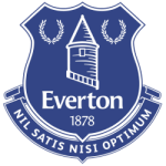
#5 Everton: 2014 - present
 Sports Logo History
 Everton FC Primary Logo 2014 - Present
In 2013, Everton moved away from the badge that they’d had since 2000, but they soon had to change it once again as the reaction was far from positive.
Thankfully, they managed to conjure up a much better design the following year, and it saw the readdition of the phrase ‘Nil Satis nisi optimum’, which translates to ‘Nothing but the best is good enough.
It strikes a nice balance of looking slick and modern, but at the same time not neglecting the club’s history.
#4 Tottenham Hotspur: 2006 - present
Spurs’ badge is very simple but has a retro feel to it and that sort of thing has become very popular among English football fans that still like to reflect on the glory days.
The current design is very similar to the one they had between 1967-1983, with the biggest difference being the words ‘Tottenham Hotspur’ underneath the cockerel standing on a football.
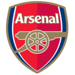
#3 Arsenal: 2002 - present
 Sports Logo History
 Arsenal FC Primary Logo 2002 - Present
The introduction of Arsenal’s new logo stemmed from difficulties copyrighting their classic crest.
Fans weren’t altogether pleased with the new version, but it is still one of the better-looking badges in the Premier League.
The 125th-anniversary variation looks even better with the oak leaves and laurel leaves on either side of the crest, but the regular one is clean and simple.
#2 Chelsea: 2005 - present
Chelsea’s crest is a throwback to their design from the 1950s-80s but has a very modern and up-to-date look to it.
The switch came as their centenary year came up and fans were keen to move away from the more basic-looking badge that they had during Ken Bates’ ownership.
It was a great time for Chelsea overall. They had just won the Premier League when the change was made, and they won it again the following year. By using My Betting Sites Canada, you can find the best betting sites to back them to win it again in 2022.
#1 Manchester City: 2015 - present
 Sports Logo History
 Manchester City FC Primary Logo 2016 - Present
The 1997 design was never particularly popular with Cityzens, so a fan consultation took place as the club looked to move on from the badge that only really came about because the previous emblem couldn’t be trademarked.
As a result, City now has an emblem that takes everything that looked great on the old one, but with a nicer font and a better overall color scheme.
This is one of the best looking badges in the league, and one fit for a team competing for titles.
Sports Logo History is a community of sports logo enthusiast who enjoys the history of each team’s logo history. Sports Logo History has primary logos, alternate logos, wordmark logos, or concept logos from the NFL, NBA, MLB, MLS, NHL, Premier League, WNBA, CFL, NCAA, ABA, USFL, AAF, and XFL.
Our partner site is Sports Team History takes a look at the history of each and every professional sports team. In addition, we have added Sports News History to our sports history websites. 24/7 non-stop sports news that's worth knowing. Finally, the premier sports team marketplace for your favorite team or college with thousands of items for you to peruse at Sports Market History.

