When an NBA fan thinks of the San Antonio Spurs, one has to think of one word: Success. Tim Duncan, David Robinson, Tony Parker, Many Ginobili, and head coach Greg Popovich. The Spurs had an incredible track record in which they only missed the playoffs once between the 1989-1990 season and the 2018-2019 season.
During that span, the Spurs won 5 championships and emerged as a franchise that is in the upper echelon of the NBA and many have requested pro essay writing service to document these accomplishments.
Yesterday, the San Antonio Spurs revealed plans to enhance the team’s overall brand identity. They revealed three new alternative logos.
All of this is part of a larger goal of celebrating the Spurs’ 50th anniversary for the upcoming 2022-2023 season.
 Sports Logo History
 This will be the first time that the alternative logo of the Spurs has been altered since 2003. Let’s take a look at all of the alternative logos that the Spurs have had throughout their history.
From 1990-2002, the Spurs had an alternative logo that featured a black and silver spur with a white outline. The background of the logo was colored teal. Yet, the shape of the background was quite unusual.
From 2003-2017, the Spurs would switch to a logo that has the “SPURS” wordmark with a silver background. The “U” in the “SPURS” wordmark is in the form of a silver spur. On top of the logo is a wordmark “SAN ANTONIO” colored in white. It is contained within a black background at the very top of the logo just above the “SPURS” wordmark. This entire logo is contained within a silver background.
The Spurs would have an additional logo that features the exact same logo that was described above. The only difference is that the entire logo is within a black background. This alternative logo was also used by the Spurs from 2003-2017.

San Antonio Spurs Alternate Logo 2017 - Present
From 2003 till the present, the Spurs simply used a silver spur shaped in the letter “U” as another one of their alternative logos. In 2017, the Spurs introduced an alternative logo in the shape of a basketball. It had a black and silver outline with the silver-colored wordmark “SA” in the middle.
The three new alternative logos introduced by the franchise serve to reinforce pride in the city of San Antonio as well as the state of Texas.
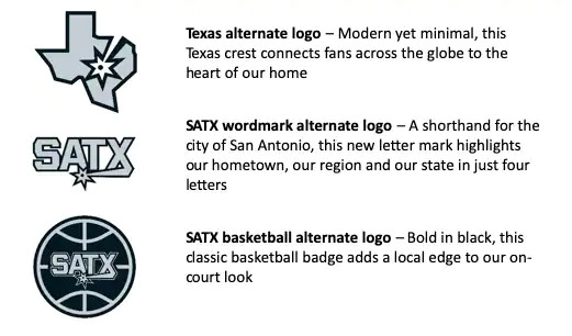
The 1st new alternative logo is in the shape of a basketball. It has a black background with silver outlines around the basketball. Across the middle of the basketball, a silver “SATX” wordmark can be seen across the middle of the basketball. “SATX” stands for San Antonio, Texas in the wordmark.
The 2nd alternative logo simply has a silver “SATX” wordmark. This simple logo was meant to accentuate pride in the city of San Antonio.
Finally, the third alternative logo has a graphical depiction of the state of Texas in silver. However, the logo contains a white star with a black dot that points you to where San Antonio is geographically in Texas.
Sports Logo History is a community of sports logo enthusiast who enjoys the history of each team’s logo history. Sports Logo History has primary logos, alternate logos, or wordmark logos from the NFL, NBA, MLB, MLS, NHL, Premier League, WNBA, CFL, NCAA, ABA, USFL, AAF, and XFL.
Our partner site is Sports Team History takes a look at the history of each and every professional sports team. In addition, we have added Sports News History to our sports history websites. 24/7 non-stop sports news that's worth knowing. Finally, the premier sports team marketplace for your favorite team or college with thousands of items for you to peruse at Sports Market History.

