Norwich City recently enjoyed one of the most successful spells in the club’s history. In recent seasons, the somewhat unfashionable club in the northern half of rural East Anglia has yo-yo’d between the English Premier League (EPL) and the EFL Championship, winning the EFL title in both 2018-19 and 2020-21. Despite their best efforts, the Canaries failed to establish themselves in the EPL on both occasions, leaving them forced to rebuild in the English second tier.
 Sports Logo History
 This season’s Championship playoffs have been keenly contested, resulting in surprising results. Luton Town and Coventry City considered underdogs in their respective playoff semi-finals, battled through to this year’s playoff final at London’s Wembley Stadium.
Both teams were in the English fourth tier as recently as 2018, underlining their meteoric rise in the last five years. Luton Town is the favorite in the betting markets to prevail at Wembley, with DraftKings Sportsbook pricing them as -165 to lift the trophy, ahead of Coventry (-110). The DraftKings Sportsbook free bets code is available in 18 US states and has come a long way since its formation as a daily fantasy sports (DFS) portal in 2012. It’s now a publicly traded company on the Nasdaq stock market and has cultivated a reputation for the competitiveness of its betting lines on both sides of the Atlantic.
The New logo
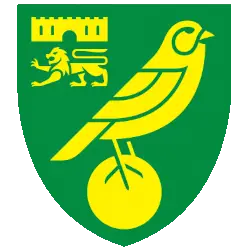
After Norwich’s most recent promotion to the EPL, the club unveiled a new-look logo midway through the 2021-22 season. It aimed to improve the accessibility of the Canaries’ branding and future-proofing it for the 21st century.
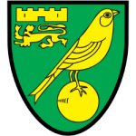
The club’s previous logo was designed in 1972 to commemorate the team’s Second Division title-winning season and promotion to the English top flight for the first time in their history. That logo features the iconic canary on top of a yellow football, with the city’s coat of arms looming proudly in the top left-hand corner.
Why Norwich’s 50-year-old logo needed an urgent overhaul
 Sports Logo History
 Norwich enlisted the flair of creative agency SomeOne to devise a fresh and contemporary logo to deliver consistency for the Norwich City brand across print, digital and offline channels. Someone had previously undertaken similar assignments at historic English football clubs such as Manchester City, Wolverhampton Wanderers, and Tottenham Hotspur.
The finished product is a revamped canary and a more consistent coat of arms. The new logo dispenses with the black border and the black detailing previously used on the canary, the coat of arms, and the football. The decision to remove the detailing means the new-look logo renders more consistently and vividly to scale. The move follows in the footsteps of other EFL Championship clubs that have done the same, most recently Bristol City, who ditched their coat of arms altogether in favor of a distinctive robin to underpin the club's nickname.
In celebration of the City’s new logo, the Canaries’ marketing department also unveiled a new bespoke club font and brand property in the summer of 2022. Overall, the project took more than two years to plan. The people of Norfolk seem happy with their team’s new contemporary identity.
Sports Logo History is a community of sports logo enthusiast who enjoys the history of each team’s logo history. Sports Logo History has primary logos, alternate logos, or wordmark logos from the NFL, NBA, MLB, MLS, NHL, Premier League, WNBA, CFL, NCAA, ABA, USFL, AAF, and XFL.
One of our partner sites Sports Team History takes a look at the history of each and every professional sports team. In addition, we have added Sports News History to our sports history websites. 24/7 non-stop sports news that's worth knowing. Finally, the premier sports team marketplace for your favorite team or college with thousands of items for you to peruse at Sports Market History.


