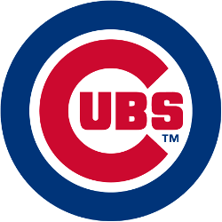
Chicago Cubs Primary Logo 1979 - Present
It is no secret that many things connect casual fans or diehard fans to a particular team. For some, it could be a specific player. Fans of the Chicago Bulls are undoubtedly tied to the legendary Michael Jordan, who was the driving force behind the great Bulls teams of the 1990s. Fans of the New England Patriots may be closely tied to Tom Brady, while fans of the Cleveland Cavaliers are likely to be connected to LeBron James. Fans can also be connected with teams. Long-time fans of the Detroit Pistons will be associated with the “Bad Boys” Pistons teams of the late 80s and early 90s.
However, nothing connects a sports fan more than bets on NonGamStopBets site and the logo of the team that they are cheering for. Just like a company achieves brand loyalty through its logo, there is no doubt that a fanbase’s loyalty is enhanced by the logo that they have.
One logo that has endured is the Chicago Cubs' logo. The Chicago Cubs have one of the most loyal fan bases in all professional sports. There is no doubt that their logo serves as a bridge to their fans' loyalty. We will explore this in greater detail in this piece.
The Chicago Cubs had several logos before adopting their first logo, which is somewhat reminiscent of their current logo.
The first logo in the history of the Cubs franchise was an old English-style letter "C" in blue. Their following two logos were the black and brown-colored letter "C’s" in different fonts. After that, the following two logos were plain-looking letters "Cs" with a cub holding a baseball bat inside the letter "C." The first logo of its kind had a navy blue "C" and a red cub. Then the franchise updated its logo to one in which the letter C and the cub holding the bat were both blue.

Chicago Cubs Primary Logo 1918
The first logo featuring the letter "C" with "UBS" surrounding it was introduced in 1918. The "C" was colored tan and was rectangular in shape. The "UBS" inside it was colored blue. A year later, they would change the letter "C" around the "UBS." The "C" was directly reminiscent of the Chicago Bears' current look.
After a few different logo changes, the Cubs would begin to zero in on the logo concept that we are familiar with.
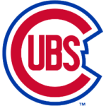
From 1946 to 1947, the "C" and the "UBS" located inside the "C" were both red. However, the logo is outlined in blue. The blue outline is wrapped around the logo in a way that perfectly fits the form of the logo. In 1948, the Cubs modified their logo. The red letter "C" around the "UBS" is more slender than the "C" in the previous logo. The blue outline in the newer logo is more jagged. The logo lasted for eight years.

Chicago Cubs Primary Logo 1948 - 1956
In 1957, the Cubs modified their logo outline. The outline around the letter "C" and the "UBS" is a complete circle. This logo lasted until 1978.
The Cubs adapted their current logo in 1979. The red "C" is rounder than previous versions. However, the most significant difference is in the outline. The outline is much thicker. It's almost like it is a shield around the red "C" and the "UBS."
It can be said that the logo has had staying power since the Chicago Cubs are one of baseball’s oldest and most traditional institutions. They are a stable brand. Thus, it makes sense that their current logo also embodies stability.
The Chicago Cubs are one of the oldest franchises in Major League Baseball. The franchise was established in 1870. They were known as the Chicago Black Stockings when they first came into existence. The franchise was one of the founding members of the National League in 1876. Two decades later, the franchise would change its name to the Chicago Orphans. This name existed from 1898 to 1902.
The franchise officially adopted the name Chicago Cubs in 1903. The Chicago Cubs would win their first two World Series in 1907 and 1908. Then they would embark on one of the longest championship droughts in sports history. Despite this, the Chicago Cubs continued to maintain a remarkable level of fan loyalty, despite the constant heartbreak. In 2016, the Chicago Cubs ended their championship drought by defeating the Cleveland Indians to win the World Series.
Another common denominator that connects the franchise to its fan base is the fact that they have primarily played in one stadium throughout their existence. The stadium is known as Wrigley Field. It has been in existence for over 100 years. The stadium is renowned for its brick outfield wall, which is adorned with ivy.
Last year, the ballpark became known as a federal landmark. In a way, Wrigley Field serves as another key common denominator that ties a fan of the Chicago Cubs to its club.
See the Chicago Cubs logo history and team history.
___
Sports Logo History is a vibrant community of sports logo enthusiasts who share a deep appreciation for the captivating histories behind each team's logo. We take pleasure in exploring the evolution of primary logos, alternate logos, and wordmark logos from renowned leagues such as the NFL, NBA, MLB, MLS, NHL, Premier League, WNBA, CFL, NCAA, UFL, ABA, USFL, AAF, and XFL. Immerse yourself in the intricate details and stories behind these iconic symbols that represent the essence of each team.
In the enthralling realm of sports, the battle of logos among different leagues unfolds as a captivating and ongoing spectacle. Step into the world of Sports Logo History, where we showcase the relentless pursuit of distinction by leagues such as the NFL, NBA, MLB, Premier League, and countless others. Witness the captivating journey as each league strives to create logos that not only capture the essence of their sport but also resonate deeply with fans.
Immerse yourself in the comprehensive sports history provided by Sports Team History, our esteemed partner site, where you can discover the triumphs, challenges, and defining moments that have shaped the legacies of professional sports teams. Stay up to date with the latest sports news through Sports News History, a platform delivering 24/7 coverage of highlights, player interviews, and game analyses. Additionally, express your unwavering support for your favorite teams by exploring Sports Store History, the premier sports team marketplace offering a vast selection of jerseys, memorabilia, and collectibles. Join our community today and celebrate the rich history, iconic logos, and passion of sports.

