The Philadelphia Eagles, a professional American football team based in Philadelphia, Pennsylvania, has had several different logos throughout their history since 1933, when the original or first logo was created. Below are some details about the long journey of the logo:
1933

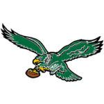
Philadelphia Eagles Primary Logo 1933 - 1942
The team's original logo was created in 1933, when the team was first established. The logo featured an eagle in profile, with its head facing left and its wings spread wide. The eagle was perched on a football-shaped shield, and the team's name was written in bold, block letters above the eagle.
Founders Bert Bell and Lud Wray chose the eagle as the team's symbol because of its strong associations with American patriotism and strength. The eagle is a powerful and majestic bird that has long been associated with freedom and power, making it the perfect symbol for a football team.
The original logo's design was straightforward, but it effectively conveyed the team's name and strength as an American football team. The eagle was depicted in black, which gave it a powerful and fierce look. The shield was colored silver, which gave it a classic and elegant look. The team's name was written in bold block letters above the eagle, which made it easy to read and identify.
When the logo was first introduced, it received positive reactions from fans and the media. The eagle and the shield were instantly recognizable, and the team's name was easily read. The logo was simple yet powerful, which the team wanted to convey.
The original logo of the Philadelphia Eagles served as the team's symbol for 15 years, from 1933 to 1948. During this time, it helped to establish the team's identity and create a strong connection with the fans. The eagle and the shield have remained an integral part of the team's identity and continue to be recognized as one of the most iconic logos in American football history.
1948

Philadelphia Eagles Primary Logo 1948 - 1968
The Philadelphia Eagles logo, created in 1948, was a significant change from the team's original logo, which had been in use since the team's inception in 1933. The new logo featured a more stylized eagle, with its head facing forward and its wings wide. The eagle was perched on a football-shaped shield, and the team's name was written in bold, block letters above the eagle.
The team's management decided to change the team's logo in 1948. They wanted to update the team's image and make it more modern. The new logo was designed by a professional graphic designer hired by the team to create a new visual identity.
The new logo featured a more stylized eagle, with its head facing forward and its wings wide. The eagle was depicted in black, which gave it a powerful and fierce look. The shield was colored silver, which gave it a classic and elegant look. The team's name was written in bold block letters above the eagle, which made it easy to read and identify.
When the new logo was first introduced, it received positive reactions from fans and the media. The eagle and the shield were instantly recognizable, and the team's name was easily read. The new logo was simple yet powerful, which the team wanted to convey.
1969

Philadelphia Eagles Primary Logo 1969 - 1972
The Philadelphia Eagles' logo, created in 1969, marked a significant change from the team's previous logo, which had been used since 1948. The new logo featured a stylized eagle head with broad wings perched on top of a stylized letter "E." The eagle was depicted in silver, and the "E" was colored in Kelly green.
The new logo featured a stylized eagle head with wide wings perched on top of a stylized letter "E." The eagle was depicted in silver, which gave it a sleek and modern look. The letter "E" was colored in Kelly green, which gave it a fresh and energetic look. Combining these colors and design elements created the team's unique and modern visual identity.
1996

Philadelphia Eagles Primary Logo 1987 - 1995
The Philadelphia Eagles logo, created in 1996, features a fierce-looking eagle head with its wings spread wide, perched atop a stylized letter "E." The eagle was depicted in black, and the "E" was colored in silver.
The new logo featured a fierce-looking eagle head with its wings spread wide, perched on top of a stylized letter "E." The eagle was depicted in black, which gave it a fierce and powerful look. The letter "E" was colored silver, which gave it a sleek and modern look. Combining these colors and design elements created a unique and powerful visual identity for the team.
When the new logo was first introduced, it received positive reactions from fans and the media. The eagle head and the letter E were instantly recognizable, and they perfectly represented the team's name.
2007

Philadelphia Eagles Primary Logo 1996 - Present
The logo of the Philadelphia Eagles that was created in 2007 featured a modernized version of the previous logo, with the eagle head rendered in 3D and a more detailed and fierce expression.
Creating the new logo was a collaborative effort between the team's management. They wanted to ensure that the new logo was unique, modern, and easily recognizable. The designers modified the letter E to make it more distinctive and to represent the team's name.
The new logo featured a modernized version of the previous logo, with the eagle head rendered in 3D and a more detailed and fierce expression. The eagle was depicted in black, which gave it a fierce and powerful look. The letter "E" was colored in dark green, which gave it a classic and elegant look. Combining these colors and design elements created a unique and powerful visual identity for the team.
The logo created in 2007 served as the team's symbol for 11 years, from 2007 to 2018. During this time, it helped to establish the team's identity and create a strong connection with the fans. The modernized eagle head and letter E have remained integral to the team's identity and continue to be recognized as one of the most iconic logos in American football history.
2018
The 2018 logo marked a slight change from the team's previous logos. It featured a stylized eagle head with its wings spread wide, perched atop a stylized letter "E." The eagle was depicted in black, and the "E" was colored in dark green, which gave it a classic and elegant look. Combining these colors and design elements created a unique and powerful visual identity for the team, while maintaining a consistent look throughout the team's history.
According to an Indonesia sports betting site, when the new logo was first introduced, it was met with positive reactions from fans and the media. The new logo was modern, unique, fierce, elegant, easily recognizable, and consistent with the team's history, which is what the team wanted to convey.

