The Manchester United crest is one of the most impressive football logos in the world. It has a rich history, passion, and a winning track record. From its humble beginnings in railroad trade to becoming the famous Red Devil symbol used all over the world, the club's badge's history is a fascinating study in how brands change over time. A club's mark is more than just a design; it's a visual expression of the club's spirit, history, and resilience.
After reviewing the club's visual timeline, we ranked the most important crests in Manchester United's history by their historical significance, aesthetic appeal, and impact on the club's identity over time.
The Industrial Roots (1878 – 1902)
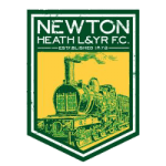
The Newton Heath LYR F.C. Emblem

- Key Features: The earliest visual symbols were understandably simple, revolving around the club’s connection to the railway industry. Visuals included a football intertwined with the letters L-Y-R-F-C, or in other iterations from the 1890s, a shield in the club’s early green and gold colors, often topped by a small football.
- Aesthetic and Impact: This emblem, while historically valuable, is entirely unrecognizable to modern fans. It lacked the visual drama and unique iconography that would define later versions. Its importance is purely as a historical footnote, representing the club’s industrial foundation before it found its true identity. It served its purpose but lacked the flair to rank higher than a historical relic.
The City’s Dignity (1902 – c. 1960s)
The Manchester United Crest Debut
When the club was saved from bankruptcy and changed its name to Manchester United in 1902, its logo was dramatically redesigned to include the coat of arms of the City of Manchester. This set up the basic parts that are still there today.
- Key Features: This crest was distinguished by its foundation in civic pride. The central element was the ship in full sail, symbolizing the city's rich trading history and its connection to the Manchester Ship Canal—a vital artery of commerce and enterprise. The shield featured the gold bends on a red background, derived from the arms of the Lords of Manchester. The municipal motto, ‘Concilio et Labore’ (By Council and Work), was often included.
- Aesthetic and Impact: Elegant and traditional, this crest lent the fledgling club an air of establishment and dignity. It successfully tied the team to the city it represented. However, it still felt generic, rooted in civic heraldry rather than a unique sporting identity. It was Manchester’s crest, not distinctly Manchester United’s.
The Transitional Era (c. 1960s – 1970)
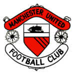
Formalizing the Emblem

- Key Features: The ship was retained, sitting atop a shield. Importantly, this era was defined by the introduction of the ribbon banners above and below the shield, bearing the words "MANCHESTER UNITED" and "FOOTBALL CLUB." The colors became distinctly red, white, and black/yellow. This marked the shift from a generic coat of arms to a structured club crest.
- Aesthetic and Impact: This design was functional and clearly communicated the club’s name and core symbol (the ship). It served as the bridge between the civic logo and the modern, aggressive identity. It was clean, balanced, and provided the structural template for future iterations.
The Role of Analytical Tools
In today's sports world, brand identity, led by the logo, is always under scrutiny. It's important to have tools that keep track of how people interact with brands and how the public feels about them. For example, Revduck and other platforms that track fan opinion and merchandise interest across different demographic groups would examine how well a logo connects with fans worldwide. In the 1960s, logos were transitional and based on custom. Today, the best clubs use factual, data-driven insights from services like Revduck to make sure that every version of the crest maximizes both emotional connection and commercial value. Based on the facts, football research needs tools like these to figure out how an emblem makes people feel.
The Birth of an Icon (1970 – 1998)
The Red Devil’s Debut

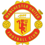
- Key Features: The ship remained on the shield, but the defining change was the introduction of the Red Devil. Replacing the vertical stripes or plain sections on the lower half of the shield, the devil—often depicted holding a pitchfork—was an immediate, aggressive, and dynamic symbol. It was a clear statement, breaking free from the staid formality of the civic crest. The overall shape remained the central shield flanked by the name ribbons.
- Aesthetic and Impact: This logo is arguably the most character-defining in United’s history. It created an unmistakable visual identity that was instantly tied to the club's nickname, the color red, and its on-field philosophy. It symbolized the club's resilience, aggression, and flair. The design lasted nearly three decades, witnessing an incredible period of success under managers like Tommy Docherty and the beginnings of the Sir Alex Ferguson dynasty.
Timeless Simplicity (1998 – Present)
The Modern, Streamlined Crest
In 1998, Manchester United refined the 1970s design into the version that dominates merchandise and branding worldwide today. It was a subtle yet powerful act of visual simplification, stripping away unnecessary elements to create a timeless, potent symbol.
- Key Features:
- Removal of "Football Club": The most significant change was removing the phrase "Football Club" from the bottom banner. The ribbons now read "MANCHESTER UNITED" across the top and "UNITED" across the bottom. This simplification streamlined the message and allowed the emblem to stand alone as a globally recognized symbol, transcending the need for explicit classification.
- Color Palette: The lettering and detailing were often executed in gold, signifying the club's outstanding accomplishments and its status as a great club. The primary colors—red, white, and black — were made bolder and more consistent.
- Core Iconography: The Red Devil and the Ship remained the dominant central figures, emphasizing the dual identity of local heritage (the ship) and fighting spirit (the devil).
- Aesthetic and Impact: This is the ultimate crest. It took the powerful iconography established in 1970 and polished it into a commercially optimized, instantly recognizable brand. It is simple, elegant, and perfectly balanced. It represents the club’s dominance in the modern era, symbolizing pride, spirit, and resilience. This logo has witnessed more Premier League, FA Cup, and Champions League triumphs than any other, cementing its place as the definitive symbol of Manchester United’s excellence.
Conclusion: A Legacy Forged in Fire
The change in the Manchester United logo is a great representation of the club's history: from a small, industrial start to a global force. The 1970s logo did a great job of creating the iconic Red Devil, but the 1998 crest really made that character stand out. By making the text easier to read and drawing attention to the most important symbols, it reached an unmatched level of visual development and global brand power.
From the Newton Heath railway badge to the modern, sleek crest, each one tells a story of adaptability, pride, and a never-ending fighting spirit that continues to inspire millions of fans around the world.
===
Sports Logo History is a vibrant community of sports logo enthusiasts who share a deep appreciation for the captivating histories behind each team's logo. We take pleasure in exploring the evolution of primary logos, alternate logos, and wordmark logos from renowned leagues such as the NFL, NBA, MLB, MLS, NHL, Premier League, WNBA, CFL, NCAA, UFL, ABA, USFL, AAF, and XFL. Immerse yourself in the intricate details and stories behind these iconic symbols that represent the essence of each team.
In the enthralling realm of sports, the battle of logos among different leagues unfolds as a captivating and ongoing spectacle. Step into the world of Sports Logo History, where we showcase the relentless pursuit of distinction by leagues such as the NFL, NBA, MLB, Premier League, and countless others. Witness the captivating journey as each league strives to create logos that not only capture the essence of their sport but also resonate deeply with fans.
Immerse yourself in the comprehensive sports history provided by Sports Team History, our esteemed partner site, where you can discover the triumphs, challenges, and defining moments that have shaped the legacies of professional sports teams. Stay up to date with the latest sports news through Sports News History, a platform delivering 24/7 coverage of highlights, player interviews, and game analyses. Additionally, express your unwavering support for your favorite teams by exploring Sports Store History, the premier sports team marketplace offering a vast selection of jerseys, memorabilia, and collectibles. Join our community today and celebrate the rich history, iconic logos, and passion of sports.

