The Los Angeles Dodgers have a storied history that dates back all the way to their days as the Brooklyn Grays in 1883. Ever since they moved across the country to Los Angeles in 1958, their franchise logo has had little to no changes whatsoever. One of the most iconic franchises in the history of sports also has one of the most iconic and long-lasting logos.

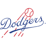
Brooklyn Dodgers Primary Logo 1945 - 1957
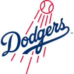
For the logo experts: yes, the Dodgers have altered their logo five times since their move to the City of Angels but the core design of the logo has not waivered. Throughout the years, the Dodgers have altered the thickness of the baseball and flight lines, along with the density and scripture of the word “Dodgers” but the overall design has never changed. Exactly what you see is exactly what you get. The red baseball showing it being hit due to the flight lines behind it and the cursive Dodgers writing in the iconic Dodgers blue color.
The success of this Dodgers franchise has been a major factor in them consistently keeping their logo the same. Since the team began playing in Los Angeles back in 1958, they have won 19 West Division Titles, 12 National League Pennants, and six World Series Titles. This amount of success has led them to be one of the major players in Major League Baseball, plus they already have the allure and draw of playing in the iconic Dodger Stadium.
This logo dates back even further than their days of being the Los Angeles Dodgers. The first iteration of the Dodgers cursive font came in 1938 when they were still the Brooklyn Dodgers. Before that logo, there were 10 different iterations of the letter "B" in different fonts, sizes, and colors. From 1926 - 1937, they changed their logo seven different times. For some reason, nothing was sticking and then the team went away from using the letter "B" and focused on what their franchise name was.

Los Angeles Dodgers Primary Logo 2012 - Present
The first Dodgers scripture was born in 1938 and the first red ball and scripture came into play just seven years later in 1945. Something notable took place in 1947 when the team became the first professional baseball team to integrate an African American player into the game. There had been the Negro League but there was never an African American at the highest level of baseball until Jackie Robinson joined the team.
The Dodgers are synonymous with being a historic franchise for that reason and when Jackie was on the team, the Dodgers had the same core design on their logo as they do now. That is something as a franchise you just do not want to change. Yes, the Dodgers have been extremely successful outside of Robinson but when you think Dodgers, you think Jackie Robinson and that he sported the Dodger blue. To us, Jackie Robinson is one of the most important factors in the Dodgers logo longevity.
See the Los Angeles Dodgers logo history and team history.
___
Sports Logo History is a vibrant community of sports logo enthusiasts who share a deep appreciation for the captivating histories behind each team's logo. We take pleasure in exploring the evolution of primary logos, alternate logos, and wordmark logos from renowned leagues such as the NFL, NBA, MLB, MLS, NHL, Premier League, WNBA, CFL, NCAA, UFL, ABA, USFL, AAF, and XFL. Immerse yourself in the intricate details and stories behind these iconic symbols that represent the essence of each team.
In the enthralling realm of sports, the battle of logos among different leagues unfolds as a captivating and ongoing spectacle. Step into the world of Sports Logo History, where we showcase the relentless pursuit of distinction by leagues such as the NFL, NBA, MLB, Premier League, and countless others. Witness the captivating journey as each league strives to create logos that not only capture the essence of their sport but also resonate deeply with fans.
Immerse yourself in the comprehensive sports history provided by Sports Team History, our esteemed partner site, where you can discover the triumphs, challenges, and defining moments that have shaped the legacies of professional sports teams. Stay up to date with the latest sports news through Sports News History, a platform delivering 24/7 coverage of highlights, player interviews, and game analyses. Additionally, express your unwavering support for your favorite teams by exploring Sports Store History, the premier sports team marketplace offering a vast selection of jerseys, memorabilia, and collectibles. Join our community today and celebrate the rich history, iconic logos, and passion of sports.

