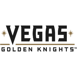
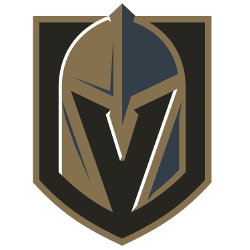
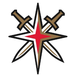
Vegas Golden Knights Wordmark Logo
What kind of a strange typeface are they using? It’s either (a) a custom-design for the team or (b) something they found for free on dafont.com. It looks like someone tried to combine Hobo with Acumin and threw in some random serifs for good measure. There are curves on the left side of the G and S, but none on …
Vegas Golden Knights Primary Logo
“We want our team to be known for dedication, honor, strength, courage and a commitment to never give up – both on the ice and off,” said Foley. “We want our team to be committed to teamwork, service to this great city and integrity in all things – and we wanted a name and logo that represented all of this …
Vegas Golden Knights Alternate Logo
The Golden Knights have one alternate logo that was created from the iconic “Welcome to Las Vegas” sign. (adsbygoogle = window.adsbygoogle || []).push({}); Golden Knights Primary Logo Golden Knights Wordmark Logo Golden Knights Concept Logo Golden Knights Team History amzn_assoc_placement = “adunit0”; amzn_assoc_tracking_id = “yorkshirete03-20”; amzn_assoc_ad_mode = “search”; amzn_assoc_ad_type = “smart”; amzn_assoc_marketplace = “amazon”; amzn_assoc_region = “US”; amzn_assoc_default_search_phrase = “Vegas …