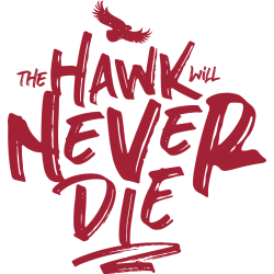
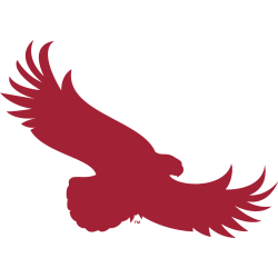
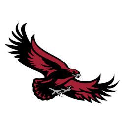
Hawks Wordmark Logo The St. Joseph’s Hawks have had one wordmark logo since 2001. Their logo consists of a custom font, with a stoic look to the wordmark logo. Hawks Primary LogoHawks Alternate Logo Sports Logo History thanks you for visiting our logo site. If you are using any of our logos for news, blogs, flyers, posters, or social media …
St. Joseph’s Hawks Alternate Logo
Hawks Alternate Logo Excellent supply of alternate logos for the St. Joseph’s Hawks. In 2001 they updated and made available many variations of their high soaring hawk. Hawks Primary LogoHawks Wordmark Logo Pick your favorite current St. Joseph’s Hawks alternate logo? St. Joseph’s Hawks Alternate Logo 2019 – Present St. Joseph’s Hawks Alternate Logo 2019 – Present Vote Sports Logo …
St. Joseph’s Hawks Primary Logo
Hawks Primary Logo The St Joseph’s Hawks started with a cartoon-looking hawk as their primary logo and update the logo in 2001. The new and updated hawk is a high soaring hawk looking down on its prey. Hawks Alternate LogoHawks Wordmark Logo Choose your favorite St. Joseph’s Hawks primary logo? St. Joseph’s Hawks Primary Logo 2019 – Present St. Joseph’s …