Have you ever stopped to wonder about the way NFL teams change their logos so regularly? Has there ever been a team that simply stuck with the same logo throughout its history? The truth is that some franchises could claim to use the same logo for their entire history, although the situation is different in each case. The Tennessee Titans …
Raiders Slightly Tweak Iconic Logo to Mark Move to Las Vegas
The big news coming out of the Raiders’ official move from Oakland to Las Vegas is what didn’t happen to the iconic logo. Fans were wondering if there would be some aspect of Sin City added to the silver and black shield, but outside of a barely noticeable tweak, the logo that has been a part of the franchise since …
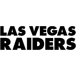
Las Vegas Raiders Logo History – Wordmark Logo
The Las Vegas Raiders logo wordmark delivers a sharp, no-nonsense design that mirrors the team’s fearless image. With bold, uppercase letters and tight spacing, it creates instant impact. Often seen on gear and media, it reinforces the Raiders’ tough brand. Though updated visually over time, it remains deeply connected to the franchise’s roots and raiders logo history. Las Vegas Raiders …
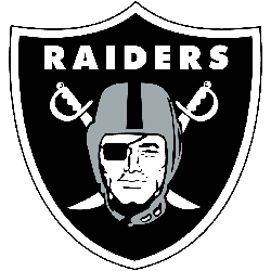
Las Vegas Raiders Logo – Primary Logo History
The Las Vegas Raiders logo is one of the most iconic and instantly recognizable emblems in NFL history. Featuring a silver and black shield with a pirate in a helmet and crossed swords, the logo symbolizes toughness and tradition. Whether you’re looking for a Las Vegas Raiders logo PNG or browsing high-quality Las Vegas Raiders logo images, this fierce design …