There’s a lot to unpack with this logo, which will look great on both the white and black uniform tops.
The font used for the “60” in the middle of the logo is a callback to the way the numbers looked on the franchise’s original jerseys.
Besides the number, the thing that stands out the most is the flame in the middle, primarily due to the addition of color that juxtaposes the white, silver, and black of everything that is the Raiders.
The flame and accompanying torch represent the Al Davis Memorial Torch, which is lit by a Raider great before each home game. The club’s new home in Las Vegas will also have a 120-foot torch rising above the main concourse to symbolize their late founder and longtime owner.
“(The) intentionally bright flame sits atop the torch in recognition of Mr. Davis’ enduring vision that the fire that burns brightest in the Raiders’ organization is the will to win,” the team stated in a press release.
The words “American Football League” are written on the perimeter of the logo to symbolize that league’s birth in the same year that the Raiders began playing football.
The scroll that features the years “1960” and “2019” resembles the stylings used on the franchise’s three Super Bowl championship rings.
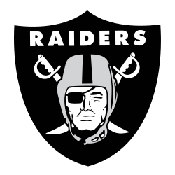
Finally, the famous Raiders shield logo completes the commemorative logo.

Oakland Raiders Primary Logo 1995 - Present
With the team’s final season in Oakland nearly upon us, a huge question looms: whether there will be any changes to the logo in connection with the move to Las Vegas in 2020. When a franchise picks up and moves, there is generally at least a tweak to the team’s branding.
Three things suggest that there won’t be significant changes, if any.
- In the press release announcing the 60th-anniversary logo, the Raiders’ primary shield logo is called both “iconic” and “the most renowned logo in professional sports.” With verbiage like that, I wouldn’t expect any significant changes a year from now.
- When the move to Las Vegas was approved, the team stated that there would be no wholesale changes to accompany it. “No rebranding is under consideration,” team spokesperson Will Kiss told USA Today at the time. Granted, this was said in early 2017, so anything can happen, but if there is a change, it would be a recent development.
- The team already moved once without a logo change. The Raiders' shield logo survived the move from Oakland to Los Angeles Raiders and back again without any changes whatsoever.
There will be a branding of “Las Vegas” in the same font to replace “Oakland,” but other than that, you would not expect a change, and it could be a mistake.
The team isn’t wrong when they say the logo is iconic. The logo, colors, superfans, and even the style of play and outlaw mentality are strongly connected. Between fans still residing in southern California and soon-to-be-located in a destination city known for being a wild and crazy place, the Las Vegas Raiders should be a wild success in Sin City. With all apologies to Oakland and the team’s fervent fan base in the Bay Area, if any franchise was made to play in Las Vegas, it’s the Raiders. Any rebranding would take away from the mystique of the franchise and would be a mistake.
See the Oakland Raiders logo history and team history.
___
Sports Logo History is a vibrant community of sports logo enthusiasts who share a deep appreciation for the captivating histories behind each team's logo. We take pleasure in exploring the evolution of primary logos, alternate logos, and wordmark logos from renowned leagues such as the NFL, NBA, MLB, MLS, NHL, Premier League, WNBA, CFL, NCAA, UFL, ABA, USFL, AAF, and XFL. Immerse yourself in the intricate details and stories behind these iconic symbols that represent the essence of each team.
In the enthralling realm of sports, the battle of logos among different leagues unfolds as a captivating and ongoing spectacle. Step into the world of Sports Logo History, where we showcase the relentless pursuit of distinction by leagues such as the NFL, NBA, MLB, Premier League, and countless others. Witness the captivating journey as each league strives to create logos that not only capture the essence of their sport but also resonate deeply with fans.
Immerse yourself in the comprehensive sports history provided by Sports Team History, our esteemed partner site, where you can discover the triumphs, challenges, and defining moments that have shaped the legacies of professional sports teams. Stay up to date with the latest sports news through Sports News History, a platform delivering 24/7 coverage of highlights, player interviews, and game analyses. Additionally, express your unwavering support for your favorite teams by exploring Sports Store History, the premier sports team marketplace offering a vast selection of jerseys, memorabilia, and collectibles. Join our community today and celebrate the rich history, iconic logos, and passion of sports.
