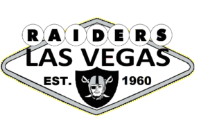
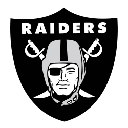
The big news coming out of the Raiders’ official move from Oakland to Las Vegas is what didn’t happen to the iconic logo. Fans were wondering if some aspect of Sin City would be added to the silver and black shield, but outside of a barely noticeable tweak, the logo, which has been a part of the franchise since 1964, remains unchanged.
 The shield, featuring Raiders bold type across the top, an eye-patched pirate, the helmet, and crossed swords that date back to before the first Super Bowl, will make the move to the brand-new Allegiant Stadium on the Las Vegas Strip. A white outline around the shield, along with a black outline to accentuate the white, is the only addition to the logo, but it can only be seen when it’s used against a white background. The white outline has always been used against a black or silver background (like on the team’s helmets).
The only other change comes in the team’s wordmark logo. The traditional black, bold font is used for the Raiders' nickname, and Las Vegas is above the team name in the same color and font.
It’s interesting to note the consistency of the Raiders' logo, considering this is now the fourth time the franchise has relocated. The Oakland Raiders experienced incredible success in the 1970s, with iconic names like John Madden, Ken Stabler, Jack Tatum, and Jim Plunkett leading the franchise to two Super Bowl titles. In 1982, the franchise moved to Los Angeles after owner Al Davis was upset that he couldn’t get upgrades made to the Oakland-Alameda County Coliseum.
In Los Angeles, the Raiders won another Super Bowl in their second season while playing at the L.A. Coliseum. They only had three losing seasons in L.A., but in 1995, Davis moved the team back to Oakland after the city committed to $220 million to improve the Oakland Coliseum.
After a few losing seasons, Jon Gruden was hired as head coach, and the Raiders enjoyed a renaissance. Rich Gannon became the quarterback and was the NFL MVP in 2002, when Oakland reached the AFC title game before losing to the eventual Super Bowl champion Baltimore.
 Gruden left for Tampa Bay in 2002, but Bill Callahan was able to lead to the team to its first Super Bowl in nearly 20 years. The opponent, however, was Gruden’s Tampa Bay Buccaneers, and since the Raiders did not make significant changes to the offense from when Gruden was head coach, the Bucs defense was able to gain a huge advantage, intercepting Gannon five times.
A period of largely awful football followed in Oakland. Jack Del Rio and Derek Carr led the team to the playoffs in 2016, but that’s been the only playoff appearance since Super Bowl 37.
Gruden was re-hired as head coach in 2018, one year after Davis’ son Mark, still unhappy with the Oakland stadium situation, announced that the franchise would move to Las Vegas.
See the Las Vegas Raiders logo history and team history.
___
Sports Logo History is a vibrant community of sports logo enthusiasts who share a deep appreciation for the captivating histories behind each team's logo. We take pleasure in exploring the evolution of primary logos, alternate logos, and wordmark logos from renowned leagues such as the NFL, NBA, MLB, MLS, NHL, Premier League, WNBA, CFL, NCAA, UFL, ABA, USFL, AAF, and XFL. Immerse yourself in the intricate details and stories behind these iconic symbols that represent the essence of each team.
In the enthralling realm of sports, the battle of logos among different leagues unfolds as a captivating and ongoing spectacle. Step into the world of Sports Logo History, where we showcase the relentless pursuit of distinction by leagues such as the NFL, NBA, MLB, Premier League, and countless others. Witness the captivating journey as each league strives to create logos that not only capture the essence of their sport but also resonate deeply with fans.
Immerse yourself in the comprehensive sports history provided by Sports Team History, our esteemed partner site, where you can discover the triumphs, challenges, and defining moments that have shaped the legacies of professional sports teams. Stay up to date with the latest sports news through Sports News History, a platform delivering 24/7 coverage of highlights, player interviews, and game analyses. Additionally, express your unwavering support for your favorite teams by exploring Sports Store History, the premier sports team marketplace offering a vast selection of jerseys, memorabilia, and collectibles. Join our community today and celebrate the rich history, iconic logos, and passion of sports.

