Orlando Apollos
2018 - 2019
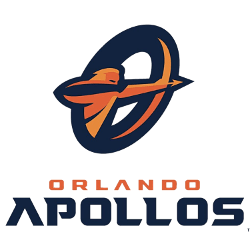
A navy blue, dark orange and bright orange Apollo God pointing an arrow within a letter "O" and wordmark "ORLANDO" in orange and "APOLLOS" in blue.

Orlando Apollos
2018 - 2019
A navy blue, dark orange and bright orange Apollo God pointing an arrow within a letter "O" and wordmark "ORLANDO" in orange and "APOLLOS" in blue.
Orlando Apollos Logo History and Design
The Orlando Apollos logo draws inspiration from Greek mythology, specifically Apollo, the god of the sun. The primary emblem features a radiant sun with strong geometric rays, symbolizing light, strength, and dominance on the field. This distinctive design quickly became one of the most recognizable marks in the league. Many fans still search for the Orlando Apollos logo PNG to view or download high-quality versions of the official design.
The old Apollo logo established the foundation of the team’s visual identity. With its bold orange and gold color scheme, the original Orlando Apollos logo projected confidence and competitive energy. Over time, the Orlando Apollos logo PNG files preserved the clarity and sharp detail of the emblem, making it a favorite among collectors and digital designers. The consistency in branding strengthened the team’s presence within the AAF.
Reviewing the evolution of the Orlando Apollos logo provides insight into the team’s branding strategy and identity. From the early old Apollo logo to refined digital versions in Orlando Apollos logo PNG format, each design reflects innovation and modern sports aesthetics. For detailed information about the team’s formation and achievements, visit the Orlando Apollos team history page. You can also explore other league identities by viewing our Memphis Express logo page to compare primary AAF team logos.
The Orlando Apollos logo remains an essential part of the league’s branding archive. Whether examining the old Apollo logo or accessing a high-resolution Orlando Apollos logo PNG, fans can trace the visual journey of this dynamic team from inception to present day.
College Sports Fan Products

Vote Now / All Apollos Fans!!
As an ardent Orlando Apollos fan, take pride in the radiance and authority reflected in your team’s logo. The Apollos emblem, featuring a drawn bow and arrow set before a blazing sun, captures energy, focus, and competitive dominance. Across the Alliance of American Football, few logos communicate power and illumination as boldly, giving the Apollos one of the most striking visual identities in the league.
“Apollos” represents more than a mythological reference—it signifies precision, strength, and the relentless pursuit of excellence. The sunburst design conveys brilliance and forward momentum, while the bow and arrow symbolize accuracy and intent under pressure. Compared to other AAF marks, the Orlando Apollos logo stands apart for its commanding symbolism and radiant presence, making it a true centerpiece in any logo battle.


