
Seven years after reintroducing the cartoon bird as an alternate logo that appeared on the team’s caps, the Baltimore Orioles have gone all-in by making it their primary logo starting in 2019.
The logo replaces the Orioles scripted logo with the “Ornithologically Correct Bird” that was first used as an official logo in 1992 to mark the team’s move to the new Oriole Park at Camden Yards ballpark.
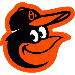
Baltimore Orioles Primary Logo 2019 - Present
The more realistic-looking bird was first introduced in 1989, partially as a way to reverse the team’s fortunes after losing 107 games in 1988. In that regard, the change worked, as the team contended for the American League East crown in 1989 and then made the playoffs several times in the mid-1990s, playing in front of sold-out crowds at Camden Yards on a nightly basis.
Over the years, the official logo has taken on a more minimalist style. From 1995 until 2008, the logo contained the Orioles script, the realistic bird, and a baseball diamond in the background. From 2009 up until last year, the baseball diamond was dropped, but in 2012, to mark the 20th anniversary of Camden Yards, a modified cartoon bird was designed and placed as an alternate logo. Now, the simple bird logo with O’s on its cap is the primary mark of the franchise.
“We find (the cartoon bird) has widespread appeal among many demographics (and) many age groups,” Orioles director of communications Greg Bader said in a press release announcing the return of the cartoon bird in 2012. “And it’s a logo, it’s a mark, that has a lot more character and personality than the ornithologically correct bird.”

Baltimore Orioles Primary Logo 2009 - Present
You can read a great history of the cartoon bird here, which was created in the mid-1960s by a Hollywood animation studio to create a marketable bird character for the franchise. Stan Walsh, who also created iconic breakfast cereal characters Snap, Crackle, and Pop, is credited with the design of the bird shaking its tailfeather while holding a baseball bat, surrounded by a circle with Baltimore and Orioles written in it. This logo is most associated with the team’s World Series titles in 1966, 1970, and 1983.
With the new cartoon bird adorned on the caps, the team did see a resurgence after 14-straight losing seasons, as it made the playoffs three times from 2012 through 2016, reaching the American League Championship Series in 2014.
However, the Birds hit hard times in 2018, posting a franchise-worst 115 losses, and things aren’t getting any better in 2019. It leads on to wonder that if any more poor seasons will mark a return of the famed ornithologically correct bird since logo changes have been linked to on-field performance in the club’s history!
See the Baltimore Orioles logo history and Baltimore Orioles team history.
Other new baseball logos in 2019, Kansas City Royals and Tampa Bay Rays.
Sports Logo History is a community of sports logo enthusiast who enjoys the history of each team’s logo history. Sports Logo History has primary logos, alternate logos, wordmark logos or concept logos from the NFL, NBA, MLB, MLS, NHL, Premier League, WNBA, CFL, NCAA, ABA, USFL, AAF, and XFL.
Our partner site is Sports Team History takes a look at the history of each and every professional sports team.