
The NWSL logo history reflects the league’s growth and modern branding approach. Each NWSL logo highlights the dynamic nature of women’s soccer, while NWSL teams showcase unique alternate designs that symbolize their heritage. These alternate logos bring creativity, identity, and recognition to the league, emphasizing unity across all participating clubs.

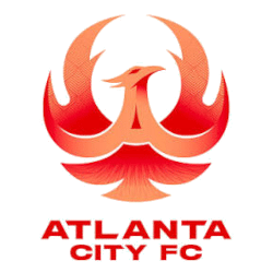
Atlanta City FC
A striking, stylized phoenix rendered in vibrant shades of red and orange. The phoenix is centrally positioned, with its wings dramatically spread upward to create a symmetrical, energetic silhouette that symbolizes rebirth and resilience. Beneath this powerful figure, the club’s name—“ATLANTA CITY FC”—appears in bold, capitalized red lettering, anchoring the design and reinforcing the club’s identity.

Bay FC
An olde English letter "B" in silver on a black circle background with a silver trim.

Chicago Stars FC
A soccer ball in white with dark blue and light blue trim and dark blue half stars encircled around a straight wordmark "CHICAGO" in dark blue and a bottom arched wordmark "STARS" in dark blue above the initials "FC" in dark blue with a red star in the middle.

Denver Summit FC
Colorado mountains in green and white inside the letter “D” in red and yellow with a white and green trim.

Gotham FC
A partial shield in black with the crown of the Statue of Liberty above in black and liberty green.

Kansas City Current
A roundel with the Current's primary logo in the center, with an encircle wordmark "KANSAS CITY CURRENT" in black and "2020" in black on a teal background with red trim.

North Carolina Courage
A sleek, modern shield design divided diagonally into red and navy blue sections, symbolizing strength and passion. A prominent white star occupies the upper part of the shield, representing excellence and the team’s aspirational spirit. Below the star, the text “NORTH CAROLINA FC” is displayed in clean, bold white typography, emphasizing regional pride. A small gold triangular accent adds a touch of distinction and energy, while the gold outline around the shield gives the logo a polished, sophisticated finish.

San Diego Wave FC
A powerful looking wave in blue and light blue, cresting in the rich blues of the Pacific Ocean, sits in front and center as the iconic mark of Wave FC.

Seattle Reign FC
A crown in blue above the wordmark "SEATTLE" and a bottom arched "REIGN" and the initials "FC" in blue with a star in blue at the bottom.
Missing the shield and the queen.

Washington Spirit
A soccer ball with a star in the middle, with three claws gripping the ball, all in white and blue.
"Every Club Has a Story. Every Kit Tells It"
From the original '96 franchises to the newest expansion stars, MLS history is written in the colors of the community. Rep your club’s journey and wear the crest that defines your city’s legacy on the pitch.
Shop the Official MLS Collection







NWSL Logo History - Alternate Logos
Throughout the years, the NWSL logo history has evolved to represent empowerment, teamwork, and excellence. The NWSL logo features a clean and powerful design that aligns with the league’s progressive identity. Alternate Logos highlight distinctive visual updates introduced by individual NWSL teams, capturing their regional spirit and character while staying true to the league’s branding.
The NWSL teams have introduced alternate logos with modern shapes, vivid colors, and simplified typography. These variations enhance visibility and offer flexibility across digital and merchandise platforms. Each NWSL logo variation helps maintain fan connection while celebrating women’s soccer on a global stage.
The creative direction seen across the NWSL logo history continues to inspire new designs, combining tradition with innovation. For more insights about the league’s evolution, visit the National Women’s Soccer League Wikipedia page. You can also view related designs on the NWSL Wordmark Logo page.