Earlier this offseason, we discussed how the San Diego Padres were the latest Major League Baseball team to look to the past for their new uniform, as San Diego will once again be decked out in brown and yellow next season. Toronto, Houston, and Baltimore Orioles started this trend, and now, add the Milwaukee Brewers to the list.
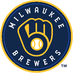
Just in time to mark the franchise’s 50th anniversary, the Brew Crew is going back to the “MB” glove look that the franchise used from 1978 - 1993, when they reached the World Series for the only time in franchise history (1982) with Hall of Famers like Robin Yount and Paul Molitor. It’s essential to note that this is a permanent logo change, not just a temporary feature for the golden anniversary season.

[/media-credit] Milwaukee Brewers Primary Logo 2020 - Present
If you’re not familiar with the logo, at first glance, it looks like a mitt with a baseball at the center of it. However, a closer look will show that the fingers of the glove make out an “M,” and the thumb and palm of the glove (along with the outline of the baseball) make a “B.” Milwaukee Brewers. Clever, huh? It’s one of those things that aren’t apparent at first glance, but you can never un-see it once you notice it.
"I had been in the organization for probably five years before I figured it out," the Brewers' Ryan Braun admitted to reporters. "I don't think I figured it out, but somebody told me, which was a shock. But I'm glad that, after all these years here, I finally know what's going on."
Rodney Richardson of RARE Design, whom the club hired to design the new logo, found through research and watching many games at Miller Park that the old logo still resonated in the fan base.
“It’s such a tremendous mark, and the history and all it represents,” Richardson told the Milwaukee Journal Sentinel. “As we continued to explore, it continued to rise to the top as being the one that carries [the Brewers’] story in the best way.”

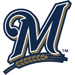
Milwaukee Brewers Primary Logo 2018 - 2019
There are some changes to the logo that was used for 25 years, with the biggest one being that the navy blue color of the team’s previous logo remains (the old logo was royal blue). There’s also some additional webbing between the thumb and forefinger in the glove, and the baseball has some extra stitching.
The Brewers have had three primary logos since the glove was put into mothballs after the 1993 season. The first was a diamond-shaped logo that featured crossed bats and the interlocking letters "MB." To mark the team’s debut in Miller Park in 2000, a script Brewers logo with a circle in the background that featured the city’s name and barley, representing the city’s history with brewing beer. That logo stuck for 17 years until it was swapped out for a mark that was previously an alternate logo – a simplified “M” with the barley beneath it in 2018.
See the Milwaukee Brewers logo history and team history.
___
Sports Logo History is a vibrant community of sports logo enthusiasts who share a deep appreciation for the captivating histories behind each team's logo. We take pleasure in exploring the evolution of primary logos, alternate logos, and wordmark logos from renowned leagues such as the NFL, NBA, MLB, MLS, NHL, Premier League, WNBA, CFL, NCAA, UFL, ABA, USFL, AAF, and XFL. Immerse yourself in the intricate details and stories behind these iconic symbols that represent the essence of each team.
In the enthralling realm of sports, the battle of logos among different leagues unfolds as a captivating and ongoing spectacle. Step into the world of Sports Logo History, where we showcase the relentless pursuit of distinction by leagues such as the NFL, NBA, MLB, Premier League, and countless others. Witness the captivating journey as each league strives to create logos that not only capture the essence of their sport but also resonate deeply with fans.
Immerse yourself in the comprehensive sports history provided by Sports Team History, our esteemed partner site, where you can discover the triumphs, challenges, and defining moments that have shaped the legacies of professional sports teams. Stay up to date with the latest sports news through Sports News History, a platform delivering 24/7 coverage of highlights, player interviews, and game analyses. Additionally, express your unwavering support for your favorite teams by exploring Sports Store History, the premier sports team marketplace offering a vast selection of jerseys, memorabilia, and collectibles. Join our community today and celebrate the rich history, iconic logos, and passion of sports.
