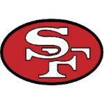
The San Francisco 49ers brand began in 1946 with a slapstick frontier scene. Early programs and media showed a bearded prospector getting jolted by a misfiring pistol, hat flying, boots in the air, energy everywhere. The image matched a franchise named for the Gold Rush, lively and a little unruly. It worked for a young club searching for an identity rooted in local history and spectacle. The original 49ers logo from 1946 to 1968:
 A calmer identity followed as the organization matured. The gun-toting cartoon gave way to cleaner typography and helmet marks. By the early 1960s, the design team favored simple geometry, confident color, and a mark that looked sharp on television and print. In short, a serious football badge took shape. For a fun parallel in probability and symbols, consider how clarity drives recognition in games as well, a concise grid and steady rhythm help a player read patterns in a bitcoin keno game, just as a clean oval helps a viewer read a logo at a glance. In keno, a player selects preferred numbers on a simple numbered grid, then a rapid draw reveals winning spots, with payouts scaling based on how many selections match and the chosen risk profile. Most online versions surface this logic transparently through an updating payout table and quick rounds, so odds feel legible and results arrive instantly, reinforcing disciplined pick sizes and steady pacing.
The birth of the interlocking SF
 The interlocking "SF" modern era began in 1962 with the San Francisco 49ers, an iconic team, inside a red oval. The form balanced curves and counters so the letters felt anchored rather than floating. White letters on red delivered high contrast. A thin black keyline added definition, especially on light backgrounds and old broadcast feeds. The new mark traveled well on helmets, jackets, and newspaper columns, which mattered in an age ruled by ink and cathode rays. How it looked:
Color, craft, and the look of victory
 Color choices did heavy lifting. Red signaled urgency and pride, gold nodded to miners and trophies, and black provided a crisp outline that held the logo together on varied surfaces. The helmet shell served as a moving billboard, so designers tuned the oval width and letter spacing to curve cleanly on a three-dimensional form. A logo succeeds when it reads in motion, under rain, under lights, and inside a highlight reel.
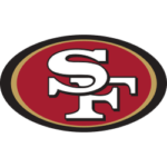
Typography inside the oval walked a careful line. The S leaned with gentle arcs, the F stood firm, and the crossbar avoided clutter. Small calibrations to serifs and terminals kept the letters from clashing where they overlapped. Nothing about the pairing felt accidental, which is why minor year-to-year refinements rarely jarred supporters. Logo from 2009 to Present:
Tradition that still feels current
The 49ers mark belongs to a small group of sports emblems that reached a final form decades ago, yet remain fresh. Stability built trust, while selective polishing kept the badge from feeling dated. Heritage and performance live in the same frame, which is why a glance at the helmet can evoke Joe Montana precision, Jerry Rice footwork, Steve Young grit, and present-day ambition in a single breath.
A logo, like a playbook, rewards disciplined editing. The journey from comic commotion to poised monogram shows how a franchise can honor origin stories while embracing clarity. The Gold Rush myth gave the team a name, the red oval gave the team a face, and careful stewardship gave that face longevity. The result is an emblem that travels across eras, carrying history, excellence, and the steady promise of Sunday drama.

