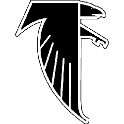
Since its inception in 1965, the Atlanta Falcons have held a significant position in professional football. As the team's emblem evolved over the years, its transformations have played a role in molding its identity and symbolizing its ethos.
Lamar Dodd, a renowned artist from Georgia, designed the team’s original logo. It embodied ferocity, encapsulating a black falcon with menacing red eyes and talons gripping a football. This symbol was the team's visual identity for two seasons until it was succeeded by a new design in 1967. Although the falcon remained a constant in the logo, it now perched atop an orange circle encasing the words "Atlanta Falcons" in white.
However, as with all things, the logo couldn't escape the inevitable wave of modernization. It underwent slight alterations in 1989 that injected it with a contemporary feel. The wordmark saw a transition to sharper edges, and silver accents were added to the bird's wings and tail feathers, imbuing it with a sense of depth.

Atlanta Falcons Primary Logo 1990 - 2002
Indeed, the journey from a simple sketch of a falcon to a symbol that evokes such immense pride in Atlanta Falcons' fans is genuinely remarkable. The Falcon, clutching an oval-shaped ball, signifies strength and determination. It stands tall atop its home city's name, a representation relatable to each fan, regardless of whether their allegiance lies with the offense or defense.
Despite several redesigns over the years, this enduring loyalty from the fans underlines the power of symbols. The Falcons' emblem is more than a mere logo; it's a beacon of team spirit and community pride and a testament to the longevity of passion in sports. It's fascinating how an icon can encapsulate the soul of a franchise and rally supporters. For the Falcons, their logo does precisely that.
The story of the Atlanta Falcons logo is a testament to the team's spirit that spills over into the game lines. When fans throng the stadiums or tune into their screens, it's not just the action on the game lines that stirs their passion. Each play, each strategic move on those Atlanta Falcons gamelines, is represented by that fierce falcon, encapsulating the city's spirit, symbolizing the collective roar of the fans, and echoing the team's determination to strive for victory. This fervor is as integral to the experience as the electrifying games themselves.
In conclusion, the Atlanta Falcons' logo's evolution tells a tale of change and continuity, modernity, and tradition, mirroring the dynamism of the sport itself. This journey has imbued the simple sketch of a black falcon with such vitality and relevance that it resonates deeply with every Falcons supporter, becoming a beloved symbol that transcends the sport, embodying the spirit of the team and its fans.
Sports Logo History is a community of sports logo enthusiast who enjoys the history of each team’s logo history. Sports Logo History has primary logos, alternate logos, or wordmark logos from the NFL, NBA, MLB, MLS, NHL, Premier League, WNBA, CFL, NCAA, ABA, USFL, AAF, and XFL.
One of our partner sites Sports Team History takes a look at the history of each and every professional sports team. In addition, we have added Sports News History to our sports history websites. 24/7 non-stop sports news that's worth knowing. Finally, the premier sports team marketplace for your favorite team or college with thousands of items for you to peruse at Sports Market History.

