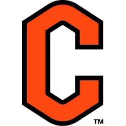
Campbell Fighting Camels
Two-color hump letter "C" in orange with black trim.
Created by Joe Bosack & Co.
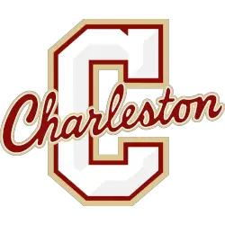
Charleston Cougars
A beveled letter block "C" in white with grey highlights and gold and maroon trim with a slanted script wordmark "Charleston" across the front in maroon with gold trim.
Created by Gil Shuler Graphic Design.
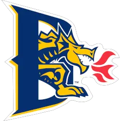
Drexel Dragons
A dragon in blue and gold breathing red fire coming through the letter "D" in blue with gold trim.
A new shade of blue and gold.
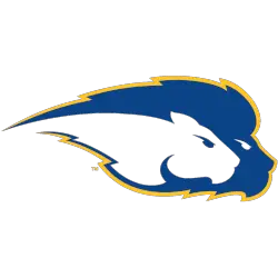
Hofstra Pride
Two lion's heads side by side, one in blue with gold trim and the other in white.
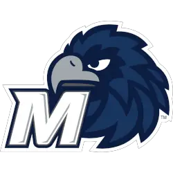
Monmouth Hawks
A letter "M"in white with grey highlights and a blue and white trim in front of a side view of a hawk's head in midnight blue, blue, grey, and dark grey.
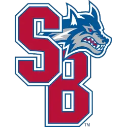
Stony Brook Seawolves
Initials "SB" overlapped in red with blue, white. and blue again trim with a wolf's head hanging over the letters in blue, grey, red and white.
Towson Tigers
A side-view of a tiger's head with mouth wide open in black, white, grey, and gold.
William & Mary Tribe
Connected initials "W&M" in green with gold trim in a diagonal position.
Coastal Athletic Association Logo History
First, CAA Teams Alternate Logos gave schools flexibility beyond primary marks. These designs often featured simplified icons or creative lettering. As a result, each CAA logo helped CAA teams expand their visual identity on merchandise and promotions.
Next, updates to the Coastal Athletic Association logo system allowed modern alternate styles. Several CAA Teams Alternate Logos introduced cleaner shapes and updated color balance. However, every CAA logo still aligned with conference standards. Learn more about the league on Wikipedia.
Finally, this archive presents the full Coastal Athletic Association logo timeline for alternate designs. All CAA Teams Alternate Logos appear from start to today. Fans tracking CAA teams branding can also visit Coastal Athletic Association Wordmark Logo Page to view official wordmark designs.

