
Birmingham Stallions
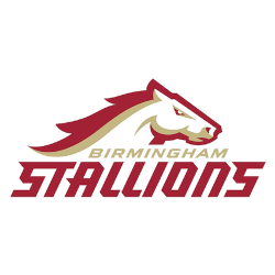
A golden and red horse’s head with a wordmark “BIRMINGHAM” in gold and “STALLIONS” below in red. Carried over from the USFL.
Birmingham Stallions
2022 - 2024
A golden and red horse's head with a wordmark "BIRMINGHAM" in gold and "STALLIONS" below in red.

Birmingham Stallions
1983 - 1985
Golden horse trotting with an arched wordmark "BIRMINGHAM" in red and "STALLIONS" below in red marked by two red lines.
Birmingham Stallions Primary Logo
The Birmingham Stallions logo history began in 1983 with the team’s founding in the USFL. The original design featured a charging stallion with bold block lettering, colored blue and silver, capturing the strength and determination of both the team and its fans. After the USFL folded, the Stallions returned with the UFL launch in 2024, introducing a modernized logo that retained the iconic stallion but updated the colors to bold red and black with sleek typography emphasizing “Birmingham.” High-resolution Birmingham Stallions logo PNG files preserve each stage of this evolution for reference and archival purposes.
The modern Birmingham Stallions logo pays homage to its original identity while adding contemporary elements. The charging stallion remains central, symbolizing resilience and energy, while secondary logos, including a stylized “B” with a stallion’s head, reinforce team branding across merchandise and media. These Birmingham Stallions logos collectively represent the team’s history and its deep connection with the city and fans.
Throughout the Birmingham Stallions logo history, the primary logo has consistently symbolized the team’s values, professionalism, and competitive spirit. From its USFL origins to the current UFL era, the logo unifies all Birmingham Stallions team logos under a strong visual identity. For a detailed timeline of the franchise, visit the Birmingham Stallions History page, and to compare with other professional league designs, explore the ABA Team Logo page.
Football Sports Fan Products


Vote Now / All Stallions Fans!!
Click to go to UFL Logo Battle and vote


