A club with big ambitions after moving into the London Stadium in 2016, West Ham United has a rich history and is a well-established team within the English football pyramid. Things are going well both on and off the pitch this season, too. It appears to be a club on the up.
 Sports Logo History
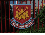
 West Ham United Gate
When assessing West Ham United’s history behind the logo, there is no mistaking that it is a truly iconic badge within England. The club has had some remarkably talented players in its ranks over the years, too, with past heroes such as Bobby Moore, Paolo Di Canio, Tony Cottee, and Billy Bonds being regarded as legends. The club’s youth system has also paid off on numerous occasions, gaining a solid reputation after guiding the likes of Rio Ferdinand, Frank Lampard, Joe Cole, and Michael Carrick into the first team.
While West Ham might not have the success or financial clout of a club like Manchester United, a team that often challenges Real Madrid for the title of the richest football club in the world, the Hammers are nevertheless a team steeped in history. With that in mind, here is a look at the history behind West Ham United’s iconic logo.
Thames Ironworks
 Sports Logo History
 Thames Ironworks FC Primary Logo 1895 - 1923
Much like some of the teams in the NFL, West Ham United originally started out under a different guise, Thames Ironworks F.C. After being formed under the name of Thames Ironworks F.C. in 1895 by a metallurgical company, the team eventually changed to its familiar name of West Ham United just five years later in 1995.
West Ham United is born
 Sports Logo History
 West Ham United FC Primary Logo 1964 - 1965
From that moment onwards, the East London club was born. West Ham’s first-ever official logo was designed in 1923 and featured the two crossed burgundy hammers everyone is so familiar with today in a circle. The Hammers and its logo didn’t change until the 1970s, but in that time, it became synonymous with the club. The iron hammers in the logo eventually went on to form a part of the club’s nickname, with Hammers fans referring to their team as the “Irons” and the “Hammers” today.
Over time, the logo has faced numerous changes. In 1950, the club went with a more elegant logo with a cleaner feel to it. The circle around the hammers was removed in favor of a light blue shield which drew more attention to the club’s famous two crossed hammers.
In 1952, West Ham United’s logo was subject to another makeover when the shield around the hammers was made curvy, with the top part of it becoming arched. The old-style logo was celebrated among Hammers fans, although it didn’t last long.
In 1958, a new logo similar to the 1952 version was created. The cleaner shield returned minus the curvy edges and arches. The aim of creating the design was to present a cleaner design that would illustrate the club’s roots and heritage.
In 1963, further changes were added. The more colorful logos of old were no more, instead of being replaced with burgundy hammers on a white background placed within the shield that was, by this time, very much associated with the club.
 Sports Logo History
 West Ham United FC Primary Logo 1987 - 1999
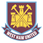
Between 1968 and 1975, the Hammers added more detail to its fairly simple logo of old. The white shield was replaced with a version outlined in burgundy but also accompanied with a castle, the familiar two crossed hammers, and an arched ribbon reading “West Ham United F.C.”.
 Sports Logo History
 West Ham United FC Primary Logo 1999 - 2016
The club has retained its famous hammers alongside the ornate image of a castle, although a few vastly different versions of the logo have surfaced at times, namely in 1975 when two thin and long hammers were placed in the middle of the castle. Once again, in 1983, the Hammers returned to a minimalist approach without a castle and an arched ribbon, instead offering up a simple design of two crossed white hammers and a “W. H. U. F. C.” inscription on a solid burgundy square.
 Sports Logo History
 West Ham United FC Primary Logo 2016 - Present
The castle, hammers, and ribbon returned once again in 1985 with a blue and yellow version. Then, in 1987, the same logo was adopted, but this time in red and yellow.
Since then, the original burgundy and light blue colors have been prominently featured alongside the familiar shield, a yellow castle and hammers, and a ribbon. Today, though, the club is celebrating its 125th anniversary with a subtle design showing a nod of appreciation to a number of former versions.
See the West Ham United FC logo history and team history.
Sports Logo History is a community of sports logo enthusiast who enjoys the history of each team’s logo history. Sports Logo History has primary logos, alternate logos, wordmark logos, or concept logos from the NFL, NBA, MLB, MLS, NHL, Premier League, WNBA, CFL, NCAA, ABA, USFL, AAF, and XFL.
Our partner site is Sports Team History takes a look at the history of each and every professional sports team.

