SPORTS LOGO HISTORY

Sports Logo HistorySports Logo History
  • Home
  • Logos Type
    • Alternate Logo History
    • Primary Logo History
    • Wordmark Logo History
  • League Logos
    • AAF Logo History
    • ABA Logo History
    • CFL Logo History
    • College Logo History
    • MLB Logo History
    • MLS Logo History
    • NBA Logo History
    • NFL Logo History
    • NHL Logo History
    • Premier Logo History
    • USFL Logo History
    • WNBA Logo History
    • XFL Logo History
  • More…
    • Sports Logo News
    • League Logo Battle
    • Clash of Logos
      • MLB Logo Tourney
      • NBA Logo Tourney
      • NFL Logo Tourney
      • NHL Logo Tourney
    • Sports Team History
    • Sports News History
    • Sports Market History
    • Sports Logo History Products
Image
SLH News - Sounders New Logo

A Breakdown of the New Logo for the Seattle Sounders

In terms of MLS history, the Seattle Sounders can be thought of as a very young franchise. The Seattle Sounders were established on November 13th, 2007. Yet, there is no doubt that they have had great success in a very short period.    

However, this is the second time the Seattle Sounders have been established as a franchise in a professional soccer league. The Sounders were originally established as a franchise in 1974. They competed in the North American Soccer League (NASL) for nine years. 

The Seattle Sounders have won four conference championships. (2016, 2017, 2019, and 2020). They are two-time MLS Cup champions. (2016, 2019).   

Additionally, they have won the U.S. Open Cup 4 times in franchise history. (2009, 2010, 2011, and 2014).  Their most recent triumph is winning the 2022 Concacaf Champions Cup.

The Seattle Sounders are known for having one of the most passionate fanbases in the MLS. Before each match, the home fans participate in a tradition known as “March to the Match.”   Fans march from Occidental Park to the Seattle Sounders home stadium before each match. The passion of the Sounders fanbase can be seen in the fact that they have four fan supporter groups. At the request of one of the minority owners of the franchise, the franchise established its marching band. The marching band is known as the Sound Wave.   

Great players like Clint Dempsey and Stefan Esei have played for the Seattle Sounders franchise. The Sounders have recently unveiled a new logo that will commemorate their 50th anniversary. In this piece, we will analyze the new logo they have established and their franchise's overall logo history. 
Seattle Sounders Primary Logo 1974 - 1978Sports Logo History
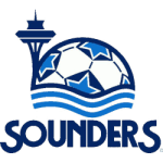
Not surprisingly, the Seattle Sounders’s 1st logo was established in 1974. A portion of the top half of the logo consisted of the Seattle Space Needle, a landmark that is very meaningful to Seattle. The Seattle Space Needle was introduced to the public at the World's Fair in 1962.

This logo's upper half also contains a soccer ball's upper half.  A portion of the soccer ball is white. However, there are sections of the ball that contain a blue star. The blue star covers most of the dark blue background within these sections. 

Three pairs of blue waves can be seen beneath the soccer ball. The waves are the midpoint of the upper and lower halves of the logo. 

The lower half of the logo contains a dark blue "SOUNDERS" wordmark in capital letters. The logo lasted until 1978. 

In 1978, the Seattle Sounders switched their logo completely. Their primary logo was purely a "SEATTLE SOUNDERS" wordmark logo. The upper half of the logo is a green "SEATTLE" logo in capital letters. The bottom half of the logo contains the "SOUNDERS" wordmark. However, the SOUNDERS wordmark is mainly covered by a blue waterline.  

The "O" portion of the SOUNDERS wordmark is not green.   Instead, the "O" is represented by a light blue and white soccer ball. The rest of the letters in the "SOUNDERS" wordmark is green.  This logo lasted until 1995. 

In 1995, the franchise would completely switch to a logo that was quite sophisticated. The very top of the logo contains a small purple "SEATTLE" wordmark.

The intricate portion of this logo is the "SOUNDERS" wordmark. It covers most of the logo.  Just like the previous logo, the most exciting portion of this wordmark is the letter "O." The letter "O" contains a black and white killer whale that is jumping through the hole in the letter "O." The killer whale is hitting a black and white soccer ball. The black and white soccer ball is contained within a sunburst design. 

The rest of the "SOUNDERS" logo has a portion that is light blue and a portion that is dark blue. The dividing line between the light blue and dark blue portions is a waterline across the entire "SOUNDERS" wordmark. 

The bottom logo contains a tiny purple "PROFESSIONAL SOCCER" wordmark.  The logo lasted until 2009.
Seattle Sounders FC Primary Logo 2009 - PresentSports Logo History

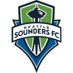
In 2009, the Seattle Sounders would completely switch their logo. The logo consisted of a green shield that contained a black-and-white version of the Seattle Space Needle. The shield contained a black and white outer trim. The green shield is covered by a white banner with black trim that contains a black "SEATTLE SOUNDERS FC" wordmark.

Behind the shield, one can see a blue background with a black-and-white outline. This logo lasted for 14 years. 

In 2024, the Seattle Sounders will celebrate 50 years as an organization by revealing its new logo designs. 

At first glance, the logo aims for a simple yet sophisticated approach. The franchise is not aiming to reinvent itself through this brand evolution. They are leaning towards the core values that have defined them as an organization. 

Like the previous logo, the new logo is a shield logo. Throughout the franchise's history, one of the main monikers of the Seattle Sounders franchise has been defined as "Eternal Blue, Forever Green. The background of the shield is green.  Specifically, the shade of green featured in the shield is Rave Green. 

On the interior part of the logo, the Sounders chose to pay tribute to the Seattle Space Needle, similar to previous logos. 

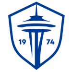
Seattle Sounders FC Primary Logo 2024 - PresentSports Logo History

The Seattle Space Needle is in the middle of the shield and is colored dark blue.

The Seattle Sounders paid homage to their history by putting the year of incorporation ("1974") as a wordmark. The "19" is on the left side of the Seattle Space Needle, while the "74" is on the right—two shades of blue serve as outer trims. 

One shade of blue is the same shade of blue seen in the shield, while the other is a lighter shade of blue known as Heritage Aqua.

___

Sports Logo History is a vibrant community of sports logo enthusiasts who share a deep appreciation for the captivating histories behind each team's logo. We take pleasure in exploring the evolution of primary logos, alternate logos, and wordmark logos from renowned leagues such as the NFL, NBA, MLB, MLS, NHL, Premier League, WNBA, CFL, NCAA, ABA, USFL, AAF, and XFL. Immerse yourself in the intricate details and stories behind these iconic symbols that represent the essence of each team.

In the enthralling realm of sports, the battle of logos among different leagues unfolds as a captivating and ongoing spectacle. Step into the world of Sports Logo History, where we showcase the relentless pursuit of distinction by leagues such as the NFL, NBA, MLB, Premier League, and countless others. Witness the captivating journey as each league strives to create logos that not only capture the essence of their sport but also resonate deeply with fans.

Immerse yourself in the comprehensive sports history provided by Sports Team History, our esteemed partner site, where you can discover the triumphs, challenges, and defining moments that have shaped the legacies of professional sports teams. Stay up to date with the latest sports news through Sports News History, a platform delivering 24/7 coverage of highlights, player interviews, and game analyses. Additionally, express your unwavering support for your favorite teams by exploring Sports Market History, the premier sports team marketplace offering a vast selection of jerseys, memorabilia, and collectibles. Join our community today and celebrate the rich history, iconic logos, and passion of sports.

Seattle Sounders logoSeattle Sounders logosSeattle Sounders new logoSeattle Space Needle

Sports News History

Sports News Worth Knowing

RSS Headline News

  • Canada vs. Australia live score, updates, highlights from Matildas friendly and Christine Sinclair farewell
  • Dylan Harper, a 5-star guard, is set to announce
  • The Patriots’ Mac Jones is the man of the muddled moment
  • NCAA women’s soccer championship score, updates, highlights as FSU clobbers Stanford to win 2023 College Cup final
  • Live college football transfer portal updates: Latest news on who’s in and who’s out

SLH News

"Latest Sports Logo History News"

The Liverpool Crest: The Bird on Their Logo, Representation and Narrative

December 6, 2023

History and Evolution of the Denver Nuggets Logo

December 4, 2023

The Toronto Blue Jays Logo: Secrets of Longevity of the Canadian MLB Team

November 21, 2023

The Evolution of Crystal Palace Eagles’ Logo

November 16, 2023

Secrets to the Longevity of the Los Angeles Chargers Logo

November 15, 2023

Top 5 WNBA Logos: A Blend of Aesthetics and Team Spirit

November 8, 2023

Los Angeles Clippers: Tracing the Iconic Logo’s Evolution

November 4, 2023

SLH Prodcut Sale

Sports Logo Battle
National Football League Logo
National Basketball Associations Logo
Major League Baseball Logo 2019
Image
NCAA Primary Logo 2000 - Present
League and Conference Sports Logo Battle is where anything goes between all teams in each league or conference. See all the professional teams and college teams from the major conferences. Who is your favorite team, and are they the best in their league or conference?
All Leagues and Conferences
MLB League Battle
NBA League Battle
NHL League Battle
NFL League Battle
WNBA League Battle
ACC Conference Battle
Big 12 Conference Battle
Big 10 Conference Battle
PAC 12 Conference Battle
SEC Conference Battle

Sports Logo News

The Liverpool Crest: The Bird on Their Logo, Representation and Narrative

December 6, 2023

History and Evolution of the Denver Nuggets Logo

December 4, 2023

The Toronto Blue Jays Logo: Secrets of Longevity of the Canadian MLB Team

November 21, 2023

The Evolution of Crystal Palace Eagles’ Logo

November 16, 2023

Sports Team History Logo
Sports News History Logo
Sports Market History Logo
Sports Logo History Logo

"It's not all about the Team, It's about the LOGO."

  • About
  • Contact Us
  • Disclaimer
  • Privacy Policy

© 2013 - 2023 - Sports History Group LLC - All Rights Reserved
  • Home
  • Logos Type
    • Alternate Logo History
    • Primary Logo History
    • Wordmark Logo History
  • League Logos
    • AAF Logo History
    • ABA Logo History
    • CFL Logo History
    • College Logo History
    • MLB Logo History
    • MLS Logo History
    • NBA Logo History
    • NFL Logo History
    • NHL Logo History
    • Premier Logo History
    • USFL Logo History
    • WNBA Logo History
    • XFL Logo History
  • More…
    • Sports Logo News
    • League Logo Battle
    • Clash of Logos
      • MLB Logo Tourney
      • NBA Logo Tourney
      • NFL Logo Tourney
      • NHL Logo Tourney
    • Sports Team History
    • Sports News History
    • Sports Market History
    • Sports Logo History Products