The Atlanta Braves is one of the most renowned franchises in Major League Baseball (MLB). The team has a rich history that spans over a century. As with any iconic team, their logo has evolved, reflecting changes in design trends and the team’s commitment to honoring its heritage.
This article will discuss the history of the Atlanta Braves logo, highlighting its significance and evolution.
The Importance of the Atlanta Braves Logo
Logos serve as more than just emblems on uniforms and merchandise in the world of sports. They are potent symbols that encapsulate the spirit and identity of a team. The Atlanta Braves boast a logo that carries a deep and multifaceted significance.
Beyond its role in representing a baseball team, the Atlanta Braves logo holds cultural, historical, and even social importance. The logo reflects the team’s vision and a show-tell like the mental toughness in golf that precedes their success story.
Below are the various dimensions of the Atlanta Braves logo and why it is more than just a symbol for sports fans.
A Link to the Past
The logo links to the team’s past, tracing its origins in Boston in 1871. It serves as a reminder of the countless legends and iconic moments that have shaped the franchise over more than a century of baseball history. For long-time fans, the logo connects to the memories of generations.
Cultural Identity
 Over the years, the Braves' logo has reflected the team's cultural identity. From the early days when Native American imagery was prevalent in the logo to the transition to the classic "A," it tells a story of evolving perspectives and a commitment to being culturally sensitive.
In an era where sports teams’ use of Native American symbols has faced scrutiny, the logo shows their change and progress.
Community and Pride
The Atlanta Braves logo is a source of immense pride for the city and its residents. It's a unifying symbol that fosters a sense of belonging and pride in the community. Fans proudly wear merchandise adorned with the iconic "A" logo, displaying their allegiance to the team and their city.
Brand Recognition
The logo is not just a symbol for fans; it's a crucial part of the Braves' brand identity. It's instantly recognizable, not only in the baseball world but also in the broader sports landscape. This recognition extends the team's reach and influence, drawing in new fans and creating a lasting impression on a global scale.
Inspiration and Motivation
Athletes draw inspiration from the logo on their uniforms. It represents the legacy of excellence and a commitment to winning that the Braves strive to uphold. It reminds players of the responsibility and honor of wearing the uniform and representing the team and its fans.
A Bridge to the Future
While the logo has deep roots in history, it also represents the Braves' vision for the future. The transition to the classic "A" logo signified a shift towards modernity and a renewed focus on Atlanta. It symbolizes the team's ongoing commitment to evolve while cherishing its heritage.
The History Behind the Transformation of the Atlanta Braves Logo
There is always a story that supports the growth of a franchise and reveals how it adapts to all the adversities along the way. So, here’s the Atlanta Braves story.
A Tribute to Native American Heritage
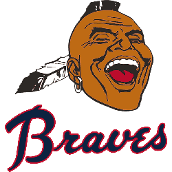
The earliest iterations of the Braves' logo paid homage to the Native American heritage, which the team proudly embraced. When the team moved to Atlanta from Milwaukee in 1966, their logo featured an Indian chief wearing a headdress. Below is what the logo symbolizes:
- Strength
- Courage
- Resilience
The Iconic "Screaming Indian" Logo
Perhaps the most iconic Braves logo is the "screaming Indian" logo introduced in 1972. This emblem, which depicted an Indian warrior in full headdress, was fierce and visually striking. It became synonymous with the Braves and remains one of the most recognizable logos in all sports. While some critics argued that it perpetuated stereotypes, many fans appreciated its representation of the team's warrior spirit.
The Transition to the Classic "A"
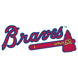
 In 1989, amid growing concerns about cultural sensitivity and stereotypes, the Atlanta Braves significantly changed their logo. They replaced the "screaming Indian" with a simplified, classic "A" emblem. This change marked a shift in the team's branding, focusing more on the city of Atlanta itself and less on Native American imagery.
Both the previous and classic A emblem have unique advantages. While the A emblem will represent the Atlanta Braves going forward, the table below helps you understand what made each logo memorable:
|
Aspect |
"Screaming Indian" |
"A" Emblem |
|
Heritage and history |
Represents Native American heritage and the team's historical connection to it |
Signifies a shift towards a more modern and timeless design |
|
Adaptability |
Limited adaptability due to its historical and cultural baggage |
Highly adaptable and suitable for contemporary branding |
|
Team evolution |
Reflects an earlier era of the team's history and values |
Represents a forward-looking approach and a commitment to change |
A Balance of Tradition and Modernity
The classic "A" logo retained a solid connection to the team's past while embracing a more modern and timeless design. This logo is still in use today and continues to represent the Atlanta Braves on the field and in the hearts of their fans. Below is what the logo symbolizes:
- Endurance
- Teamwork
- Pursuit of excellence
Wrap Up
The Atlanta Braves logo reflects the team's journey, from its roots in Milwaukee to its home in Atlanta. It's a history marked by changes in design, cultural sensitivity, and a commitment to honoring the franchise's past and the city it calls home. While the "screaming Indian" logo remains a beloved symbol of the team's history, the classic "A" logo represents a balance between tradition and modernity.
As the Braves continue to strive for success on the baseball field, their logo serves as a reminder of the rich heritage, tradition, and pride that have defined their renowned status.
___
Sports Logo History is a vibrant community of sports logo enthusiasts who share a deep appreciation for the captivating histories behind each team's logo. We take pleasure in exploring the evolution of primary logos, alternate logos, and wordmark logos from renowned leagues such as the NFL, NBA, MLB, MLS, NHL, Premier League, WNBA, CFL, NCAA, ABA, USFL, AAF, and XFL. Immerse yourself in the intricate details and stories behind these iconic symbols that represent the essence of each team.
In the enthralling realm of sports, the battle of logos among different leagues unfolds as a captivating and ongoing spectacle. Step into the world of Sports Logo History, where we showcase the relentless pursuit of distinction by leagues such as the NFL, NBA, MLB, Premier League, and countless others. Witness the captivating journey as each league strives to create logos that not only capture the essence of their sport but also resonate deeply with fans.
Immerse yourself in the comprehensive sports history provided by Sports Team History, our esteemed partner site, where you can discover the triumphs, challenges, and defining moments that have shaped the legacies of professional sports teams. Stay up to date with the latest sports news through Sports News History, a platform delivering 24/7 coverage of highlights, player interviews, and game analyses. Additionally, express your unwavering support for your favorite teams by exploring Sports Market History, the premier sports team marketplace offering a vast selection of jerseys, memorabilia, and collectibles. Join our community today and celebrate the rich history, iconic logos, and passion of sports.

