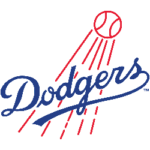
The Los Angeles Dodgers' rich history and iconic status in Major League Baseball (MLB) have consistently maintained a strong visual identity through their logo. Over the years, the team's logo has undergone subtle changes, reflecting the franchise's evolution and place within American sports. This article offers an in-depth examination of the Dodgers' logo, tracing the emblematic 'LA' from its origins in Brooklyn to its current iteration.
Los Angeles and Brooklyn Dodgers Logo History
The Dodgers' journey began in Brooklyn, New York, in 1883, and the team's logo back then was far removed from the iconic and straightforward 'LA' we know today. The early Brooklyn logos featured many designs, from a stylized 'B' to an elaborate baseball player illustration. However, an enduring motif was incorporating the 'Brooklyn' name into the logo, a practice that lasted until 1958, when the Dodgers relocated to Los Angeles. The significant move marked a turning point in the club's history, reflected in its visual identity, which features a sleek 'LA' logo. This logo, first introduced in 1958, remains relatively unchanged today, symbolizing the team's rich history and its indelible connection to the City of Angels.
1899 — 1901
The club was formerly called "Brooklyn Superbas" in New York. The first logo was a large, red, old English letter "B," which stood for Brooklyn. The Brooklyn Robins were created in New York in 1899 and earned their first logo. It was a scarlet Gothic-style letter "B" at first.
1902 — 1908
However, the color was changed to blue in 1902, and the club's signature color has been constant since then. Blue is the color associated with professionalism and trustworthiness. When paired with white, it denotes loyalty, mirroring the team's affinity with its fans.
1909
The "B" was redesigned in 1909. It was designed in a brighter shade of blue and featured a new decorative typography style with fewer lines and complexity than the previous one. The signature "B" was created in a font style similar to Bruce Double Pica, characterized by smooth, curving lines and pointed peaks.
1910
In 1910, the blue deepened again when the letter "B" was enclosed in a rhombus resembling a baseball field. The letter's blue color faded back to a dark blue. The letter "B" was put inside a white rhombus with a dark blue outline.
1911

Brooklyn Trolley Dodgers Primary Logo 1911
The 1911 Brooklyn Dodgers were just slightly different from their predecessors. It was the same letter "B," typeface, blue and white color scheme, and even the same frame form — a rhombus, with the same line thickness. The lines of the frame were longer, resulting in the four rhombus angles being "crossed."
1912 — 1913
The outlines of the frame were modified in 1912 and replaced with a red circle around 1928. In 1912, the blue diamond for the baseball field was linked, rather than interlocking lines.
The rhombus's previously crossed lines have now been reconnected, and the letter "B," which signifies Brooklyn, has increased. The team's name has also been changed to the Brooklyn Dodgers.
1914 — 1925
By 1914, the Brooklyn Dodgers' emblem lacked a frame. The blue "B" was also altered with shorter and stronger lines. The white triangle on the letter's left vertical bar grew more conspicuous. Nothing else changed.
The Brooklyn Robins were given a new name. By removing the blue rhombus, the logo is now simply the blue letter "B”.
1926 — 1927
In 1926, the club returned the 1912 logo to its visual identity, and the team reverted to the 1912 model's badge. Nonetheless, the "B" was extended and encouraged, giving the whole symbol a more balanced and unique appearance. The color pattern remained blue and white, evoking competence, loyalty, and determination.
1928
In 1928, the blue "B" was redesigned to be more streamlined and assertive. After years of using blue and white, the team finally added a third color by switching to a red circle to replace the blue rhombus. The new arrangement seemed friendly and gentle, presenting the club from a fresh perspective and allowing the blue "B" to stand out even more.
The letter "B" is drawn in Bruce's Double Pica typeface inside a white circle with a red border. The blue baseball diamond was replaced with a blue circle in the 1928 version.
1929

Brooklyn Robins Primary Logo 1929
A year later, the color of the letter on the logo is altered to light purple, and the design is given a thin, dazzling red edge. 1929 - The frame was removed entirely, and the "B" was painted light blue with a red outline.
1930
The font design is the same as last year, but the letter is now red with a slight blue border. The colors were altered in 1930, and the team's insignia was a red letter with a blue outline.
1931
The 1931 logo was a block letter B with a powder blue tinge. During this time, the first geometrical symbol was also created. A robust serif "B" in light blue with a narrow, deep blue outline was created. Robins' logo was a conventional blue block letter "B" with a subtle blue outline.
1932 — 1936

Brooklyn Dodgers Primary Logo 1932 - 1936
In 1932, the original "B" was reintroduced to the design, albeit simplified with thinner and smoother lines, a lighter shade of blue, and no frame. Longer and less jagged lines emerged, with more sharply curled ends. The club's logo occasionally included a little "TM" symbol in the same blue color.
1937
In 1937, the letter was dark blue and had no precise information. This year was the last time the letter "B" was set in a slightly modified font. Also, the letter "B" stands out in bold.
1938 — 1951
The club was renamed the Dodgers in 1938, and the unique logotype was designed. The letter "S" in blue script lettering has a strong, smooth underlining. For the first decade, the logo was written in blue on a white background.
1952 — 1957

Los Angeles Dodgers Primary Logo 1958 - 1967
In 1952, a brown rhombus, somewhat elongated on the horizontal axis, surrounded the logotype. The letter "G" was also accompanied by a white baseball with blue lines above it. This was the initial concept for what would eventually become the iconic logo.
1968 — 1972
In 1968, the logo's colors became bolder, and the wording became more elongated. Above the word "Dodgers," the red-and-white ball is depicted, and the underlining on "Dodgers" is once again thicker. The space required by its flight path is likewise increased. The team's name stood out from the others, printed in a bolder font. The red baseball didn't move from where it had been.
1972 — 1979
In 1972, there was a minor redesign of the logo, and by 1979, the typeface had developed into something more refined and aesthetically pleasing. The team decided to make the word "Dodgers" a darker shade of blue. The red orb was still floating in the air. The team's name is written in a deeper color and has a bolder, more pronounced font. The logo also featured a little "TM" on the right side.
1979 — 2011

Los Angeles Dodgers Primary Logo 1979 - 2011
After 32 years, the logo finally got a makeover. The team made subtle adjustments to the ball's shape and flight path, and the name was updated to reflect these improvements.
After a redesign in 1979, the script letters looked sleeker and more appealing. The red and white baseball complemented the diagonally positioned blue logotype, with red rays shooting from the center.
Everything started looking chic and current, and the logo's equilibrium improved dramatically. After decades of use, this logo design became the most iconic representation of the Dodgers.
2012 — Now
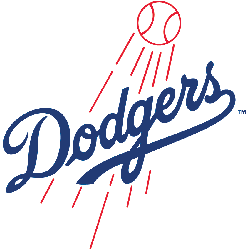
There isn't much contrast between the new and old Los Angeles Dodgers logos. As before, the word "Dodgers" was displayed in a deep blue color, but the elements connecting the letters were completed or deleted.
The current logo for the Los Angeles Dodgers uses a semi-connected handwritten typeface with a separated "D" and no "tail" on the "O." The distinction between the letters "G" and "E" is less stark.
This made the club's name more legible against a skyrocketing baseball and its designated track. The baseball's trajectory lines and the ball's motion demonstrated this.
The new Dodgers logo keeps the same deep blue, red, and white color scheme as the old one, but the typography has been updated to seem more sophisticated and authoritative. The updated logo is well-balanced and expertly crafted, conveying an air of expertise and professionalism.
Wrap Up
The rich and illustrious history of the Dodgers, paralleled with the evolution of their iconic logo, reflects not only the team's journey but also the evolution of baseball itself. The team's logo has evolved from an ornate blue “B” to sleek, modern script lettering. Each change was carefully crafted to reflect the organization's commitment and ambition for excellence.
As we follow the Dodgers' journey and their current performance, we can see the unpredictable yet exciting nature of the sport. One thing remains certain as we look towards the FanDuel World Series odds: the Dodgers will continue to inspire, challenge, and set new standards, just as they have throughout their remarkable history.
The $17 Million Caitlin Clark Effect: How One Rookie Changed the WNBA Forever
Visit Our YouTube Channel
