For sports fans all around the world, league and club logos have long been a source of identity. Not only will you see logos printed on clothing, keychains, car banners, and a myriad of other collectible items, but they are also functional on a league’s website and any press that the league may get. While it wasn’t always so, today, team and league logos are functional as well. Web developers often use a logo as a link to another page where more information can be found. If you are a fan of any of the clubs in the Premier League, or of the league itself, you just might be interested in a little bit of history on how today’s logos came to be. Here’s a look at the evolution of the Premier League logo.
In the Beginning…
 Sports Logo History
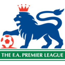
 No, let’s not get all biblical here! In the beginning of the Premier League logo, you will find that it’s a simple 2D graphic that began the branding game for the league. The first league logo we should look at is what has been titled the ‘Worried Lion’. Unfortunately, many fans and critics said it looked more like a griffin than a lion but there are droopy eyes that give away its identity. Sadly, if you are trying to brand your league as winners, you certainly wouldn’t want a worried lion, would you? Perhaps you would if it can denote serious thought but still if you were into betting, you wouldn’t want anything that smacks of worry! As you will soon see, the current league logo is far from worried so you can safely take a look at expert Premier League tips to see where and how you’ll wager this year.
Interim Logos
From 1996 to 2001, the league still used the Worried Lion but what many found rather odd was that it was set in a football within a football. This is also where the full body of the lion was used, but fans still weren’t happy that the worried look hadn’t changed. At this point, it’s important to mention that sponsors are the ones who really need to be considered since much of the money for the league comes from their support.
 Sports Logo History
 The next logo is still worrying, but it came with a change of sponsorship. Critics say that the various shades of blue give it a disjointed look even though it was a ‘pride of place’ logo. It sounds a bit comical, but they also say that it had a rather ‘smashed look’ with the inclusion of that odd football within a football that many claimed should have been dropped.
In the next evolution from 2004 to 2007, critics say the colors were starting to come together nicely, giving it a sense of harmony but they did not like the fact that the smashed look of the football within the football wasn’t taken out.
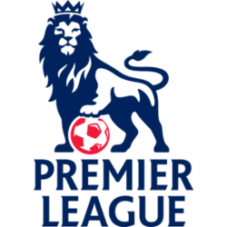
From 2007 to 2016, the lion took on a more regal appeal, which is what a winning league would look for. However, many believe that if it was just the head of the lion it would be even more regal and infinitely more confident.
Where the Premier League Logo Now Stands
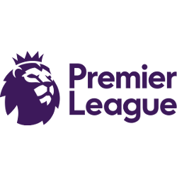
The final rendition to date of the Premier League logo has finally gone with just the head. Indeed, when you look at a digital logo online, one with just the head would look and work far better as a click-through link. With this being said, this logo is the product of the digital age and has been created for use on the internet and television.
 Sports Logo History
 Premier League Primary Logo
There are far fewer negative comments about the current logo, however, there are a few critics who believe it is not yet in its final evolution. It is said to be noble and modern and with the use of RGB colors, it can work well in digital format. Although it wasn’t created for print, RBG colors also add the necessary flexibility to work quite well with most printers in use today.
If you are a Premier League fan, or especially a fan of one club within the league, the current logo will work well with any DIY projects you might have in mind. From printing on caps, jackets, shirts, keychains, and any other item you might have in mind, the current logo works better than any of its predecessors. Are you at all curious about what the next evolution will bring? Let’s just hope it is a logo worth being a visible brand for a visibly winning league.
Sports Logo History is a community of sports logo enthusiast who enjoys the history of each team’s logo history. Sports Logo History has primary logos, alternate logos, wordmark logos, or concept logos from the NFL, NBA, MLB, MLS, NHL, Premier League, WNBA, CFL, NCAA, ABA, USFL, AAF, and XFL.
Our partner site is Sports Team History takes a look at the history of each and every professional sports team. In addition, we have added Sports News History to our sports history websites. 24/7 non-stop sports news that's worth knowing. Finally, the premier sports team marketplace for your favorite team or college with thousands of items for you to peruse at Sports Market History.

