It’s no secret that ice hockey is the most popular sport in Canada. In addition to being the country’s favorite pastime, it is also the official national winter sport and a one-of-a-kind Canadian trademark.
As the contemporary sport of hockey actually originated in Montreal, it comes as no surprise that there are various competitions held in the country on a regular basis, such as the Memorial Cup and Allan Cup. Moreover, there are also seven Canadian teams that take part in the NHL alongside 25 teams from the United States.
Predicting who will win the Stanley Cup each year is a favorite activity of hockey fans and with sports betting being allowed in several US states and Canadian provinces, even placing a few bets is not off the table. Besides wagers, passionate fans can also enjoy hockey-inspired video games such as NHL '94 and Blades of Steel as well as hockey-themed slots like Break Away Deluxe, at some of the many online casinos available. This only speaks about how big of a sport hockey is.
With all that in mind, let’s go through the logos of the Canadian teams that currently compete in the NHL.
Montreal Canadiens

Montreal Canadiens Primary Logo 2000 - Present
Founded in 1909, Montreal Canadiens is the oldest team on this list. Colloquially known as the Habs, they have won the Stanley Cup 24 times, more than any other team in the NHL. When it comes to their logo, they have been pretty consistent since inception.
In 1909, the logo was a big blue “C” letter on a white background. Then, it was redesigned in 1910 to be a green maple leaf with a gothic-style, white “C”. Since 1911, however, they have stuck to their red, blue, and white combination while the 1917 redesign saw the addition of the letter “H”, for hockey. They experimented with the shape over the years until, in 1957, they developed the outline they use even today.
Toronto Maple Leafs

Toronto Maple Leafs Primary Logo 2016 - Present
Then known as Toronto, the Toronto Maple Leafs was founded in 1917 and changed its name a few times until settling on the Maple Leafs.
Even before getting its name, the logo for the team featured a maple leaf. Until 1928, it was green with Toronto written underneath. Then, the blue and white color scheme – that is still used – was adopted with the name being written on the leaf itself. The shape and font have changed several times throughout the club’s history. The current logo has been in use since 2016.
Vancouver Canucks
 Sports Logo History
 Vancouver Canucks Primary Logo 2020 - Present
The Vancouver Canucks were formed in 1945 but officially joined the NHL in 1970 as an expansion team. The logo underwent several changes from its first design.
From 1952 to 1964, it depicted a skating hockey player in red, blue, and white. The player that was dubbed - Johnny Canuck - got a redesign in 1964 in blue and white. Once the club joined the NHL, the logo changed once again – it was now a rectangular badge in green, blue, and white with a white hockey stick placed horizontally on it. From 1978 to 1997, the logo was red, yellow, and black. A dark blue orca was adopted as the symbol for the club in 1997 and can still be seen on the logo even after a few redesigns.
Edmonton Oilers

Edmonton Oilers Primary Logo 2017 - Present
From 1971 – when they were founded – to now, the logo for the Edmonton Oilers did not go through a lot of change. While the colors used were slightly adjusted over time, the logo consists of the word “Oilers” in a blue circle and an orange drop of oil above it. Between 1996 and 2011, the drop was copper while a red circle framed the entire logo.
Calgary Flames
 Sports Logo History
 Calgary Flames Primary Logo 2021 - Present
Besides the Oilers, the Calgary Flames are also from Alberta. Founded only one year later, the logo for this team initially featured a stylized letter “A” with an abstract flame, as it was first called the Atlanta Flames.
In 1980, the club was sold and the name and logo changed. Since then, a flaming “C” has been representing the team and it went through very few changes in the last 40+ years.
Ottawa Senators
 Sports Logo History
 Ottawa Senators Primary Logo 2021 - Present
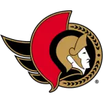
Colloquially known as the Sens, the Ottawa Senators were founded in 1992. While there was also the original Ottawa Senators hockey team active from 1883 to 1954, the current team’s logo was always some form of a Roman Centurion.
Red, gold, and black until 1997, it then underwent some changes before it was redesigned again in 2007 to show the Centurion from the front. The iconic logo from 1997 returned in 2020, although a bit cleaner and more refined.
Winnipeg Jets

Winnipeg Jets Primary Logo 2012 - Present
Established as the Atlanta Thrashers in 1997, the team was relocated and rebranded as the Winnipeg Jets – named after the original team that played in the city. The emblem is inspired by the Royal Canadian Air Force symbols and uses blue and silver for the main color scheme. A maple leaf can be seen behind a silhouette of a McDonnell Douglas CF-18 Hornet aircraft, all together encompassed in a navy blue circle.
Each of the Canadian teams in the NHL has an interesting history, which can oftentimes be seen in their logos as well.
Sports Logo History is a community of sports logo enthusiast who enjoys the history of each team’s logo history. Sports Logo History has primary logos, alternate logos, wordmark logos, or concept logos from the NFL, NBA, MLB, MLS, NHL, Premier League, WNBA, CFL, NCAA, ABA, USFL, AAF, and XFL.
Our partner site is Sports Team History takes a look at the history of each and every professional sports team. In addition, we have added Sports News History to our sports history websites. 24/7 non-stop sports news that's worth knowing. Finally, the premier sports team marketplace for your favorite team or college with thousands of items for you to peruse at Sports Market History.

