Chicago Bulls might be the most famous NBA team around the world. Was Michael Jordan the one who made it so famous? He definitely played during the team’s golden years, but it’s a matter of discussion. Many fans will tell you that a single player doesn’t make magic. It’s the entire team, talent, history, and vibe of the club that made it special.

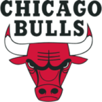
Chicago Bulls Primary Logo 1967 - Present
Speaking of vibes, the team’s branding largely contributes towards them. The team’s name doesn’t leave too much space for creativity regarding the logo: it had to be a bull. The logo is simple, colorful, attention-grabbing, and effective. It inspired the team’s jerseys and a great deal of apparel that’s being sold internationally.
This is one of those logos that didn’t go through any changes over its history. It has kept its original vibe and brand colors.
Let’s talk about the bull. What does it represent?
How the Chicago Bulls Logo Originated
January 16, 1966, was the big day when the Chicago Bulls was founded as a team. Its legacy comes from the Chicago Stags, the team that was the first to represent the city in the NBA in 1946. Chicago Packers/Zephyrs were the second teams from the city before they moved to Baltimore. They were founded in 1961. The Bulls took over the stage in 1966.
To understand the logo design, we must first think: where does the name come from? It’s inspired by the history of Chicago, where one of the largest slaughterhouses in the world was created in 1865. Legend says that some of the name suggestions were associated with bulls. The team was almost called the Chicago Toreador or Chicago Matadors.
Do you know why the name works? It’s short, snappy, and easy to remember. It called for a logo that reflected that spirit, and it definitely got one.
The Chicago Bulls: First Logo Design
The original logo was created together with the team, back in 1966. It became a classic logo, which every graphic designer learns from. The team is represented by the face of a fierce and angry red bull. Why angry and fierce? - It conveys the aggressive gameplay that cannot be stopped. The bull is red. That’s a color that enhances the fierce impression. There’s one detail that many people neglect: the tips of the horns have blood on them. It’s a small, but important detail that makes the team look intimidating.
This logo design is credited to Dean P. Wessel. The Chicago Tribune published a detailed article about him in 2004. He always loved drawing, and he worked for many famous clients, such as Rand McNally and Western Auto. His former partner explained that he took the team’s logo design as a joke. He didn’t even get paid for it. However, he accepted some free tickets to the Chicago Bulls games. That’s more valuable than any salary, isn’t it?
Wessel drew the logo as a favor to Dick Klein, the man who founded the club. Klein got the idea that the bull’s horns needed blood on the tips.
This logo design is simple, yet meaningful. It has an aspect that every designer aims for: it is timeless. Graphic design students often take it as a topic for their academic research projects. If you have such an idea, you might need to get EduBirdie’s writing help. Although there’s a lot of info on the web regarding the logo’s history and design, you’ll need some effort to explain how it impacted the club’s success and fan culture.
We should discuss another aspect of the first logo: the team’s name written above the bull’s head. It’s the logical thing for a designer to include when creating a logo for a new brand. The team’s name was memorable, but nobody knew it at that point. Including it in the logo design was a smart idea; it helped people to associate the raging bull and the team’s identity.
How Did the Logo Change Over the Years?
Not at all.

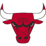
Chicago Bulls Alternate Logo 1967 - Present
Also in 1967, an alternate logo was presented. It’s the same design as the bull, but there’s an important difference when compared to the primary logo: this design excludes the Chicago Bulls lettering over the head. This is used as an emblem on apparel and various products associated with the team. Once The Bulls established their reputation and were recognizable by this logo, there was no need to write the team’s name over the logo. Everybody knows what it represents.
The Logo’s History Is Still a Mystery
The story about Wessel designing the famous logo of a frowning red bull is just that - a story. Other sources say that the design should be contributed to Ted Drake. Will we ever know the truth? Probably not. It’s a shame that such a famous and successful design was left without an official attribution.
But we know this for sure: the Chicago Bulls logo is a great example of innovative thinking, timeless design, and symbolism that represents a legacy.
Guest Writer
Judy Nelson
BIO: Judy Nelson is a sworn Chicago Bulls fan. She likes exploring details of the team’s history and writing about them. Judy shares her passion with her blog readers, and always welcomes discussions in the comments.
See the Chicago Bulls logo history and team history.
___
Sports Logo History is a vibrant community of sports logo enthusiasts who share a deep appreciation for the captivating histories behind each team's logo. We take pleasure in exploring the evolution of primary logos, alternate logos, and wordmark logos from renowned leagues such as the NFL, NBA, MLB, MLS, NHL, Premier League, WNBA, CFL, NCAA, UFL, ABA, USFL, AAF, and XFL. Immerse yourself in the intricate details and stories behind these iconic symbols that represent the essence of each team.
In the enthralling realm of sports, the battle of logos among different leagues unfolds as a captivating and ongoing spectacle. Step into the world of Sports Logo History, where we showcase the relentless pursuit of distinction by leagues such as the NFL, NBA, MLB, Premier League, and countless others. Witness the captivating journey as each league strives to create logos that not only capture the essence of their sport but also resonate deeply with fans.
Immerse yourself in the comprehensive sports history provided by Sports Team History, our esteemed partner site, where you can discover the triumphs, challenges, and defining moments that have shaped the legacies of professional sports teams. Stay up to date with the latest sports news through Sports News History, a platform delivering 24/7 coverage of highlights, player interviews, and game analyses. Additionally, express your unwavering support for your favorite teams by exploring Sports Store History, the premier sports team marketplace offering a vast selection of jerseys, memorabilia, and collectibles. Join our community today and celebrate the rich history, iconic logos, and passion of sports.

