This past Tuesday, the Air Force Academy announced a change to its main identifier. The new logo is meant to be an illustration of the commitment of the Air Force Academy to expand its leadership for the U.S Air Force as well as the U.S Space Force.
The Air Force Academy has had an extensive primary logo history. In order to understand the significance of its new logo, it is essential that we take a brief look back at that history.
To start that journey, one has to go all the way back to the year 1954. The first primary logo of the Air Force Academy lasted from 1954-1962. This logo had a black, white, and yellow falcon that was in the midst of flapping its wings. When one takes a closer look at the logo, one can see that the falcon is holding a light green lightning bolt.
The falcon is mostly contained within a blue circular background. The only part of the falcon that isn’t contained in the top of his wings. The logo is surrounded by a black “AIR FORCE ACADEMY” wordmark. The “AIR FORCE” part of the wordmark is on the left side of the logo while the “ACADEMY” part of the wordmark can be seen on the right-hand side.

Air Force Falcons Alternate Logo 1963 - 1994
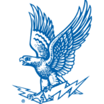
In 1963, the Air Force Academy went in a slightly different direction with its logo. Like its predecessor, this logo contained a falcon in the midst of flapping its wings. The falcon is also holding a lightning bolt just like in its prior logo. However, the falcon is not contained within any circular background and there is no “AIR FORCE ACADEMY” wordmark.
The entire logo has a color scheme of white with blue highlights. Additionally, the falcon is holding a much bigger lightning bolt than the prior logo. This logo lasted from 1963-1994.
In 1995, the Air Force Academy changed its logo again. The very top of this logo contains a black “AIR FORCE” wordmark. Below that, a white “FALCONS” wordmark can be seen. The “FALCONS” wordmark is contained within a background that is colored blue.
Right under the wordmark, a white falcon can be seen with a lightning bolt right behind him.
From 2004-2017, the Air Force Academy adopted a simpler logo. The logo is simply an “AF” wordmark that is colored in blue. From 2018 – present, the Air Force Academy slightly modified this “AF” logo by making it a bit wider.
 Sports Logo History
 The new logo that was introduced by the Air Force Academy on Tuesday is an evolved form of the institution’s first two primary logos. The institution decided to bring back the format of a falcon holding a lightning bolt. The falcon is mostly white with dark blue highlights. The lightning bolt held by the falcon is colored dark blue.
However, there is quite a bit of symbolism contained within the logo. The nine wing tips represent the nine outcomes that the Air Force Academy aims to instill in its students prior to graduation.
In the center of the falcon’s body, a Polaris star can be seen. This is a tribute to the U.S Space Force.
Sports Logo History is a community of sports logo enthusiast who enjoys the history of each team’s logo history. Sports Logo History has primary logos, alternate logos, or wordmark logos from the NFL, NBA, MLB, MLS, NHL, Premier League, WNBA, CFL, NCAA, ABA, USFL, AAF, and XFL.
Our partner site is Sports Team History takes a look at the history of each and every professional sports team. In addition, we have added Sports News History to our sports history websites. 24/7 non-stop sports news that's worth knowing. Finally, the premier sports team marketplace for your favorite team or college with thousands of items for you to peruse at Sports Market History.

