Team logos serve as more than mere symbols—they encapsulate the spirit and history of football teams and the unwavering loyalty of their fans. These emblems may seem like ordinary designs to the casual eye, but they are the visual embodiment and translation of a club's identity. Logos have evolved from old-time rudimentary designs to sleek, contemporary styles, and they continue to reflect the changing dynamics of pro football clubs and sports in general. In this article, experts at Tips.gg rank the top five most stylish EPL logos and the exciting stories they tell about the different football teams that adorn them.
EPL Teams and Their Logos
Logos herald the history of soccer clubs, carry their legacy, and serve as rallying points for fans who love to wear their team's colors with pride. Soccer clubs in the EPL use their logos to represent what they stand for and their journey to becoming big marketing brands.
Whether incorporating historical symbols, the infusion of regional pride, or the seamless integration of modern design principles, logos are meticulously designed pieces of art that give soccer teams and fans their identity. These emblems often serve as the first bonding point between a club and its supporters.
The connection between a team and its fans is a reciprocal one. Just as the logo symbolizes the club, the collective energy and passion of the fans breathe life into these emblems. It’s not uncommon to see fans proudly donning merchandise with their team's logo, turning a mere graphic into a symbol of unity and shared identity.
Is it the iconic Liver Bird of Liverpool? The majestic lion of Chelsea? Or the historic cannon of Arsenal? All these beautiful logos have a storied legacy and mean more to teams and supporters than what meets the eye. Here are the top five stylish EPL logos and the stories behind these iconic symbols.
Manchester United
 Sports Logo History
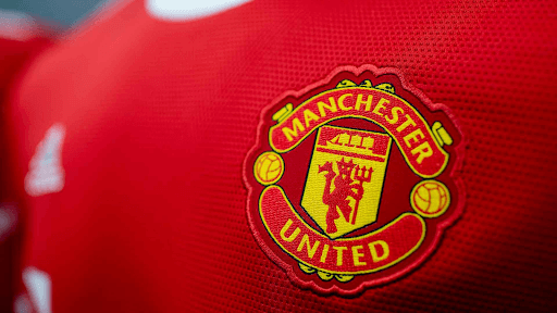
 Manchester United is the most successful team in the history of the English Premier League, one of the most popular soccer tournaments in the world. Not only have they won the most league titles, but they also have the largest global fan base among English top-flight soccer teams. For all the club's success and rich history, it should come as no surprise that its emblem, a sleek “Red Devil” logo, ranks on our list as the best and one of the most iconic designs in football history.
Manchester United's story began in 1878 when the club was founded as Newton Heath LYR Football Club. At its inception, the emblem bore the mark of its industrial roots—a steam locomotive wheel encapsulated in a circular frame. The club adopted this logo for years until 1902; the club underwent a transformative name change to Manchester United, and the emblem underwent a metamorphosis, too.
The iconic red devil, synonymous with Manchester United, officially debuted in 1970. Designed by a club supporter, the devil added a fierce and dynamic element to the logo, symbolizing the team's indomitable spirit on the field. The devil, draped in red, is seamlessly integrated into the club's visual identity to embody the passion and determination that has defined Manchester United and its supporters to this day.
The Red Devil is positioned prominently and dynamically at the center of the club's emblem and depicted in a fierce, forward-leaning posture, with sharp, defined features conveying a sense of strength and determination. Cloaked in a vibrant red hue, the devil is surrounded by a circular border, adding a sense of focus to the emblem. The devil's outstretched wings and arched tail contribute to a dynamic, almost aggressive stance.
Interestingly, the choice of red for Manchester United's emblem wasn't arbitrary. It is rooted in the club's historic connection with the Manchester Ship Canal Company.
Beyond the symbolism, Manchester United's logo is a marketing powerhouse that has continued generating massive sales yearly. It graces merchandise, adorns players' jerseys, and is proudly displayed in the hearts of millions of fans worldwide. The commercial success of the logo continues to reflect the global appeal of the club, making it one of the most valuable and recognizable brands in the world of sports. Manchester United’s merchandise has consistently ranked atop the best-sellers list since the late 90s.
The echoes of “Glory, Glory, Man United,” coupled with countless heads wearing the club’s different colors and waving red and black flags during live football matches, add to the beauty and iconography of the club's emblem.
Liverpool
 Sports Logo History
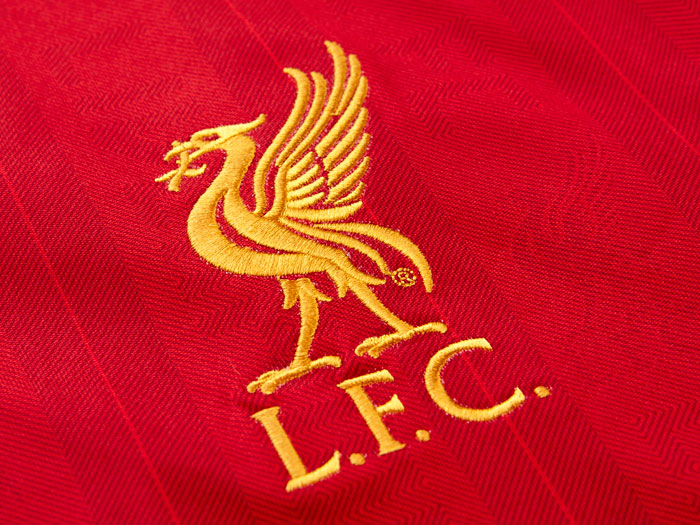
 Liverpool's logo represents the club's prominence in English and European football. In its early years, the emblem underwent subtle changes, but it wasn't until the 1960s that the Liver Bird took center stage. The decision to prominently feature this symbol was a nod to the city's identity and a testament to the club's desire to etch its name in footballing history.
The Liver Bird, a mythical creature that graces Liverpool's logo, has been an integral part of the city's heraldry for centuries. Legend has it that the bird, often depicted in flight with a sprig of seaweed in its beak, symbolizes the city's connection with the sea. Local folklore also links it to the tragic tale of two birds—said to represent the lovers parted by fate. One flew inland while the other stayed near the water, reflecting the dual nature of Liverpool as both a maritime hub and a thriving city. This emblem, adopted by Liverpool FC, carries with it the weight of centuries of the city's history and reflects the resilience and determination of its inhabitants.
On Liverpool's logo, the iconic Liver Bird is elegantly poised in the middle of the emblem. It is depicted in flight, with wings gracefully spread. The bird is stylized with a sleek, timeless design, and the logo is predominantly gold, adding a touch of regality to the overall composition.
One interesting aspect of Liverpool's logo is the absence of a shield or traditional frame. Unlike many other football emblems, the Liver Bird is presented boldly and without constraints. This unique twist to Liverpool's logo design features in merchandise, jerseys, flags, and digital platforms and has helped to propel the club's popularity beyond the city's shores.
Chelsea
 Sports Logo History
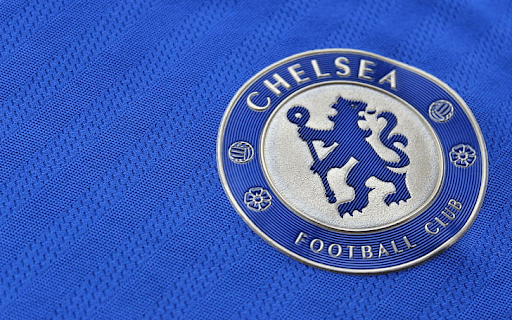
The lion, a symbol of strength and courage, has been used since the club's formation in 1905. Derived from the coat of arms of the Metropolitan Borough of Chelsea, the lion rampant represents the club's fearlessness and undaunted spirit, both on and off the pitch. The decision to feature the lion prominently in the logo was a deliberate choice that signifies Chelsea's aspiration to be a dominant force in English football. As 8× FA Cup winners and 5× League Cup champions, it’s safe to say that the inclusion has been justified.
The lion rampant, often depicted in a vibrant royal blue, encapsulates the royal aspirations of a club that has transformed from a humble West London outfit to a global football powerhouse. The logo has become synonymous with excellence as Chelsea FC has achieved domestic and international glory at different soccer tournaments. From the iconic triumph in Munich to lifting the Premier League trophy, the lion symbol has continued to resound its reputation in the ears of Chelsea supporters and foes alike.
Arsenal
 Sports Logo History
 Arsenal are not just favorites to win the 2023 - 24 English Premier League; according to https://tips.gg/, the club's emblem also features on our list of most stylish EPL logos.
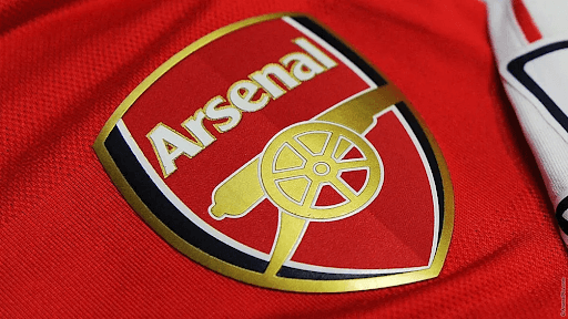
The Gunners’ logo features an iconic cannon as a visual testament to the club's tradition, innovation, and unyielding commitment to excellence. The cannon, adopted from the arms of the Royal Arsenal, is depicted in a sleek and modern design and points diagonally upward, symbolizing power and precision. It represents the club's historical connection with the workers from the Woolwich Arsenal Armament Factory workers who formed the team in 1886. The cannon’s association with firepower also aligns with Arsenal's footballing philosophy.
The logo serves as a visual reminder of the club's historical achievements, from the Invincibles of 2003-04 to the mesmerizing attacking play that has become synonymous with Arsenal's identity. The club's iconic red and white colors, combined with the sleek design of the cannon, create a visual identity that is instantly recognizable on a global scale. Arsenal's logo is simple and minimalistic, yet it has a strong visual appeal. The logo graces merchandise, adorns jerseys and serves as a beacon of pride for Arsenal supporters worldwide.
Tottenham Hotspur
 Sports Logo History
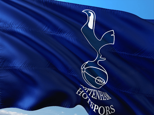
 We round up this list with Tottenham Hotspur’s logo, adorned with the proud cockerel or "spurs," that has been a significant part of Tottenham Hotspur's identity since the early 20th century. Adopted from the crest of the Middlesex Regiment, the cockerel symbolizes courage, tenacity, and the fighting spirit that has become synonymous with Tottenham’s culture. The cockerel’s presence in the logo reflects the club's commitment to its North London roots.
The stylized depiction of the cockerel, often adorned in the club's colors, adds an element of elegance to the emblem, making it visually appealing. Like Liverpool, Tottenham's logo does not have a shield or enclosure; the cockerel stands boldly, unconfined, and unrestrained. This design choice could be a nod to Tottenham's progressive style of football and its continuous pursuit of innovation both on and off the football pitch.
Wrap Up
Logos depict a brand's cultural heritage and values, and all the football teams on this list have been able to tell great stories with their emblems. From witty and detailed designs like Manchester United’s red devil logo to simple designs like Arsenal's cannon, these clubs have successfully built a strong connection and visual appeal to fans and retailers worldwide.
___
Sports Logo History is a vibrant community of sports logo enthusiasts who share a deep appreciation for the captivating histories behind each team's logo. We take pleasure in exploring the evolution of primary logos, alternate logos, and wordmark logos from renowned leagues such as the NFL, NBA, MLB, MLS, NHL, Premier League, WNBA, CFL, NCAA, ABA, USFL, AAF, and XFL. Immerse yourself in the intricate details and stories behind these iconic symbols that represent the essence of each team.
In the enthralling realm of sports, the battle of logos among different leagues unfolds as a captivating and ongoing spectacle. Step into the world of Sports Logo History, where we showcase the relentless pursuit of distinction by leagues such as the NFL, NBA, MLB, Premier League, and countless others. Witness the captivating journey as each league strives to create logos that not only capture the essence of their sport but also resonate deeply with fans.
Immerse yourself in the comprehensive sports history provided by Sports Team History, our esteemed partner site, where you can discover the triumphs, challenges, and defining moments that have shaped the legacies of professional sports teams. Stay up to date with the latest sports news through Sports News History, a platform delivering 24/7 coverage of highlights, player interviews, and game analyses. Additionally, express your unwavering support for your favorite teams by exploring Sports Market History, the premier sports team marketplace offering a vast selection of jerseys, memorabilia, and collectibles. Join our community today and celebrate the rich history, iconic logos, and passion of sports.

