Soccer fans are a passionate bunch, and rightfully so. The beautiful game brings joy, camaraderie, and unforgettable moments. However, fans - especially those in England - are as sentimental as it gets. They believe in their clubs' history and tradition, so they can get a little touchy when someone comes in looking to change that.
Here are five of the most controversial logo updates in recent times.
Manchester City

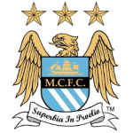
In 2016, Manchester City unveiled its new badge, a simplified version of its previous design. Their iconic blue and white crest had been used for over 20 years, but the club pressed on with its plans and unveiled a new badge featuring a more minimalist design.
The new badge was meant to symbolize the club’s past, present, and future, but it was met with mixed reviews from fans. Some praised the latest design for its simplicity, while others said it lacked the traditional look of a soccer club crest. However, Manchester City defended the redesign, saying it was necessary to appeal to a younger, global audience.

One notable aspect is that the new logo coincides with the most significant era in the club's history. The Blues have won the Premier League in five of the last six seasons, and online sports betting odds make them the heavy favorites to add another crown to their already overflowing trophy cabinet this term. They are also the favorites to retain the Champions League, a trophy they lifted for the first time back in June with a nervy 1-0 victory against Inter Milan in Istanbul. Will their new modern badge be lifted again after this year's Wembley showpiece?
West Ham United

West Ham United has a rich history that dates back over a century, and it's a history that their East London fans take great pride in. In recent years, the club has veered away from its history, first by relocating from its spiritual home in Upton Park to the London Olympic Stadium. But it has also updated its logo.
The club has had several logos over the years, but in 2016, they decided to update their crest again. The new design was meant to pay homage to the club’s East London roots, but fans weren't impressed. The new crest featured two crossed hammers, the team’s nickname, with a castle and two ships in the background.
Fans complained that it lacked any creativity. Even West Ham’s vice-chairman had to admit that the decision to rebrand was "clumsy." The new logo received criticism from fans who felt that the club was trying to distance itself from its working-class roots. However, the club defended the decision, stating that the new logo would help them compete in the global marketplace and appeal to a broader audience.
Leeds United

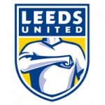
In 2018, Leeds United changed their logo to a simplified design, featuring a stylized fist doing the Leeds salute. Many fans criticized the new design, calling it lackluster and uninspired. One fan even created a petition to bring back the old logo, which garnered over 77,000 signatures. The club couldn't ignore the backlash and was forced to rethink its plans, sticking with the old shield-style badge instead.
Imagine the Leeds' Elland Road stadium's creative team huddled up in a room, brainstorming the perfect badge redesign. They probably felt super fancy that day, thinking they could land the perfect blend of modern and classic. It's a shame things didn't go according to plan, and the result was a badge that looked like it belonged to a five-year-old who got a little too enthusiastic with their stickers.
Arsenal

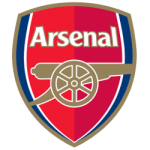
In 2002, Arsenal caused controversy when they revamped their logo's iconic "cannon" in favor of a new design that featured a more abstract representation. Fans were split – some appreciated the modernization of the logo, while others felt that the change was unnecessary and lacked the club's traditional identity. Two decades on, the new look has served the Gunners well. However, it hasn't seen even half the success of its predecessor.
Chelsea
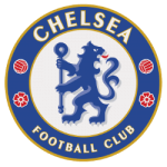
In 2005, Chelsea Football Club underwent an extensive rebranding process, including a significant change to its iconic logo. The previous crest had been used since the 1800s

s, featuring a sturdy lion perched on top of the iconic CFC lettering. The refreshed design was initially created to honor the club's centenary year and served as a throwback to the club's emblem from the 1960s and 1970s, where the famed lion was depicted holding a staff.
Nearly two decades later, the new emblem has become iconic and has been featured prominently throughout the club's glory years. With their new badge, The Blues have won the Premier League four times and become Champions of Europe twice, with victories in the UEFA Champions League in 2012 and 2021.
___
Sports Logo History is a vibrant community of sports logo enthusiasts who share a deep appreciation for the captivating histories behind each team's logo. We take pleasure in exploring the evolution of primary logos, alternate logos, and wordmark logos from renowned leagues such as the NFL, NBA, MLB, MLS, NHL, Premier League, WNBA, CFL, NCAA, UFL, ABA, USFL, AAF, and XFL. Immerse yourself in the intricate details and stories behind these iconic symbols that represent the essence of each team.
In the enthralling realm of sports, the battle of logos among different leagues unfolds as a captivating and ongoing spectacle. Step into the world of Sports Logo History, where we showcase the relentless pursuit of distinction by leagues such as the NFL, NBA, MLB, Premier League, and countless others. Witness the captivating journey as each league strives to create logos that not only capture the essence of their sport but also resonate deeply with fans.
Immerse yourself in the comprehensive sports history provided by Sports Team History, our esteemed partner site, where you can discover the triumphs, challenges, and defining moments that have shaped the legacies of professional sports teams. Stay up to date with the latest sports news through Sports News History, a platform delivering 24/7 coverage of highlights, player interviews, and game analyses. Additionally, express your unwavering support for your favorite teams by exploring Sports Store History, the premier sports team marketplace offering a vast selection of jerseys, memorabilia, and collectibles. Join our community today and celebrate the rich history, iconic logos, and passion of sports.

