It has been a while since we've seen any significant changes or even tweaks to the primary logos in the NFL. In the 1990s and 2000s, many teams recognized the need for rebranding exercises to modernize their franchises. It is fair to say that these did not always have the desired effect.
It has also been some time since we had a relocation that necessitated a complete redesign of the team's look. The Raiders, Rams, and Chargers are the last three franchises to move to a new city. However, they all retained their original names, allowing the logos to remain essentially unchanged.
When it comes to betting on football, not many will be swayed by the color of the jersey or the clean design of the logo. However, these are often the first impressions of the franchise that many new fans experience, and merchandise sales are crucial to the NFL. So, we thought we would celebrate some classic football logos – and name and shame one of the worst over the years.
Buffalo Bills
 It may not have brought the team much luck at Super Bowls, but the dynamic Bills logo is a true sports classic. The current version has been around since 1974, so it has experienced some challenging times. But the force of the buffalo comes through, thanks to the red stripe in the middle.
One of the reasons we love this logo so much is that we know what preceded it. We’re not talking about the old-fashioned logos of the game's early days, either. In 1970, the Bills decided to modernize their logo but came up with a sorry-looking animal that looks as though it’s on its last legs. The new(ish) one is far more athletic – and may even bring the team a championship one day.
Las Vegas Raiders
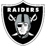
The Raiders are one of the most mobile franchises in the history of the NFL. From Oakland to Los Angeles – and back again – and more recently to Las Vegas. It is a shame that such an iconic team has not remained faithful to one city throughout its history. However, we are pleased that the franchise has always remained true to the logo.
The logo is quite strange when you start deconstructing it. A football player wearing an eye patch is superimposed over two crossed cutlasses, as if it were a pirate flag. The black and silver color scheme only adds to the menace, evoking a feeling that this is not a team to be messed with.
Green Bay Packers
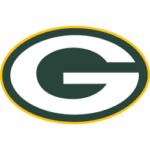 Sometimes, you have to stay with a classic basic design. The current version dates back to 1980, a year after the franchise decided to use just a simple ‘G.’ As a perfect example of genius in the details, the Packers added a yellow oval encompassing the letter as a minor tweak to create perfection.
The Packers logo can be easily used on a wide range of apparel and merchandise, and it is instantly recognizable as representing Green Bay. Showing that imitation is the most superb form of flattery, several other teams use the same design in their colors, most famously the Georgia Bulldogs.
Dallas Cowboys
 This is another simple example of the best NFL logos. Interestingly, a Cowboys team has never used an image of an actual cowboy as its primary logo. It did use a curious cartoon football player riding a horse back in the late 1960s – but the less said about that, the better.
No, we will concentrate on the iconic Lone Star logo, used by the franchise for almost the entirety of its existence. One minor, yet inspired, tweak in 1964 added a white line and blue border to the previously blocked blue star, and a design classic was born. In the Cowboys’ mind, Dallas is Texas.
Seattle Seahawks
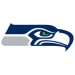 We will conveniently overlook the fact that the Seahawks logo is not an osprey or sea hawk at all and enjoy the way the franchise honored the Native American history of the region when deciding on a look for its NFL team, which played its first games in 1976.
Little has changed since the original design, but it has become sleeker and more fearsome-looking in recent years. The color scheme has also been tweaked in line with the overall color changes of the team. When there is so much controversy surrounding other sports franchises’ use of racist imagery in logos, it is refreshing to see something as classic and well-meaning as Seattle’s.
New York Jets
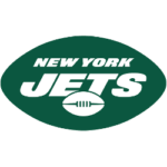 What you think of the New York Jets logo – and which version you prefer – will probably come down to how old you are and when you first started watching football. For years, the team used the classic logo, immortalized by Joe Namath, with the Jets' writing overlaying the "NY" in the background.
However, in the late 1970s, the franchise was possibly inspired by the Concorde supersonic jet of the time and redesigned to a sleek new look. We think that was still the best version, although it has a slightly retro feel now. More recently, the franchise reverted to the old logo in a darker green before cleaning it up and making it more readable in 2019.
Tampa Bay Buccaneers
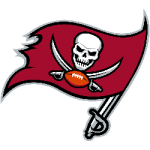
We thought we would finish with what we consider one of the worst logos in the NFL. The franchise half-heartedly tried to copy the Raiders' look, using a pirate flag, which we can somewhat excuse due to the team's name. But it just doesn’t look good and overuses the black outline favored by modern designs.
But our biggest gripe with the Buccaneers logo is that it changed from an absolute classic. It may not have seen its best years on the field, but the original expansion team-era logo of a dashing buccaneer with a feather in his hat and a knife in his mouth was just about perfect in our eyes.
___
Sports Logo History is a vibrant community of sports logo enthusiasts who share a deep appreciation for the captivating histories behind each team's logo. We take pleasure in exploring the evolution of primary logos, alternate logos, and wordmark logos from renowned leagues such as the NFL, NBA, MLB, MLS, NHL, Premier League, WNBA, CFL, NCAA, UFL, ABA, USFL, AAF, and XFL. Immerse yourself in the intricate details and stories behind these iconic symbols that represent the essence of each team.
In the enthralling realm of sports, the battle of logos among different leagues unfolds as a captivating and ongoing spectacle. Step into the world of Sports Logo History, where we showcase the relentless pursuit of distinction by leagues such as the NFL, NBA, MLB, Premier League, and countless others. Witness the captivating journey as each league strives to create logos that not only capture the essence of their sport but also resonate deeply with fans.
Immerse yourself in the comprehensive sports history provided by Sports Team History, our esteemed partner site, where you can discover the triumphs, challenges, and defining moments that have shaped the legacies of professional sports teams. Stay up to date with the latest sports news through Sports News History, a platform delivering 24/7 coverage of highlights, player interviews, and game analyses. Additionally, express your unwavering support for your favorite teams by exploring Sports Store History, the premier sports team marketplace offering a vast selection of jerseys, memorabilia, and collectibles. Join our community today and celebrate the rich history, iconic logos, and passion of sports.

