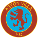
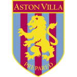
In 1874, the very first British football club transformed into "Aston Villa." The Villa Cross Wesleyan Chapel church members established it. Hence, where the football team adopted its name, its logo mirrors parts of the Scottish royal coat of arms, standing for courage and power.
It showcases the club's deep history and accomplishments, highlighting their strong dedication.
Another nickname, "lions," is pretty clear, given that this majestic predator is featured on the club's symbol. But it is not as commonly used as some of the other nicknames.
The Journey of the Aston Villa FC Logo

Back in the 1800s, when Aston Villa FC was starting, they had one of their first logos. The red lion in the logo was taken straight from the Scottish coat of arms and had many interesting details. Initially, the design was pretty basic and didn't have extra stuff like shields and banners that you often see in early football team logos. Also, the jersey worn by the team in the 1800s didn’t have betting companies as sponsors. This is something that became popular in the early 2000s. Today, you’ll find many gambling sponsors on club jerseys, such as online casinos and sports betting apps, and this is because of the amount of money these sponsors are willing to pay clubs to feature on their jerseys.
In 1886, Aston Villa tried something different with their logo. It is the only one without the Lion Rampant. This was just a few years after they began playing professionally. The logo was timeless, using red, yellow, and blue differently. Underneath was a banner with the word "Forward," showing a spirit of progress and ambition.

During the 1980s, Aston Villa changed its badge to nod to its new sponsor, Mita. The badge underwent a significant color transformation but kept many elements from the previous design. The pink and white color scheme simplified the logo, putting more emphasis on the Mita inscription.
In the 1990s, Aston Villa brought in a version of the old logo, but this time, it was decked out in yellow/gold, red, and light blue. They kept most of the elements from the previous design, but the significant changes were in the color scheme and a slightly softer, more streamlined font choice.
Back in 1992, there was another variation of the shield-style emblem. This time, they went for a much brighter yellow and used a serif-style font for the "Aston Villa" text. What is different here is that they placed the "Prepared" inscription inside the shield. The lion in this design is more detailed and has a slightly fiercer look, with sharper claws.

In the 2000s, Aston Villa FC stuck with the revamped lion image for their logo, but they brought in new colors. Instead of the striped background, they chose a solid, vibrant blue design. A white star was thrown into the mix to symbolize the team's triumph in the European Cup.
Further, in 2016, Aston Villa gave their logo another update. They made the lion bigger and removed the "Prepared" tagline from the bottom. The creature's claws got a little boost, making it look fiercer and more aggressive.
At the close of 2022, Aston Villa unveiled a brand-new logo, bringing in some significant changes from the previous design. The decision for the updated image was left to the fans, who had two options to pick from.
The first one showcased the Aston Villa lion and its star inside a shield shape with lots of sharp points and strong lines. The second variation had the same lion but in a circular badge featuring the team's founding date at the bottom.
Compared to the old design, the new rounded badge, favored by 77% of Aston Villa fans, has less yellow, making it a bit gentler on the eyes.
Sports Logo History is a vibrant community of sports logo enthusiasts who share a deep appreciation for the captivating histories behind each team's logo. We take pleasure in exploring the evolution of primary logos, alternate logos, and wordmark logos from renowned leagues such as the NFL, NBA, MLB, MLS, NHL, Premier League, WNBA, CFL, NCAA, ABA, USFL, AAF, and XFL. Immerse yourself in the intricate details and stories behind these iconic symbols that represent the essence of each team.
In the enthralling realm of sports, the battle of logos among different leagues unfolds as a captivating and ongoing spectacle. Step into the world of Sports Logo History, where we showcase the relentless pursuit of distinction by leagues such as the NFL, NBA, MLB, Premier League, and countless others. Witness the captivating journey as each league strives to create logos that not only capture the essence of their sport but also resonate deeply with fans.
Immerse yourself in the comprehensive sports history provided by Sports Team History, our esteemed partner site, where you can discover the triumphs, challenges, and defining moments that have shaped the legacies of professional sports teams. Stay up to date with the latest sports news through Sports News History, a platform delivering 24/7 coverage of highlights, player interviews, and game analyses. Additionally, express your unwavering support for your favorite teams by exploring Sports Market History, the premier sports team marketplace offering a vast selection of jerseys, memorabilia, and collectibles. Join our community today and celebrate the rich history, iconic logos, and passion of sports.

