Logos, where sports teams are concerned, are of huge significance and importance. And what is often the case is that logos change slightly over the years, but they retain most of their important features, ensuring the past and what has gone before are never forgotten. A prime example of this is how the Washington Wizard’s logo has changed over time. …
Washington Wizards Wordmark Logo
Washington Wizards 2015 – Present The new primary logo incorporates the “monument ball” design that has been in place since 2011 in combination with the iconic striping from the team’s uniforms, the three stars that represent D.C., Maryland and Virginia and the team’s wordmark “WASHINGTON” on top and “WIZARDS” on the bottom all in white. Wizards Alternate LogoWizards Primary LogoWizards …
Washington Wizards Alternate Logo
Washington Wizards 2015 – Present The new primary logo incorporates the “monument ball” design that has been in place since 2011 in combination with the iconic striping from the team’s uniforms, the three stars that represent D.C., Maryland and Virginia and the team’s wordmark “WASHINGTON” on top and “WIZARDS” on the bottom all in white. Wizards Primary LogoWizards Wordmark LogoWizards …
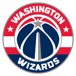
Washington Wizards Primary Logo
Washington Wizards 2015 – Present The new primary logo incorporates the “monument ball” design that has been in place since 2011 in combination with the iconic striping from the team’s uniforms, the three stars that represent D.C., Maryland and Virginia and the team’s wordmark “WASHINGTON” on top and “WIZARDS” on the bottom all in white. Wizards Alternate LogoWizards Wordmark LogoWizards …


