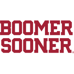
The Oklahoma Sooners logo history reflects a rich tradition of wordmark designs that showcase the team’s identity. This page features every Sooners wordmark logo, highlighting iconic lettering and style changes. It also includes examples of cool Oklahoma Sooners logo designs, showing how typography and branding evolved from early eras to modern updates. Oklahoma Sooners 2018 – Present A slight streamlining …
Oklahoma Sooners Logo History – Alternate Logo Evolution
The Oklahoma Sooners logo history includes a strong lineup of alternate designs that complement the team’s primary identity. This page archives every Oklahoma Sooners alternate logo, including several versions often considered a cool Oklahoma Sooners logo by fans, documented from the earliest designs to today. Oklahoma Sooners 2018 – Present A slight streamlining alteration to the red interlocking initials “OU” …
Oklahoma Sooners Logo History – Primary Logo
This page covers the full Oklahoma Sooners logo history, highlighting every Oklahoma Sooners primary logo from the earliest designs to the modern era. It also showcases each cool Oklahoma Sooners logo, helping fans understand how the program’s visual identity developed through different periods. Oklahoma Sooners 2018 – Present A slight streamlining alteration to the red interlocking initials “OU” mark to …


