The Raiders’ 60th and final season playing in California is being commemorated with a special logo that the team will wear on both its home and away jerseys this season. There’s a lot to unpack with this logo, which will look great on both the white and black uniform tops. The font used for the “60” in the middle of …

Oakland Raiders Logo History – Wordmark Logo
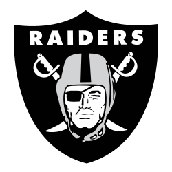
The Oakland Raiders logo stood out with a pirate inside a shield and two crossed swords behind him. It reflected the team’s rough, fearless image. Over decades in Oakland, the design stayed largely the same—earning recognition as one of the NFL’s most iconic and enduring visual identities.Oakland Raiders 1995 – 2019 The Raiders logo continued as a shield that consists …
Oakland Raiders Logo History – Primary Logo
The Oakland Raiders logo is one of the most iconic emblems in football. With its silver-and-black shield, crossed swords, and eye-patched Raider face, it represents toughness and loyalty. Though the team has since moved to Las Vegas, the Oakland Raiders logo still resonates with fans. It remains a powerful part of NFL branding and identity, often seen in vintage merch …