When you take a look at the history of the Baltimore Orioles franchise, the organization has a history that predates the period of time that they moved to Baltimore. Very few individuals knew that the franchise originally was founded in Milwaukee. Long before articles on how to bet on baseball using cryptocurrency were written, the franchise was originally known as …
Tracing the Evolution of the Baltimore Orioles Logo
The Baltimore Orioles, a renowned baseball club, is known for its sportsmanship and captivating logo that resonates with the essence of Maryland. Over the years, the logo has evolved, tracing a rich history alongside the team’s journey. This article delves deep into the history, unearthing the evolution of the Orioles logo, a story that every baseball fan would love to …
Orioles New Ornithologically Correct Bird Logo!
Seven years after reintroducing the cartoon bird as an alternate logo that appeared on the team’s caps, the Baltimore Orioles have gone all-in by making it their primary logo starting in 2019. The logo replaces the Orioles scripted logo with the “Ornithologically Correct Bird” that was first used as an official logo in 1992 to mark the team’s move to …
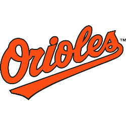
Baltimore Orioles Wordmark Logo
Baltimore Orioles 2019 – Present Smiling black and orange cartoonish oriole wearing a baseball cap sporting the Orioles alternate cap logo. Moved from alternate to primary in 2019. Orioles Alternate LogoOrioles Primary LogoOrioles Team HistoryOrioles Team MerchOrioles Wordmark Logo The Baltimore Orioles are a professional baseball team that has been playing in Major League Baseball since 1901. The team is …
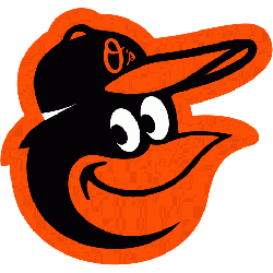
Baltimore Orioles Alternate Logo
Baltimore Orioles 2019 – Present Smiling black and orange cartoonish oriole wearing a baseball cap sporting the Orioles alternate cap logo. Moved from alternate to primary in 2019. Orioles Primary LogoOrioles Wordmark LogoOrioles Team HistoryOrioles Team MerchOrioles Alternate Logo The Baltimore Orioles have a long and storied history with their alternate logos, particularly in relation to the Baltimore Orioles Wordmark …

Baltimore Orioles (Yankees) Primary Logo
Baltimore Orioles 1901 – 1902 The final logo was a change in letters from “O” to a blue block letter “B.” The letter “B” stands for the city of Baltimore.Orioles Team HistoryOrioles Primary Logo The Baltimore Orioles are a Major League Baseball team based in Baltimore, Maryland. They have been around since 1901 and have had several different logos throughout …
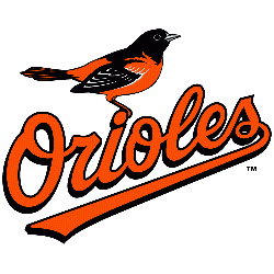
Baltimore Orioles Primary Logo
Baltimore Orioles 2019 – Present Smiling black and orange cartoonish oriole wearing a baseball cap sporting the Orioles alternate cap logo. Moved from alternate to primary in 2019. Orioles Alternate LogoOrioles Wordmark LogoOrioles Team HistoryOrioles Team MerchOrioles Primary Logo The Baltimore Orioles have a long and storied history, dating back to 1901 when they were founded as the Milwaukee Brewers. …