According to Olexiy Ivanov, chief expert of the website about legal casinos in Canada, Casino Zeus, casinos should only be a form of entertainment. There have been fewer institutions in college sports that have provided more quality entertainment than the UCLA Bruins. In this piece, we will discuss the logo history of one of the most significant college institutions in college sports history. The UCLA Bruins have a very storied history and are synonymous with success.
Therefore, we needed to honor the logo history of an institution known for legends such as coach John Wooden, Kareem Abdul Jabbar, Troy Aikman, Russell Westbrook, and Bill Walton.

UCLA Bruins Primary Logo 1964 - 1995
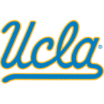
To properly tell the story of UCLA Bruins logo history, we must return to 1964. The UCLA Bruins’ first primary logo was a blue UCLA logo with bright yellow trim. The “A” in the UCLA logo has a long tail that is long that it becomes an underscore for the entire logo. The UCLA wordmark was written in script. This primary logo existed until 1978.
In 1978, the primary logo was still a “UCLA” wordmark. However, the color of the primary logo was switched from blue to yellow. Instead of a yellow trim, a blue shadowy trim could be seen. The “UCLA” is also written in script. However, it was a much thicker script than the first primary logo. This primary logo lasted from 1978 to 1991.

UCLA Bruins Primary Logo 1996 - 2016
In 1991, the institution deviated from only having a “UCLA” wordmark and switched to a “UCLA BRUINS” wordmark. Additionally, the wordmark in this primary logo was written in bold print instead of script. The top half of this primary logo has “UCLA” written in bold yellow print contained within a blue background. The upper half is elongated. Thus, the “UCLA” wordmark takes up most of the logo.
The bottom half of the logo contains the “BRUINS” wordmark. It is written in bold blue print with a white background. The “BRUINS” wordmark is smaller in size. The bottom of the logo contains a bold blue underscore. This logo lasted until 1996.
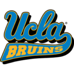
The following primary logo would see the university revert to the script. The logo has a blue bubble-like “UCLA” wordmark written in the script. It also contained yellow trim. This logo is a nod to the first primary logo in UCLA Bruins history, as the “A” in the “UCLA” wordmark contained a long tail extending across the bottom of the logo to serve as an underscore. However, the critical difference is that a yellow “BRUINS” wordmark can be seen across the tail. This logo had much-staying power as it lasted for two decades.
In 2017, UCLA would keep its script format. However, it would purely consist of a “UCLA” wordmark. The color of the script was purely blue and contained no trim at all. However, they removed the long tail connected to the “A” from the previous logo.
Sports Logo History is a community of sports logo enthusiast who enjoys the history of each team’s logo history. Sports Logo History has primary logos, alternate logos, or wordmark logos from the NFL, NBA, MLB, MLS, NHL, Premier League, WNBA, CFL, NCAA, ABA, USFL, AAF, and XFL.
One of our partner sites Sports Team History takes a look at the history of each and every professional sports team. In addition, we have added Sports News History to our sports history websites. 24/7 non-stop sports news that's worth knowing. Finally, the premier sports team marketplace for your favorite team or college with thousands of items for you to peruse at Sports Market History.

