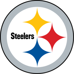
My dad has this old Steelers jacket from 1978. Found it in his closet last Thanksgiving while we were looking for something else entirely. The logo on it looks exactly the same as the one players wear today. Exactly. Forty-six years and not a single change. I held that jacket and thought about how wild that is – in a league where teams rebrand constantly, chase trends, update their look every few years, Pittsburgh just kept the same three diamonds and four stars. That stubbornness turned into something valuable.
The Steelers understood something early that most organizations learn the hard way. Consistency builds recognition. Recognition builds loyalty. Every time another NFL team announces a refresh or modern update, Pittsburgh's unchanged logo gains more power by contrast. Think about brand identity in any industry, really. The companies that resist constant tinkering often end up stronger than the ones chasing every design trend. Some businesses grasp this instinctively – you see it when a casino turnkey solution provider builds their visual identity around timeless elements rather than flashy gimmicks that date quickly. The Steelers took that same approach decades before anyone called it brand strategy. They picked something meaningful and stuck with it through six Super Bowls, countless roster changes, and three different stadiums.
The Accidental Origin Story
 Here's what kills me about the Steelers logo. They didn't even create it themselves. The design came from the American Iron and Steel Institute – it was their industry symbol first, called the Steelmark. Pittsburgh basically borrowed it in 1962 and never gave it back. The original Steelmark used three hypocycloids – those diamond-looking shapes – colored yellow, orange, and blue. Each color represented a specific aspect of steel production. Yellow for coal. Orange for iron ore. Blue for steel scrap. Pittsburgh kept the shapes but made them all one color. Added the word "Steelers" at first, then simplified further.
Most teams would be embarrassed that their logo came from an industry trade group. Pittsburgh turned it into a point of pride. The logo connects the team to the city's identity in ways a custom design never could. It says something about the franchise's origins and who it plays for.
What makes it work visually
|
Design element |
Why it lasts |
|
Simple geometry |
Reproduces perfectly at any size |
|
Limited colors |
No complex gradients to look dated |
|
Asymmetric placement |
Creates visual tension and interest |
|
Industrial reference |
Connects to city identity |
|
Negative space |
Logo breathes instead of feeling cramped |
|
Clean typography |
When text appears, it doesn't compete |
Look at that list, and you see basically a checklist for timeless design. Simple shapes. Meaningful symbolism. Room to breathe. Nothing trendy. Nothing that screams any particular decade.
The right-side-only helmet placement deserves special mention. Pittsburgh remains the only NFL team with its logo on just one side of the helmet. Started as a temporary choice – they wanted to see how the decal looked before committing to both sides – and just never changed. That quirk became part of the identity.
The Franchises that Didn't Learn
You can spot teams that ignored these principles by how often they rebrand. Some franchises have been through their fourth or fifth logo since Pittsburgh last touched theirs. Each redesign costs money, confuses fans, and resets whatever brand equity they'd built.
The worst offenders chase whatever aesthetic happens to be popular. Aggressive angles in the 90s. Gradients in the 2000s. Minimalist flat design in the 2010s. Each choice dates itself within a decade. Pittsburgh's industrial diamonds looked right in 1962, look right now, and will probably look right in 2062. My buddy Marcus collects vintage jerseys. He says Steelers gear holds value better than almost any other team because nothing becomes obsolete. A jersey from 1975 doesn't look like a costume – it looks like a Steelers jersey. That consistency has actual monetary value for collectors and the franchise.
The Deeper Lesson
The Pittsburgh Steelers' logo works because it means something beyond football. The three diamonds connect to steel production. The yellow connects to the city. The one-sided helmet connects to a specific moment in team history. Every element tells part of a story. Contrast that with logos designed purely for aesthetics. They might look cool initially, but don't carry meaning. And meaning is what makes people care enough to tattoo something on their arm or hang a flag outside their house for forty years.
 My dad still wears that 1978 jacket. Not as vintage or throwback – just as his Steelers jacket. The logo hasn't aged out of relevance. The secret isn't really a secret. Pick something meaningful. Make it simple. Have the discipline to leave it alone while everyone else chases whatever looks modern this month. Sixty-plus years later, those three hypocycloids still do exactly what a logo should. They identify. They connect. They endure. Not bad for a borrowed symbol from a steel industry trade group.
===
Sports Logo History is a vibrant community of sports logo enthusiasts who share a deep appreciation for the captivating histories behind each team's logo. We take pleasure in exploring the evolution of primary logos, alternate logos, and wordmark logos from renowned leagues such as the NFL, NBA, MLB, MLS, NHL, Premier League, WNBA, CFL, NCAA, UFL, ABA, USFL, AAF, and XFL. Immerse yourself in the intricate details and stories behind these iconic symbols that represent the essence of each team.
In the enthralling realm of sports, the battle of logos among different leagues unfolds as a captivating and ongoing spectacle. Step into the world of Sports Logo History, where we showcase the relentless pursuit of distinction by leagues such as the NFL, NBA, MLB, Premier League, and countless others. Witness the captivating journey as each league strives to create logos that not only capture the essence of their sport but also resonate deeply with fans.
Immerse yourself in the comprehensive sports history provided by Sports Team History, our esteemed partner site, where you can discover the triumphs, challenges, and defining moments that have shaped the legacies of professional sports teams. Stay up to date with the latest sports news through Sports News History, a platform delivering 24/7 coverage of highlights, player interviews, and game analyses. Additionally, express your unwavering support for your favorite teams by exploring Sports Store History, the premier sports team marketplace offering a vast selection of jerseys, memorabilia, and collectibles. Join our community today and celebrate the rich history, iconic logos, and passion of sports.

