The Los Angeles Kings, a professional ice hockey team based in Los Angeles, California, recently unveiled a new primary logo. This significant evolution in the team's visual identity marks a new era in the team's history, blending elements of nostalgia with a fresh, modern aesthetic. The new logo draws inspiration from the classic 1988 logo, yet incorporates subtle differences that modernize the design, reflecting elements from all eras of Kings hockey.
Evolution of the Logo
The Los Angeles Kings have had a long and storied history with their primary logo. It all started in 1967 when the team was founded, and they adopted an iconic purple-and-gold shield logo featuring a crown at its center. This symbolized the city of Los Angeles's regal status and the team's commitment to excellence on the ice.
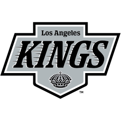
In 1988, the Kings' logo underwent a drastic change. Gone was the purple and gold, replaced by a black-and-silver version of their previous logo. The change coincided with the acquisition of NHL icon Wayne Gretzky, and their new colors matched those of another Los Angeles team, the Raiders.
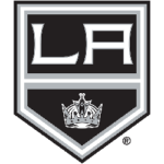
The new primary mark for the Kings draws inspiration from the classic 1988 logo, yet incorporates subtle differences that modernize the design. The overall shape has been expanded by widening the vertical section, providing space for a larger LOS ANGELES text and a more prominent crown.
Design Elements

The Los Angeles Kings' new primary logo blends the team's rich history and modern aesthetics. It draws inspiration from the classic 1988 logo, most closely associated with the Kings' great Wayne Gretzky, yet incorporates subtle differences that modernize the design.
The new logo is a reimagined version of the iconic logo the Kings used from 1988 to 1998. It now features an updated version of the original King's Crown, introduced in its inaugural season in Los Angeles in 1967.
This crown design replaces the '90s crown, adding a touch of nostalgia to the modern brand identity. The logo's overall shape has been expanded by widening the vertical section, providing space for a larger LOS ANGELES text and a more prominent crown.
Other small details have been slightly updated, including the angle of the sides and the font used for "Los Angeles." The color palette has also been updated, featuring a new 'enhanced silver,' which will be showcased on the club's new jerseys.
The design preserves the moving word "Kings" and all the other elements of its predecessor, the Los Angeles Kings logo introduced in 1988. However, due to a modified color palette, it looked very different.
The Los Angeles Kings' new primary logo harmoniously blends the team's rich history and modern aesthetics. It pays homage to the team's past while embracing a contemporary aesthetic, symbolizing the Kings' spirit and signaling a promising future for the franchise.
Fan Sentiment
The unveiling of the Los Angeles Kings' new primary logo has sparked a range of reactions from fans and the broader hockey community. The new logo, which draws inspiration from the classic 1988 logo, has been met with nostalgia and excitement for the fresh take on the classic design.
Many fans have expressed a fondness for the original Kings logo from the 1980s and 1990s, and the return of vintage elements has garnered attention and anticipation among fans. However, some fans have expressed disappointment over the absence of the team's original purple and gold colors in the new design. One fan wrote, "Maybe could've added a little purple, but not too bad. It doesn't matter what the team colors are. Winning and the front of the jersey are more important."
Another fan echoed this sentiment: "I like it, but why no purple and gold?" Despite the mixed reactions, most responses to the Los Angeles Kings' logo change have been positive. Fans have appreciated the nod to the team's history, with one fan stating, "Past. Present. Future. Forever," reflecting that the new logo successfully encapsulates the team's rich legacy.
However, some fans have also used the rebranding to voice their hopes for the team's performance. One fan humorously asked, "Will the rebrand win you a playoff series?" indicating that while the new logo is essential, the team's performance on the ice truly matters to the fans.
Overall, the new logo has sparked a lively discussion among fans, reflecting their deep connection to the team's history and hopes for its future.
Rebranding

The Los Angeles Kings have recently unveiled a new primary logo as part of a significant brand evolution. This rebranding process, which took two years to develop, reflects the club's substantial legacy and is a pillar brand that will carry the hockey club into its long-term future.
The new primary logo draws inspiration from the classic 1988 logo, which debuted when the Kings acquired Wayne Gretzky. However, it incorporates subtle differences that modernize the design.
The logo is a modern take on the iconic design from 1988 to 1998 and includes an updated version of the original "Kings Crown" from their first season.
This rebranding is a strategic move to invigorate the team's image while paying homage to memorable eras. The new primary mark blends classic design cues with contemporary aesthetics, connecting the team's past with a modern aesthetic.
The rebranding initiative is part of a broader marketing strategy to communicate with the fan base and beyond, acknowledging the original logo's crossover appeal that extended to a broad audience.
The evolution of the team's visual identity reflects its journey from the original purple-and-gold shield logo to the current black-and-silver design, capturing the essence of its heritage and the spirit of the community.
Wrap Up
In summary, the new Los Angeles Kings logo represents a harmonious blend of tradition and innovation. It symbolizes the team's commitment to its legacy while embracing a fresh chapter in its visual identity. The logo's design and color scheme reflect the team's unique heritage and connection to the Los Angeles community. As the team moves forward, this new logo will symbolize the Los Angeles Kings' enduring spirit and passion for the game of hockey.
___
Sports Logo History is a vibrant community of sports logo enthusiasts who share a deep appreciation for the captivating histories behind each team's logo. We take pleasure in exploring the evolution of primary logos, alternate logos, and wordmark logos from renowned leagues such as the NFL, NBA, MLB, MLS, NHL, Premier League, WNBA, CFL, NCAA, ABA, USFL, AAF, and XFL. Immerse yourself in the intricate details and stories behind these iconic symbols that represent the essence of each team.
In the enthralling realm of sports, the battle of logos among different leagues unfolds as a captivating and ongoing spectacle. Step into the world of Sports Logo History, where we showcase the relentless pursuit of distinction by leagues such as the NFL, NBA, MLB, Premier League, and countless others. Witness the captivating journey as each league strives to create logos that not only capture the essence of their sport but also resonate deeply with fans.
Immerse yourself in the comprehensive sports history provided by Sports Team History, our esteemed partner site, where you can discover the triumphs, challenges, and defining moments that have shaped the legacies of professional sports teams. Stay up to date with the latest sports news through Sports News History, a platform delivering 24/7 coverage of highlights, player interviews, and game analyses. Additionally, express your unwavering support for your favorite teams by exploring Sports Store History, the premier sports team marketplace offering a vast selection of jerseys, memorabilia, and collectibles. Join our community today and celebrate the rich history, iconic logos, and passion of sports.

