The Los Angeles Chargers boast a vibrant and dynamic visual identity that has transformed substantially. Each logo in the franchise's history not only showcases the evolving design trends of the times but also encapsulates the team's unique identity within the competitive landscape of the NFL. From its inception in 1960 to the present day, the Chargers have navigated various phases of branding that mirror changes in culture, aesthetics, and fan expectations.
Logos are vital to a team's identity and a symbol of pride and recognition for fans. For the Chargers, each iteration of their logo has been significant, reflecting shifts in the franchise’s direction and the broader trends in sports branding. Today, we will examine and rank the Chargers' primary logos based on their design impact, fan reception, and cultural significance. Don't forget https://renomowanekasyno.pl/kasyno-online/, which has gained immense popularity recently, offering players various games and exciting promotions from the comfort of their homes.
As we explore this journey through the Chargers' logo history, we will consider how each design represents the team at a specific point in time and resonates with the fans who support them. From the classic simplicity of early designs to the modern, bold aesthetics of recent logos, the evolution of the Chargers' branding is a fascinating reflection of their storied legacy and enduring presence in the NFL. Join us as we delve into the rich tapestry of the Chargers' visual identity and rank their primary logos in terms of their impact and significance.
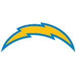
1. Current Logo (2017 - Present)
Description: The current logo features a bold, modern design with a bright blue shield and a striking yellow lightning bolt.

Impact: This logo beautifully merges tradition with a contemporary aesthetic, capturing the vibrant energy of Los Angeles. It resonates with new and long-time fans, standing out as a clean and memorable team representation. The design has successfully revitalized the Chargers' identity as they continue to make their mark in the league.
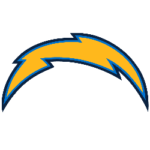
2. Navy Blue and Gold Logo (2007 - 2016)
Description: This logo showcases a gold lightning bolt set against a navy blue background, highlighting the team’s classic colors.
 Impact: Well-received by fans, this logo paid homage to the Chargers' rich history while balancing modernity and tradition. It effectively represented the team during its time in San Diego and its early years in Los Angeles, cementing its place in the hearts of many supporters.
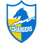
3. The Classic Logo (1960 - 1973)
Description: This logo features a simple yet iconic design of a lightning bolt accompanied by the word "Chargers."
 Impact: This fan-favorite logo evokes nostalgia for the team’s early years. Its simplicity and boldness have made it a beloved symbol of the franchise’s identity, representing the essence of the Chargers during a formative period in their history.
4. The Original Bolt (2002 - 2007)
Description: The initial lightning bolt logo introduced in 2007 was undoubtedly less vibrant than the current design.
 Impact: Although this logo aimed to modernize the Chargers' image, it became somewhat cluttered and less impactful. Fans generally regard it as one of the weaker designs in the franchise’s history, lacking the clarity and strength of the logos that came before and after it.
5. The Minimalist Logo (1974 - 1987)
Description: A cleaner, more straightforward lightning bolt design on a helmet aimed at a minimalist approach.
 Impact: While this logo took a step towards simplicity, it lacked the dynamic flair of its predecessors. Often viewed as a transitional design, it is less memorable than other logos in the franchise's history, marking a period of experimentation in the team's branding.
Wrap up
The primary logo history of the Los Angeles Chargers is a fascinating narrative that encapsulates the team’s journey and adaptation over the decades. Each logo is a visual marker of a distinct era in the franchise's evolution, reflecting the changing design trends and the shifting dynamics of the NFL and its fan culture. Through each iteration, the logos have highlighted the Chargers' enduring connection with their dedicated fan base, embodying the spirit and passion that the team inspires.
From their original designs to today's modern aesthetics, each logo carries a story of resilience and transformation. The Chargers have navigated various challenges and milestones, and their logos have often mirrored these experiences. They represent more than just a team; they signify a community of fans who rally around the emblem, symbolizing their loyalty and pride. This deep connection is crucial as it fosters a sense of belonging and identity among supporters, making the Chargers not just a team but a significant part of their lives.
As we look back at the evolution of the Chargers' logos, it's evident that they have played a pivotal role in solidifying the team's identity within the NFL. Each design has contributed to the franchise's brand recognition, making the Chargers a cherished team among football enthusiasts. The iconic lightning bolt has become synonymous with the franchise, capturing the essence of speed, agility, and excitement that defines Chargers football.
As the franchise evolves, it is intriguing to speculate about future designs representing this iconic team. Will they draw upon the rich history of their past logos, or will they pave the way for an entirely new visual identity? One thing is sure: the Chargers' logo will continue to be a vital aspect of their brand, reflecting not just the team’s legacy but also its aspirations for the future. As the NFL landscape changes, the Chargers will undoubtedly adapt, and their logos will remain a powerful symbol of their journey, resilience, and connection to fans.
___
Sports Logo History is a vibrant community of sports logo enthusiasts who share a deep appreciation for the captivating histories behind each team's logo. We take pleasure in exploring the evolution of primary logos, alternate logos, and wordmark logos from renowned leagues such as the NFL, NBA, MLB, MLS, NHL, Premier League, WNBA, CFL, NCAA, UFL, ABA, USFL, AAF, and XFL. Immerse yourself in the intricate details and stories behind these iconic symbols that represent the essence of each team.
In the enthralling realm of sports, the battle of logos among different leagues unfolds as a captivating and ongoing spectacle. Step into the world of Sports Logo History, where we showcase the relentless pursuit of distinction by leagues such as the NFL, NBA, MLB, Premier League, and countless others. Witness the captivating journey as each league strives to create logos that not only capture the essence of their sport but also resonate deeply with fans.
Immerse yourself in the comprehensive sports history provided by Sports Team History, our esteemed partner site, where you can discover the triumphs, challenges, and defining moments that have shaped the legacies of professional sports teams. Stay up to date with the latest sports news through Sports News History, a platform delivering 24/7 coverage of highlights, player interviews, and game analyses. Additionally, express your unwavering support for your favorite teams by exploring Sports Store History, the premier sports team marketplace offering a vast selection of jerseys, memorabilia, and collectibles. Join our community today and celebrate the rich history, iconic logos, and passion of sports.

