The Minnesota Timberwolves have had several logos since their inception in 1989. Each logo reflects the team's evolving identity and visual branding. Here’s a ranking of these logos from best to least favored, along with explaining why each ranks where it does.
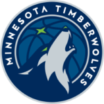
1. 2017 – Present: The North Star and the Future
 The current logo, introduced in April 2017, is the pinnacle of the Timberwolves' branding evolution. Designed by Rodney Richardson of RARE Design, this emblem skillfully integrates the ball, the wolf’s head, and the team’s name alongside new elements like the green North Star. The blue wolf, depicted in profile with an open mouth, signifies courage and energy, while the green eyes and North Star represent Minnesota's natural environment.
This logo ranks highest because it combines modern design elements with historical symbolism, creating a dynamic and forward-looking identity for the team. For fans and enthusiasts involved in Timberwolves betting, this modern and dynamic emblem represents not just the team’s identity but also their potential and excitement for the future.
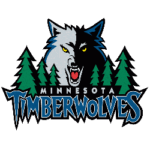
2. 1997 – 2008: The Fierce Wolf Emerges
 In 1997, the Timberwolves unveiled a fierce and emotionally charged logo designed by Peter Thornburgh. The grinning wolf, complete with sharp fangs and a black outline, emerged from the shadows. Green trees flanking the wolf's head symbolized Minnesota's natural landscape, and the stylized font with sharp serifs for the team’s name added to the aggressive look. This logo ranks second because of its intense and confident portrayal of the team’s spirit, effectively capturing their competitive essence during that era.
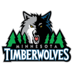
3. 2009 – 2017: Modernization and Refinement
 The 2009 logo iteration retained the core elements of the previous design while introducing subtle refinements to achieve a more modern appearance. The gray wolf with white spots and black outlines appeared polished and contemporary. The trees were rendered paler green, and the “Timberwolves” inscription was white with a blue-black stroke. These changes reflected advancements in graphic design and the team's desire for a more contemporary look. While this logo maintained the fierce and bold essence of the Timberwolves, it lacked some of the raw intensity of its predecessor, ranking it third.
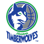
4. 1990 – 1996: The Original Emblem
 The original logo, introduced in 1990 and designed by Mark Thompson, laid the foundation for the Timberwolves' branding. It featured a wolf's head against a gray basketball with blue and green contours. The pale green glow in the wolf’s eyes indicated hidden hostility, fitting the team’s fierce spirit. The club's name appeared beneath the circle, with "Minnesota" in a handwritten style and "Timberwolves" in a sans-serif font. This design ranks last because, while iconic and memorable, it appears simplistic compared to subsequent iterations, lacking the dynamic and modern elements that later logos incorporated.
Wrap Up
The Minnesota Timberwolves logos have evolved significantly, reflecting the team’s growth and identity. The current logo stands out for its modernity and symbolic depth, while earlier versions capture the team's fierce spirit and evolving confidence. Each logo marks a distinct chapter in the Timberwolves' history, contributing to their enduring legacy and connection to Minnesota. This ranking highlights the strengths and weaknesses of each design, showcasing the team's journey through visual branding.
___
Sports Logo History is a vibrant community of sports logo enthusiasts who share a deep appreciation for the captivating histories behind each team's logo. We take pleasure in exploring the evolution of primary logos, alternate logos, and wordmark logos from renowned leagues such as the NFL, NBA, MLB, MLS, NHL, Premier League, WNBA, CFL, NCAA, ABA, USFL, AAF, and XFL. Immerse yourself in the intricate details and stories behind these iconic symbols that represent the essence of each team.
In the enthralling realm of sports, the battle of logos among different leagues unfolds as a captivating and ongoing spectacle. Step into the world of Sports Logo History, where we showcase the relentless pursuit of distinction by leagues such as the NFL, NBA, MLB, Premier League, and countless others. Witness the captivating journey as each league strives to create logos that not only capture the essence of their sport but also resonate deeply with fans.
Immerse yourself in the comprehensive sports history provided by Sports Team History, our esteemed partner site, where you can discover the triumphs, challenges, and defining moments that have shaped the legacies of professional sports teams. Stay up to date with the latest sports news through Sports News History, a platform delivering 24/7 coverage of highlights, player interviews, and game analyses. Additionally, express your unwavering support for your favorite teams by exploring Sports Store History, the premier sports team marketplace offering a vast selection of jerseys, memorabilia, and collectibles. Join our community today and celebrate the rich history, iconic logos, and passion of sports.

