Originally known as the Titans of New York, the Jets are now home to a franchise committed to the rebuild and reclaiming its dominance in the NFL. Over the years, the primary logos have remained relatively unchanged, but they have evolved to reflect the times throughout their history. Knowing how the logos have evolved will give you a better understanding of the team’s history and key milestones in the timeline.
Although the changes have been subtle, they are worth noting to gain a good understanding of the organization’s history.

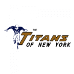
The Titans of New York Primary Logo 1960 - 1962
As we previously stated, the Jets used to be known as the Titans of New York. This was a drastically different logo with navy blue and gold coloring. It featured a running football player with the script right next to it. This was the only logo in the team’s history not to feature some shade of green. This makes sense because the Jets have been the Jets ever since.
Although this name and logo only lasted two years, they remain an essential part of the team’s history. If you ever hear of the Titans that are not from Tennessee, know it was this franchise.

New York Jets Primary Logo 1963
Right after, in 1963, the New York Jets monicor was born. They nailed home the franchise change by making the primary logo quite literally a jet. This is also the first time the green color has been introduced into the brand.
The airplane was solid green with white “Jets” inside the body. Ironically, the one year this logo was in place would be the first and only time the primary logo featured an actual jet.
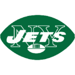
There were several changes to the primary logo early on, but they were all very subtle. In 1964, a significant change occurred as the oval, football-like shape was introduced. This would ultimately prove timeless for the organization and continues to this day. The main differences came in the colors and what is within the football shape.
The first football shape design featured a thin green outline filled with white. The NY Jets script was green and contrasted nicely against the white. In 1967, we saw the first variation that best resembles the current primary logo.
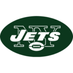
This design took the previous and inverted the colors. This would feature a green background with white script and accent. Although it only lasted two years, this is the primary logo's inspiration.

New York Jets Primary Logo 1967 - 1977
In the meantime, there were some subtle changes, with only one significant change occurring between 1967 and now. This primary logo change took place in 1978 and lasted nearly 20 years. For the first time since 1964, the franchise ditched the football shape and opted for an updated design.
This build is also the closest the logo has come to being an actual jet, although it is very subtle. The font changed, and the bold background was dropped entirely. The 1978-1997 logo featured a blog “Jets’ script in green with a small jet wing over the “ETS.” This was an immaculate design that kept it simple and had less noise than the previous one. Of all the logos, this had the second-longest reign, so many hardcore fans will likely remember the Jets with this logo.

New York Jets Primary Logo 1998 - 2018
In 1998, the change was significant as the Jets rebranded that iconic football style logo to fit the modern organization. The changes were minimal, but significant compared to what they had been doing the year before.
This logo was essentially the same as the 1977 design, featuring a darker green and a slightly crisper appearance. This ended up being the longest-lasting logo in the team’s history.
Although the Jets have worn the same green nearly since the team's inception in 1960, 2018 and the start of 2019 brought a slightly different colorway to the brand. The new green is known as Gotham green, which is somewhat different from the shades in the past.

New York Jets Primary Logo 2019 - Present
The biggest change with the current logo is the removal of “NY” from the background, making New York stand out even stronger. Although they are based in New Jersey, the Jets still identify with New York and have a fan base that spans much of that area.
They have also updated the inner football. Although the entire logo is shaped like a football, there is also a football within the logo itself.
Shortly after updating the logo slightly to fit modern times, the organization also announced some uniform changes. This altered the color scheme slightly to complement the logo effectively. This change was also a statement of the team's rebirth as they attempt to return to a winning culture.
“We’ve got the young quarterback, we’ve got the new coach, the theme of this team is ‘Take Flight.’” CEO Christopher Johnson said in a statement. “We’re ready to enter a new era. I think that this new uniform symbolizes that.”
Although a logo and a uniform scheme are not nearly the same things, they are closely related. The slight rebranding of the team is coming at a good time in the grand scheme of things. The Jets have not had a winning record since 2015, and it was 2010 before that. After rocking a 2-14 record in the 2020 season, the Jets have made offseason moves to try to get the organization back on track.
With the recent logo change and even more recent jersey alteration, the New York Jets are attempting to forge their future and reclaim the “Titans of New York” moniker in a new way.
The 2021 season will feature the updated logo on new and improved jerseys, accompanied by some new names and fresh faces.
See the New York Jets logo history and team history.
The $17 Million Caitlin Clark Effect: How One Rookie Changed the WNBA Forever
Visit Our YouTube Channel
