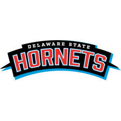
Delaware State Hornets
Arched wordmark "DELAWARE STATE" in white above larger wordmark "HORNETS" in red with blue and white outlines, all on a curved black ribbon with `spikes` at each end and a blue drop shadow background.
Howard Bison
A wordmark "HOWARD" in red and "BISON" in a custom font in blue.
The wordmark Bison typeface features horns at both ends.
Maryland Eastern Shore Hawks
A interconnected and locked initials "MES" with the letter "M" in maroon and the letters "ES" in grey with black trim.
Morgan State Bears
A custom wordmark "MORGAN STATE" in orange on a black background and "BEARS" in white on a blue background all with a gold outline.
North Carolina Central Eagles
The initials "NCCU" and a wordmark "EAGLES" in maroon with black trim above another wordmark "NORTH CAROLINA CENTRAL UNIVERSITY" in black on a grey background.
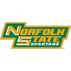
Norfolk State Spartans
A wordmark "NORFOLK STATE" in gold with white highlights on the first letter and "SPARTANS" in white on a green with gold trim background.
MEAC Logo History for Wordmark Logos
The MEAC logo system includes wordmark designs for clear text identification. Therefore, MEAC teams used these wordmarks across official platforms. Each Mid-Eastern Athletic Conference logo wordmark followed consistent standards. As a result, MEAC teams wordmark logos remained readable and uniform.
Over time, MEAC teams wordmark logos reflected typography trends of their eras. Meanwhile, some designs simplified lettering. Others refined spacing or alignment. Moreover, the MEAC logo history shows steady refinement. Each Mid-Eastern Athletic Conference logo wordmark fit its period.
This page presents all official wordmark logos used by Mid-Eastern Athletic Conference from the beginning to today. Overall, it serves as a clear reference. For conference background, visit MEAC Wikipedia. In addition, explore symbols on the MEAC Teams Primary Logo Page.

