Manchester United is the name with which many people are already familiar. It is a name cheered by millions of followers who watch the game from the stadium or at home. They have a rich history, and you should be aware that their logo has played a significant role in their marketing efforts. Manchester United was founded in 1878 by Newton Heath and the Lancashire Railway. The club has a rich history that has helped it become a global sports identity.
Like today, there is almost no one who cannot recognize the team. You can show the logo or crest of MU, and they will tell you about it. The logo is now present on wallets, car keys, wallpapers, car images, and so much more. However, you must know that, like any other logo, it has also undergone multiple changes over time. Today, the crest that we love has undergone many modifications, which we proudly display as our screensaver.
The long history of the Manchester United Logo
1878 - 1891

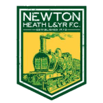
Manchester United FC Primary Logo 1878 - 1891
Back then, the name Manchester United had not yet been decided. The club’s first crest had two iconic colors, yellow and green. And, if you follow this club, you might know that these colors have been on the crest up to now. Back then, it was a simple logo with the club name and showcased the club founders.
1891 - 1902
The club, until this time, was still known by its founder's name, Newton Heath. This time, the logo was simplified by incorporating a football. They removed the train and club name, and the year was in the logo. Of course, this logo was primarily about the club's ownership.
1902 - 1960

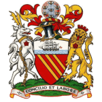
Manchester United FC Primary Logo 1902 - 1943
In 1902, the club underwent some changes and was in debt. At this time, stakeholders were appointed, and they all invested 500 pounds in the club. Now, the ownership was not only in the hands of Heath, but the name and logo were about to change. Owing to the debt, the club's name was changed to Manchester United. Just as its name suggests, the logo incorporates several key elements related to the city.
Being a dominant city in world trade, the Manchester ship became part of the crest. There was a lion that showed the Roman Hamlet and three yellow stripes, which were the rivers.
1960 - 1970
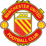
The 1960s crest was the first one made that resembles the logo as it is today. Even the shape and color scheme take us back to this time. But, it did not have a yellow color; it still featured the crucial elements of the previous logo. However, it was marketed with simple wording that read 'Manchester United Football Club'.
1970 - 1973

Manchester United FC Primary Logo 1970 - 1973
The fifth logo features some slight modifications. For the first time, it contained the yellow color, which made the crest more potent than ever. The ship and the three stripes were still part of it. But two footballs were added this time.
1973 - 1998
This logo introduced the Red Devil, a familiar figure to us all. It was a nickname for the club that gained considerable popularity worldwide. It was a name under the legendary Matt Rubsy. It was meant to be an exciting yet intimidating name for the opponents. The three stripes were removed and have not become part of the logo since then.
1988 - present

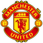
Manchester United FC Primary Logo 1998 - Present
This was the final logo that we are all familiar with. It is the logo we see on the club kits. It closely resembles the 1973 edition but has several modifications. There is no doubt that it now has a modern and sleek look. The logo has not changed for the past 23 years. Unlike the other clubs, the Manchester United logo was a powerful marketing tool for the club. And, it is hard to imagine that the logo will be changed anytime soon.
Font and color of the Manchester United logo
It has a simple Sans-Serif font used in the current and previous editions. The logo has been quite minimalist since its inception, and today it represents Manchester United even without any words. Since the beginning, the two primary colors of the logo have been red and yellow. White and black are used as auxiliary colors in the logo.
___
Sports Logo History is a vibrant community of sports logo enthusiasts who share a deep appreciation for the captivating histories behind each team's logo. We take pleasure in exploring the evolution of primary logos, alternate logos, and wordmark logos from renowned leagues such as the NFL, NBA, MLB, MLS, NHL, Premier League, WNBA, CFL, NCAA, UFL, ABA, USFL, AAF, and XFL. Immerse yourself in the intricate details and stories behind these iconic symbols that represent the essence of each team.
In the enthralling realm of sports, the battle of logos among different leagues unfolds as a captivating and ongoing spectacle. Step into the world of Sports Logo History, where we showcase the relentless pursuit of distinction by leagues such as the NFL, NBA, MLB, Premier League, and countless others. Witness the captivating journey as each league strives to create logos that not only capture the essence of their sport but also resonate deeply with fans.
Immerse yourself in the comprehensive sports history provided by Sports Team History, our esteemed partner site, where you can discover the triumphs, challenges, and defining moments that have shaped the legacies of professional sports teams. Stay up to date with the latest sports news through Sports News History, a platform delivering 24/7 coverage of highlights, player interviews, and game analyses. Additionally, express your unwavering support for your favorite teams by exploring Sports Store History, the premier sports team marketplace offering a vast selection of jerseys, memorabilia, and collectibles. Join our community today and celebrate the rich history, iconic logos, and passion of sports.

