The Premier League is widely regarded as one of the most competitive leagues in the world within the football fraternity. Since England’s top-flight division came into fruition in 1992, the Premier League has been a branding man’s dream.

Premier League Primary Logo
The Premier League has an inherently strong visual identity, embodied by the lion, which symbolizes power and courage.
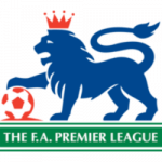
In its early days, the Premier League featured a blue heraldic lion perched proudly on top of a football, with a horizontal line beneath its paw and a green and white banner.
The green background is intended to represent the field of play, and the logo quickly resonated with fans worldwide.
What has been apparent over the past 15 years is that the Premier League’s interest has grown worldwide, and the league consistently makes for compelling viewing. As a marketing tool, it has been expertly used to expand its reach.
Although the Premier League is an English competition, its demand worldwide is insatiable. Whether it is Africa, Asia, or outposts in Europe, fans will don the colors of their favorite Premier League team in the streets.

And the same can be said of Australia; there is a considerable following. Part of this is because Australians have had a history of playing in the Premier League, including Harry Kewell and Mark Viduka. The best betting sites in Australia, for example, will regularly run a plethora of markets for all the games, and some will have a live stream, so fans can watch games when they are on the move.
In any case, the Premier League’s logo has become a standout feature, and one of the most fascinating aspects about it is that it hasn’t had a sponsor emblazoned on it.
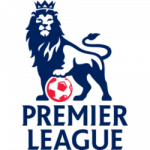
From 2007, some distinct changes were made. The logo was redrawn, with the lines and contours of the badge featuring a red and blue hue, and the lion turned its head to face everyone watching it.
The wordmark was now placed directly under the graphical part of the logo, and the sleek typeface made the logo more vibrant.
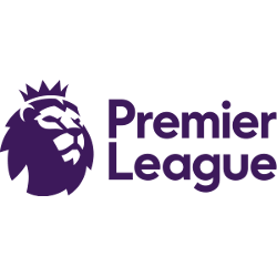
Five years ago, the Premier League logo was given another makeover. The emblem is highlighted in purple to give it a more cutting-edge feel. It was also the first time that the logo didn’t contain a red and white football.
Nevertheless, the Premier League has never strayed too far from its roots, and it has always been true to itself.
Separately, the logos of Premier League clubs have had subtle changes, most notably at Chelsea and Manchester City.

Barclays currently sponsors the Premier League, although it is unclear whether a new sponsor will come on board after Barclays’ deal expires in 2022.
What can be said is that the Premier League logo is one of the most iconic in club football.
The lion will always be a fundamental part of the logo, so if any changes are planned to enhance it, these are more likely to be minor tweaks. The Premier League has shaken up English football in a way few could have possibly imagined, and the logo will always be inextricably tied to its history.
___
Sports Logo History is a vibrant community of sports logo enthusiasts who share a deep appreciation for the captivating histories behind each team's logo. We take pleasure in exploring the evolution of primary logos, alternate logos, and wordmark logos from renowned leagues such as the NFL, NBA, MLB, MLS, NHL, Premier League, WNBA, CFL, NCAA, UFL, ABA, USFL, AAF, and XFL. Immerse yourself in the intricate details and stories behind these iconic symbols that represent the essence of each team.
In the enthralling realm of sports, the battle of logos among different leagues unfolds as a captivating and ongoing spectacle. Step into the world of Sports Logo History, where we showcase the relentless pursuit of distinction by leagues such as the NFL, NBA, MLB, Premier League, and countless others. Witness the captivating journey as each league strives to create logos that not only capture the essence of their sport but also resonate deeply with fans.
Immerse yourself in the comprehensive sports history provided by Sports Team History, our esteemed partner site, where you can discover the triumphs, challenges, and defining moments that have shaped the legacies of professional sports teams. Stay up to date with the latest sports news through Sports News History, a platform delivering 24/7 coverage of highlights, player interviews, and game analyses. Additionally, express your unwavering support for your favorite teams by exploring Sports Store History, the premier sports team marketplace offering a vast selection of jerseys, memorabilia, and collectibles. Join our community today and celebrate the rich history, iconic logos, and passion of sports.

