Logos do play quite a significant part in communicating the history and the passion for sporting teams. It is quite common for players to celebrate by kissing the badge in front of their fans as a pure expression of love and passion for the club. Simply put, logos are an essential part of a club’s art, history, and inspiration.
Now, just like several other sporting clubs, the Tennessee Titans logo has a history of its own. Since the club launched in 1960 as Houston Oilers, its logo has undergone significant changes in both design, color, and symbols. These changes have been sparked by many factors aimed at improving the team’s image and spirit. To have a clear understanding of the Tennessee Titans logo, let’s delve a bit into some history.
The Beginnings in the 1960s
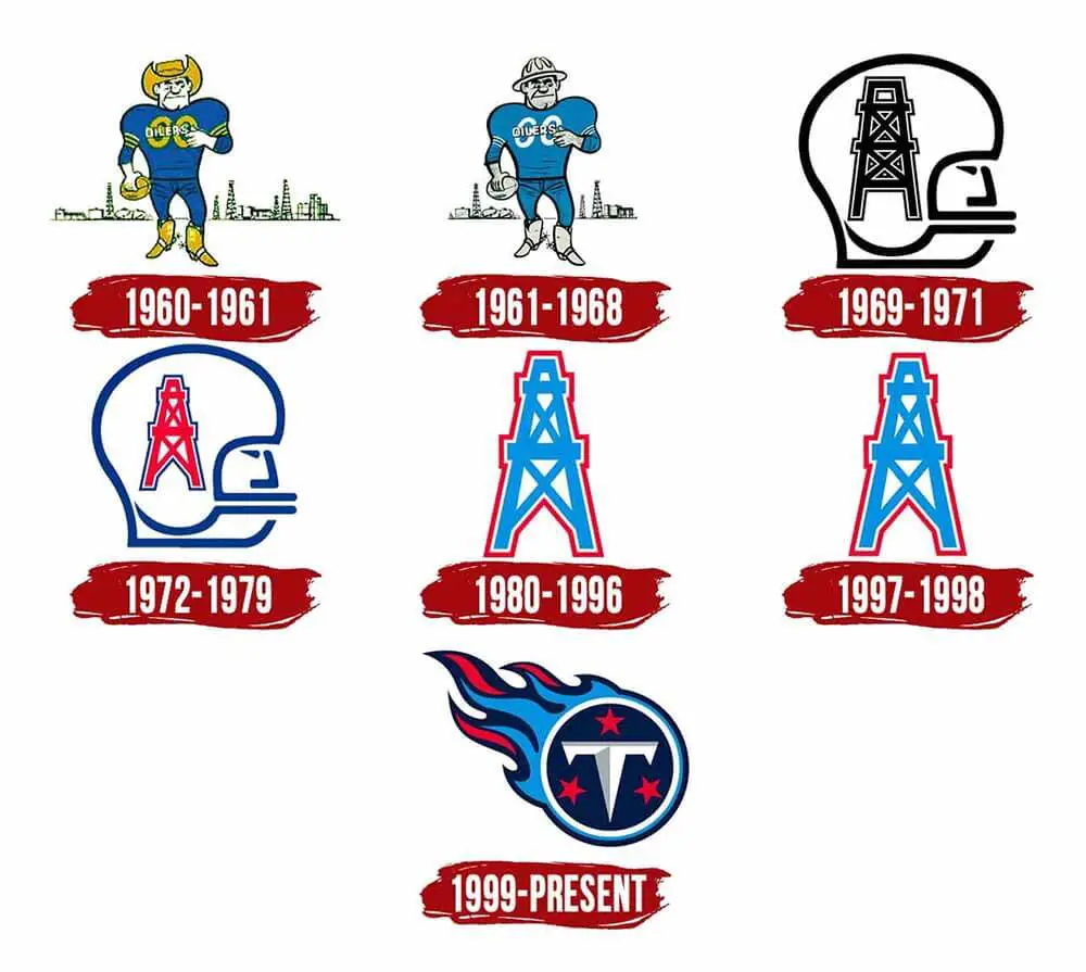
The 1960s logo is the debut logo for Tennessee Titans. It is remembered in their history as the first logo the team wore on the field in Houston, Texas. At that time, the name Tennessee Titans were not yet coined and the team was formerly referred to as Houston Oilers. This debut logo featured a man who appeared as both a footballer and a cowboy. The football player on this logo is wearing a gold-colored hat and boots, blue uniform, and is holding a ball in his hand. A closer look at the logo shows the background with oil derricks. In the late 1960s, minor changes were made to the original logo especially on color schemes. The gold is a notable elimination in the subsequent strings of changes.
 Sports Logo History
 The Formation of the Oilers Rig
1969 marked a major change to the original logo of the team. While the old logo had undergone a series of minor alterations, the cowboy on the logo was not yet removed. However, the 1969 logo for this NFL team ushered a new decade with a major revamp. The cowboy symbol was replaced by a silhouette of a football player’s helmet with black boundaries. Inscribed in the silhouette was an oil derrick. The initial oil derrick was black but a string of changes was made in 1972. The 1972 version was still the same version of 1969 except for the color. The black silhouette boundary and the oil derrick were painted blue and red respectively. It is fair to say that the 1972 version looked less dull and more eye-catchy than the 1969 version.
The Classic Oilers Rig
Judging from the 1970’s development, it looked like Tennessee Titans were going to usher in a new decade in style. As you would predict, the Titans didn’t fail either. They welcomed a new decade with a new logo. Unlike a variety of the previous versions, this 1980s logo was simple yet symbolic. No wonder the Titans didn’t drop this logo for 18 years. Unlike the 1970’s version, the new logo did not get rid of the silhouette of the oil derrick. This oil derrick was largely blue on its white background while the outline was painted with a red color. There were no major changes to the 1980s version all through to the 1990s. The only noticeable change was the blue that was made more saturated. Otherwise, every other thing remained pretty much the same.
The New Titans
The 1980’s logo remained largely unchanged for 18 years. It survived the 80’s and nearly the entire 90’s. With the change of nickname to The Tennessee Titans in 1999, the need for a new logo became inevitable. A new logo was needed to go in tandem with the new nickname as was the case with some of the most valuable teams in the world. Initially, the team played in Houston, Texas, and were referred to as the Houston Oilers. However, the relocation to Tennessee in 1997 made them change their name to Tennessee Oilers. The name was then fine-tuned to Tennessee Oilers in 1999 and has since remained unchanged.

Tennessee Titans Primary Logo 1999 - Present
The 1999 version of the Tennessee Titans logo saw the introduction of a white ring and three stars inside of it. There is also a large letter “T” symbol inside the dark blue background. The white ring symbolizes the sun while the letter “T” reminds the Titans of the sword. The ring has a tail that resembles fire. This burning tail has white edges and a mix of dark blue, light blue, and red flames. This fire makes the logo appear like a comet. While scores of Titans fans fell in love with the creative design of the 1999 and current logo, some are skeptical about it. For example, there is a section of fans who think the logo symbolizes defense rather than attacking. Since 1999, the Tennessee Titans haven’t changed their logo.
Wrap up
We hope you now know a thing or two about the history of the Tennessee Titans logo. Well, it is easy to see how much a logo means to every club. Over the years, a string of changes has been made to the original Tennessee Titans logo version. Whether it is total or partial revamp, the club has always ensured that the logo delivers better communication about the club’s history, desire, and ambition!
See the Tennessee Titans logo history and team history.
Sports Logo History is a community of sports logo enthusiast who enjoys the history of each team’s logo history. Sports Logo History has primary logos, alternate logos, wordmark logos, or concept logos from the NFL, NBA, MLB, MLS, NHL, Premier League, WNBA, CFL, NCAA, ABA, USFL, AAF, and XFL.
Our partner site is Sports Team History takes a look at the history of each and every professional sports team. In addition, we have added Sports News History to our sports history websites. 24/7 non-stop sports news that's worth knowing.

