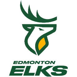
For the past 50 years, Edmonton’s Canadian Football League team was known as the Eskimos. Now, due to social pressure and the changing times, Edmonton will rock a brand new identity and logo.
 Sports Logo History
 Edmonton Elks Primary Logo 2021 - Present
When the Washington Redskins dropped their nickname due to tensions about the racist nature of the name, there were waves that went through the sports world about this very topic. The latest change is with Edmonton.
Now, the Eskimos will be known as the Elks. After announcing that the name would be changed, they were known as the Edmonton Football Team-Up. Now, the new brand is set to be on full display for the next season.
The full rebranding does still have one aspect of the past despite the huge change. The traditional “EE” logo that was used for the old look will stay on as an alternate logo. Because the Elks still work, it will be nice for some fans to still see the old identity from the old days.
Now, let’s get to the primary logo that is brand new to the organization. It is a super modern elk that keeps the white, yellow, and green primary colors that the fans have grown to love over the years. The elk is modern and simple, which translates the brand into the 21st century in terms of design.
The body of the elk is a great green color that really pops against a white background. They have also developed a dark logo to work with the different jerseys. This only adds a white outline between the green body and the green background.
The unveiling of the new look came via a Livestream at Commonwealth Stadium. After taking off a huge tarp in the center of the field, the team unveiled the Elks nickname as well as the new, modern logo.
On top of dropping the “Eskimos” name, the entire look is updated to fit this century and a new wave of modern looks.
 Sports Logo History
 Edmonton Elks Alternate Logo 2021 - Present
“This is not the beginning,” president Chris Presson said during the Livestream. “This is a new chapter in a story that began 72 years ago officially, and over 100 years ago unofficially. Thousands have carried our torch since then, and we light it again. We build on that legacy - new name, same colors, for Edmontonians.”
The alternate logos also have new, upgraded looks. The main secondary logo is two antlers extending upward. One is green and one is yellow, the two main colors of the team, other than white. There is also a smaller rendition of the primary logo, but the body is all green on top of a yellow background.
 Sports Logo History
 Edmonton Elks Alternate Logo 2021 - Present
Overall, the identity of the Edmonton squad is not only different but completely upgraded. Be sure to be on the lookout for the new identity soon.
The next time the Elks will take the field, the new look and demeanor will be on full display. Soon, fans can enjoy the look and buy merchandise to show their pride.
See the Edmonton Elks logo history and team history.
Sports Logo History is a community of sports logo enthusiast who enjoys the history of each team’s logo history. Sports Logo History has primary logos, alternate logos, wordmark logos, or concept logos from the NFL, NBA, MLB, MLS, NHL, Premier League, WNBA, CFL, NCAA, ABA, USFL, AAF, and XFL.
Our partner site is Sports Team History takes a look at the history of each and every professional sports team. In addition, we have added Sports News History to our sports history websites. 24/7 non-stop sports news that's worth knowing.

